Started By
Message


 2
2

Posted on 5/15/20 at 10:56 am to Farmer1906
We've also had a crappy doggy logo. However, it was pretty much never used anywhere.
Posted on 5/15/20 at 11:01 am to SCDawg95
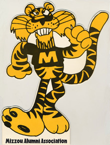
Stroke Dawg is the second best logo we’ve ever had.
The worst is this piece of shite:

The worst is this piece of shite:

Posted on 5/15/20 at 11:15 am to tylerdurden24
quote:
Stroke Dawg is the second best logo we’ve ever had.
I think it’s silly Georgia ever got rid of stroke dawg. It’s one of the best old school secondary logos and much like the VOLS rifleman, I am unsure why they felt the need to change.
I am not a fan of Georgia’s current secondary logo

Posted on 5/15/20 at 11:18 am to David Ricky
Nike has been fricking awful the last decade. The rebranding is trash and I’ve never liked the new font, not to mention they claim our famed silver britches can’t actually be made with their fabrics when Ohio State runs around in silver pants.
Posted on 5/15/20 at 11:40 am to tylerdurden24

Posted on 5/15/20 at 11:44 am to Pauldingtiger
I dont think any of these beats toonces
This is not a crown I'm proud of for lsu
This is not a crown I'm proud of for lsu

Posted on 5/15/20 at 11:53 am to tylerdurden24
quote:
not to mention they claim our famed silver britches can’t actually be made with their fabrics when Ohio State runs around in silver pants.
I agree I hate how metallic colors aren’t seemingly able be used anymore but these look the same to me
/cdn.vox-cdn.com/uploads/chorus_image/image/61807425/1033673978.jpg.0.jpg)

Posted on 5/15/20 at 12:02 pm to SummerOfGeorge
This vanilla arse bullshite right here. And those fricking birds. Terribad. The whole bunch.


I want the Power K and the actual Wildcat back. frick, I'll even take dick mouth Wildcat back at this point just to get rid of the terrible arse logos we have now.
I want the Power K and the actual Wildcat back. frick, I'll even take dick mouth Wildcat back at this point just to get rid of the terrible arse logos we have now.
Posted on 5/15/20 at 12:11 pm to Farmer1906
quote:
I hated when we updated our official seal.
I agree. I understand athletics is the big marketer for many schools but they should have never put the athletic logo on the official seal. At least the backlash made them keep the original seal on degrees.
This post was edited on 5/15/20 at 12:12 pm
Posted on 5/15/20 at 12:14 pm to SummerOfGeorge

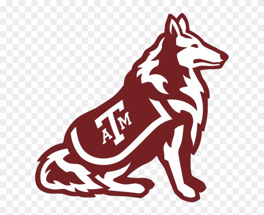
Texas A&M Logo going forward.

Posted on 5/15/20 at 12:15 pm to el gato
I don't really hate any of them, but was noticing that the older logos used to look a lot friendlier.

I guess everyone is trying to look tougher these days.
I guess everyone is trying to look tougher these days.
Posted on 5/15/20 at 12:24 pm to bigDgator
quote:
I don't really hate any of them, but was noticing that the older logos used to look a lot friendlier.
I think UF has generally done a pretty good job. I don't really have an issue with any of ours. I think the most "controversial" is probably:
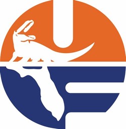
But even that one is still pretty popular. It's used quite frequently.
Posted on 5/15/20 at 12:25 pm to bgator85
I never liked that logo, but now that is the logo of my favorite t-shirt. Wearing it right now. 
Posted on 5/15/20 at 12:54 pm to SummerOfGeorge
Worst = our current one 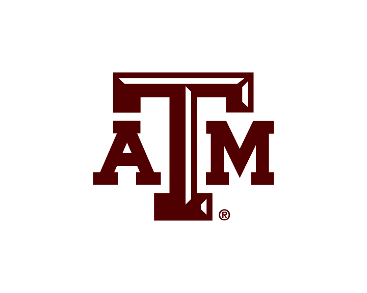

Posted on 5/15/20 at 12:54 pm to tylerdurden24
I didn't like Georgia's big change - the new logo or the lettering changes (including the new numbers on the jerseys).


The G, old dog and color scheme are great. No reason to ruin a good thing.
The G, old dog and color scheme are great. No reason to ruin a good thing.
This post was edited on 5/15/20 at 1:03 pm
Posted on 5/15/20 at 12:57 pm to gohogs141
Oh God those are terrible. The best logo was the hog wearing a sweater leaning against the A.
Posted on 5/15/20 at 1:01 pm to bigDgator
That 1961 logo is sick lmao
What is “stroke dog”? Initially I thought it was because it looked like a dog being stroked... but are you saying the droopy face makes it look like he’s having a stroke? That’s hilarious.
What is “stroke dog”? Initially I thought it was because it looked like a dog being stroked... but are you saying the droopy face makes it look like he’s having a stroke? That’s hilarious.
This post was edited on 5/15/20 at 1:03 pm
Posted on 5/15/20 at 1:05 pm to mouse_cop
Damn

Posted on 5/15/20 at 1:33 pm to SummerOfGeorge
Why do schools allow coaches to change uniforms and logos? A few times it has worked, but what do coaches know about good logos?

 Page 3 of 6

Back to top