Started By
Message
re: Worst logo/branding your school ever had?
Posted on 5/15/20 at 5:38 pm to Captain Falcon
Posted on 5/15/20 at 5:38 pm to Captain Falcon
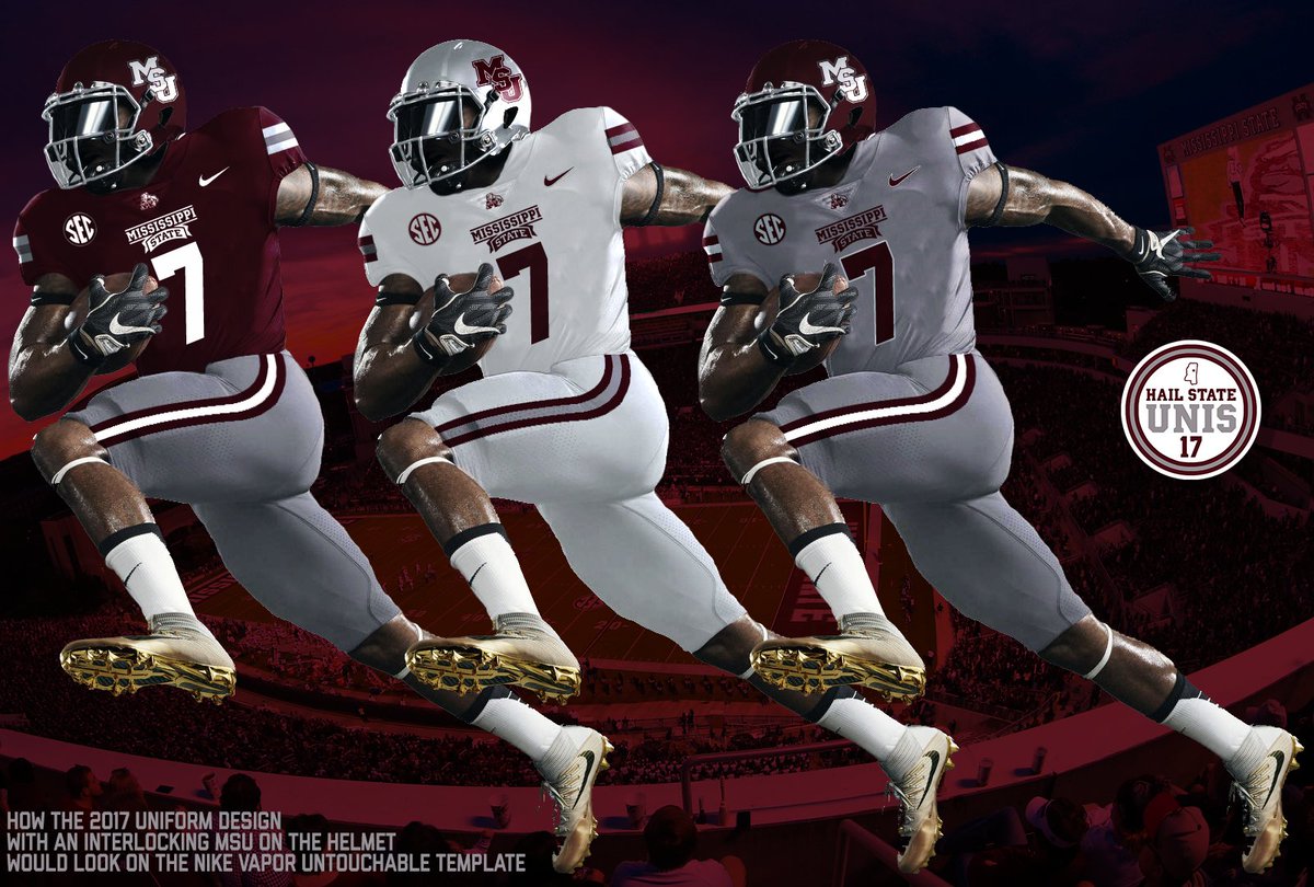
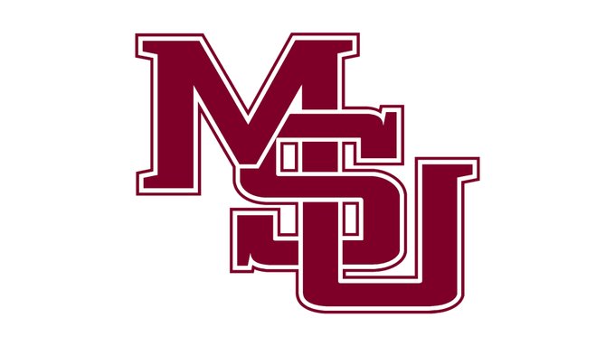
Mississippi State needs to try to bring the interlocking MSU logo back
 1
1


Posted on 5/15/20 at 5:56 pm to red sox fan 13
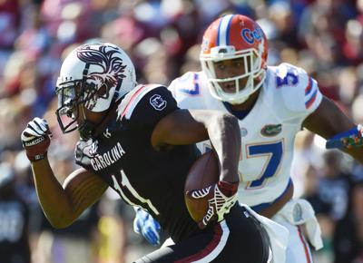
Hate these. But the top was only used once. I want the script Carolina shite to DIAF. Looks really dumb with the Carolina in the other font on the front.
This post was edited on 5/15/20 at 5:58 pm
Posted on 5/15/20 at 6:20 pm to southpawcock
How do y'all know and remember all this shite.
I don't know that I could think of a single Lsu logo now. Not to mention y'all have names for logos. Jesus , Y'all are serious about the little things around here.
I don't know that I could think of a single Lsu logo now. Not to mention y'all have names for logos. Jesus , Y'all are serious about the little things around here.
Posted on 5/15/20 at 7:52 pm to Tigerpride18
quote:
How do y'all know and remember all this shite.
I don't know that I could think of a single Lsu logo now. Not to mention y'all have names for logos. Jesus , Y'all are serious about the little things around here.

Posted on 5/15/20 at 8:44 pm to SummerOfGeorge
Everything about that logo is shite
I even despise the font
I even despise the font

Posted on 5/15/20 at 8:46 pm to David Ricky

I think my heart just melted

Posted on 5/15/20 at 10:51 pm to SummerOfGeorge
Yep. Us changing our fonts and numbers is just another case of Nike overthinking everything.
Our best era for jerseys were 06-12
Our best era for jerseys were 06-12
Posted on 5/15/20 at 10:52 pm to SummerOfGeorge
Posted on 5/15/20 at 11:04 pm to The Winner
One of the best, along with the helmets. What happened to it?
Posted on 5/15/20 at 11:24 pm to SummerOfGeorge
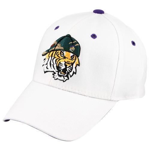
Goddamn Toonces. I get irritated every time I see that ugly weak arse logo 
And I don’t agree about Alabama’s angry elephant but I do think the other elephant logo y’all have looks classy as the frick.
And I don’t agree about Alabama’s angry elephant but I do think the other elephant logo y’all have looks classy as the frick.
Posted on 5/15/20 at 11:30 pm to southpawcock
quote:
Hate these. But the top was only used once. I want the script Carolina shite to DIAF. Looks really dumb with the Carolina in the other font on the front.
To think people actually got paid big money to design that walking contradiction is amazing to me. I think the helmet on the first one could look decent paired with a white out jersey and pants.
Posted on 5/16/20 at 5:43 am to SummerOfGeorge
Definitely the elephant.
Posted on 5/16/20 at 6:01 am to SummerOfGeorge
The late 90's/early 2000's was the golden age of horrible, gigantic cartoony logos that were hideous and quickly abandoned.
Was rampant not only in college but also pros, all sports too.
Was rampant not only in college but also pros, all sports too.
Posted on 5/16/20 at 7:28 am to PEPE
I don’t know of a single logo change in the 90s that was an improvement in the SEC.

Posted on 5/16/20 at 7:52 am to southpawcock
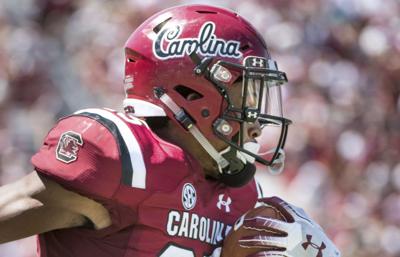
I always liked the script Carolina helmet
Really classy shite
The chicken one is fricking awful
Really classy shite
The chicken one is fricking awful
Posted on 5/16/20 at 7:57 am to Mithridates6
quote:
One of the best, along with the helmets. What happened to it?
I think my inquiry into this told me Nike owns the rights to the interlocking logo? Can anybullies confirm/deny that?
Posted on 5/16/20 at 8:55 am to SummerOfGeorge
It was so so bad
Posted on 5/16/20 at 9:34 am to SummerOfGeorge
Every one of those feels so 2006 to me. Especially Alabama and LSU
Posted on 5/16/20 at 10:16 am to SummerOfGeorge
These were teased in the spring/summer of 2012 and the reaction was so universally terrible Mack Brown said "don't worry they're just practice jerseys"


Posted on 5/16/20 at 10:49 am to SummerOfGeorge
& block #'s!

 Page 5 of 6

Back to top