Started By
Message
re: Worst logo/branding your school ever had?
Posted on 5/15/20 at 8:35 am to David Ricky

Posted on 5/15/20 at 8:35 am to David Ricky
quote:
checkerboards need to stay on the sidelines/end zones and away from apparel
Have to disagree. I need to see fans in the stands with the checkerboard overalls. I think they're awesome.
 1
1


Posted on 5/15/20 at 8:40 am to TigerLunatik
quote:
Have to disagree. I need to see fans in the stands with the checkerboard overalls. I think they're awesome.
Oh I like seeing the reds in those on game day. I was referring to when Butch put checkerboard stripes on the pants and checkerboard rat tails on the helmets

Posted on 5/15/20 at 8:44 am to David Ricky
I gotcha. You're talking about on the unis. Yeah, I don't need checkerboards on my classic uniforms. 
Posted on 5/15/20 at 8:44 am to David Ricky

Posted on 5/15/20 at 8:55 am to TigerLunatik
quote:
To be fair, most fans probably believe that they have the best logo and/or uniforms
True, but most are not fans of the Delta State Fighting Okra.

Posted on 5/15/20 at 8:57 am to Riseupfromtherubble
That top one is what I picture as Alabama’s logo, no matter the timeframe.

Posted on 5/15/20 at 9:01 am to SummerOfGeorge
We all watched too many TMNT as kids

Posted on 5/15/20 at 9:05 am to Riseupfromtherubble
That first one is a bitch to paint
Posted on 5/15/20 at 9:13 am to SummerOfGeorge
I really didn’t mind the Elephant. Toonces was LSU’s by a mile.
This post was edited on 5/15/20 at 9:16 am

Posted on 5/15/20 at 9:20 am to SummerOfGeorge
This thing:

But we are making it more subtle:

But we are making it more subtle:

Posted on 5/15/20 at 9:24 am to Riseupfromtherubble
Gotta be honest, I'm not really a fan of any of the older Alabama logos except maybe the elephant standing with the football, and that's probably just sentimental.
I'm more of a purist - I like just the current script 'A' without the ring.
I'm more of a purist - I like just the current script 'A' without the ring.
Posted on 5/15/20 at 9:35 am to SummerOfGeorge
Sports wise? This USC logo that Holtz brought in in the early 2000s. I'm pretty sure it was just a thumb in the eye to the Trojans from his old ND days. We used it on the field as a smaller logo for a bit and then our basketball team started using it. Thank God it's been gone for a while now.

General school rebranding? This shite pile we started last year for no reason at all

General school rebranding? This shite pile we started last year for no reason at all
This post was edited on 5/15/20 at 12:09 pm
Posted on 5/15/20 at 9:49 am to TigerLunatik
Didn't we launch Toonces in 2003 when we won our first NC since 1958?
So the merch sold and the admins were like "people love him"
So the merch sold and the admins were like "people love him"
Posted on 5/15/20 at 10:20 am to SummerOfGeorge
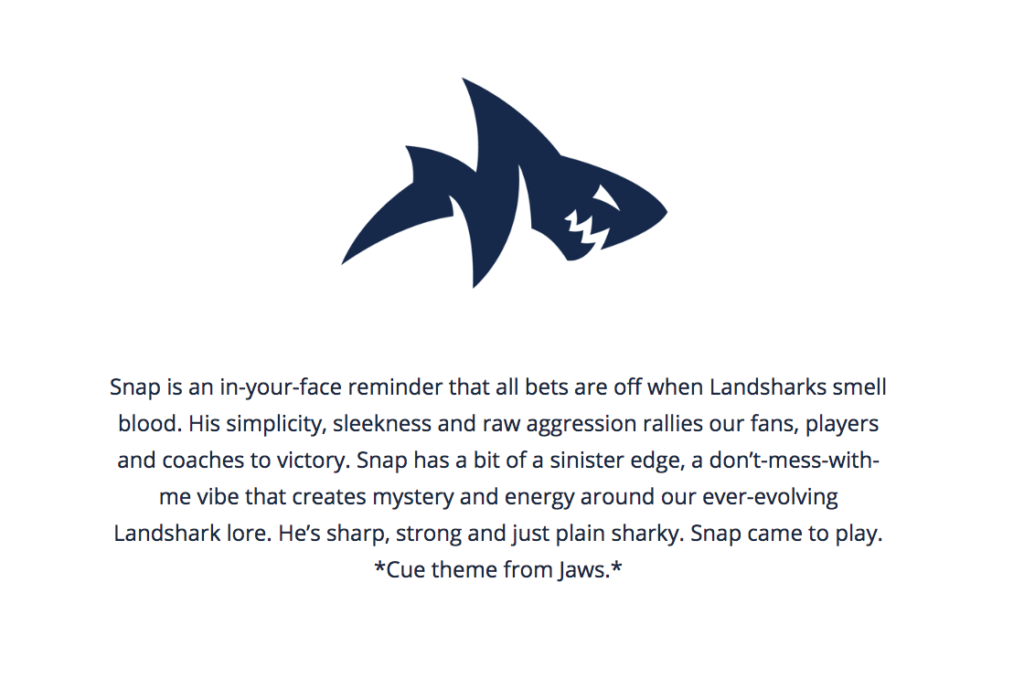
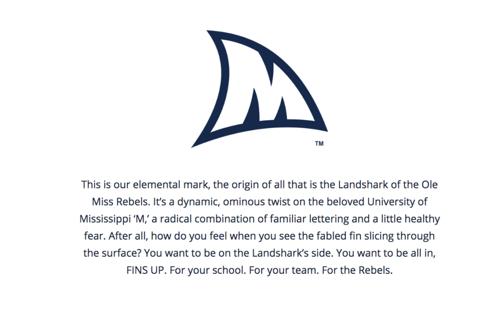
Pretty much anything OM has come up with in the last 15 years. Particularly the shark stuff
This post was edited on 5/15/20 at 10:22 am
Posted on 5/15/20 at 10:22 am to SammyTiger
I'm not sure when Toonces was created, Sammy. I really don't mind just the head, but the rest of it is garbage.
Posted on 5/15/20 at 10:23 am to SummerOfGeorge
Don't think this was ever an official university logo but this was used on some branding in the 80's
Posted on 5/15/20 at 10:32 am to rebelrouser
Yes, the entire "Landshark" thing is an abomination.

Posted on 5/15/20 at 10:41 am to TigerLunatik
"Grrrrrrrrrr"

Posted on 5/15/20 at 10:49 am to oleheat
Whoever designed toonces and whoever approved toonces needs to be beaten with large sticks of bamboo.

Posted on 5/15/20 at 10:52 am to TigerLunatik
Toonces originally started out as a full-body drawing. While not a great piece of art, the head did match the rest of the drawing.

It was a horrible idea to separate the toonces head from its body, and looked even worse when the drawing was altered to fit other iterations of the logo.

The floating head and toonces with a cap were terrible.
:format(jpeg)/cdn.vox-cdn.com/uploads/chorus_image/image/26141611/bc_27g6iuaagpqj.0.jpg)
It was a horrible idea to separate the toonces head from its body, and looked even worse when the drawing was altered to fit other iterations of the logo.
The floating head and toonces with a cap were terrible.

 Page 2 of 6

Back to top