




 14
14





.png)




Started By
Message

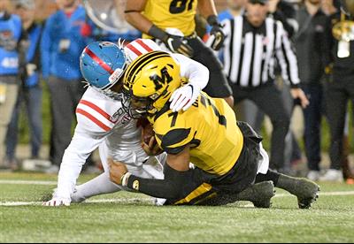
State makes permanent return to interlocking logo on helmet
Posted on 8/25/26 at 10:38 am
Posted on 8/25/26 at 10:38 am
Posted on 8/25/26 at 10:38 am to anc
Looks good.
Posted on 8/25/26 at 10:40 am to anc
quote:
Its the best logo we have.


Posted on 8/25/26 at 10:51 am to anc
The long national nightmare is over
Posted on 8/25/26 at 10:52 am to anc

the Kang would tell us all that State once again has a better looking helmet than ... Mississippi -
well done to whoever finally got their heads out of their collective butts in Starkville - MSU is your logo
Posted on 8/25/26 at 10:54 am to 1801
Its a good looking logo and you know who it is when you see it. The decision to get rid of it was awful.
Posted on 8/25/26 at 11:15 am to anc
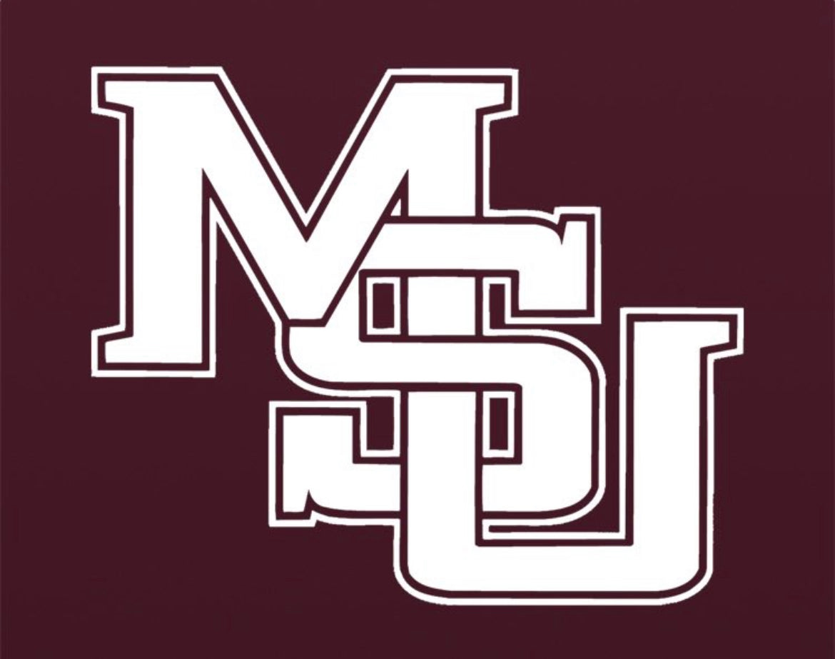
A cease and desist letter has been issued by Ole Miss against using this retired logo.
Posted on 8/25/26 at 11:35 am to anc
Hell yeah!
Posted on 8/25/26 at 11:38 am to anc
quote:
Its the best logo we have.
Posted on 8/25/26 at 11:42 am to anc
Very good looking. I love the MSU all white road Uniforms. Will be even better with this helmet logo.
Posted on 8/25/26 at 11:49 am to mckibaj
Never understood why the switched from this logo, glad they went back.
Posted on 8/25/26 at 11:54 am to anc
ole wayne madkin must be 50 years old now.
we called him chris rock junior.
jeeez time flies. i remember being at that OT game in 2000 when we beat moo u. great game.
moo u had a good team that year also. madkin, dontae walker, pork chop womack.
yes the interlocking is way better than that M state shite they started wearing.
we called him chris rock junior.
jeeez time flies. i remember being at that OT game in 2000 when we beat moo u. great game.
moo u had a good team that year also. madkin, dontae walker, pork chop womack.
yes the interlocking is way better than that M state shite they started wearing.
This post was edited on 8/25/26 at 11:58 am
Posted on 8/25/26 at 12:04 pm to anc
Looks cool!
Is this the before and after?
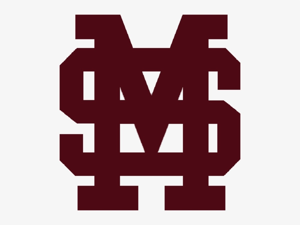
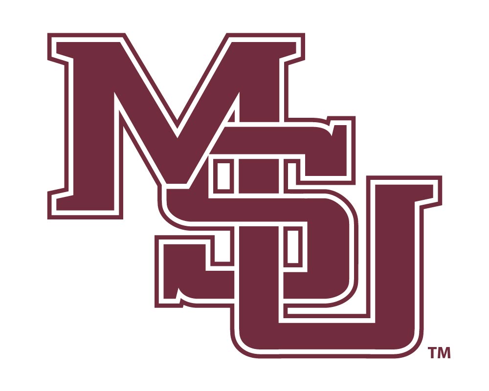
or this?
Is this the before and after?
or this?
This post was edited on 8/25/26 at 12:07 pm
Posted on 8/25/26 at 12:05 pm to paperwasp

Posted on 8/25/26 at 12:11 pm to anc

Posted on 8/25/26 at 12:16 pm to anc
Congrats.
It was sorely missed.
Getting back to a 1990s/2000s SEC isn’t a bad thing.
It was sorely missed.
Getting back to a 1990s/2000s SEC isn’t a bad thing.
Posted on 8/25/26 at 12:17 pm to anc
S looks like a 5, can't be used.
Posted on 8/25/26 at 12:18 pm to paperwasp
So in the 1970s, State started wearing the diagnal MS helmet that started this trend. Very basic.

In the early 80s, they tightened it up and added a U

By the mid80s, they made the letters more collegiate block and this was the look for over a decade


In 1996, State became a Nike school, and Nike redesigned the logo

State was a good team in the late 90s, and the fanbase was growing. This is the logo they remember.
In 2004, State hired Croom, switched from Nike to Russell Athletic, and everything went to shite. The athletic director spread a rumor that Nike owned the beloved logo - when in actuality they wanted to switch everything to the M-State.
In the early 80s, they tightened it up and added a U
By the mid80s, they made the letters more collegiate block and this was the look for over a decade
In 1996, State became a Nike school, and Nike redesigned the logo
State was a good team in the late 90s, and the fanbase was growing. This is the logo they remember.
In 2004, State hired Croom, switched from Nike to Russell Athletic, and everything went to shite. The athletic director spread a rumor that Nike owned the beloved logo - when in actuality they wanted to switch everything to the M-State.
Posted on 8/25/26 at 12:18 pm to hawgndodge
5 is for the amount of losses they had the year they won the West. Crazy times.
Posted on 8/25/26 at 12:21 pm to anc
Always thought the Flying M was pretty cool.



 Page 1 of 2


Popular
Back to top
 Follow SECRant for SEC Football News