Started By
Message
re: School logos/brands
Posted on 3/5/26 at 9:20 pm to GamecockUltimate
Posted on 3/5/26 at 9:20 pm to GamecockUltimate
Is the C for Cocks or Carolina?
 0
0

Posted on 3/5/26 at 10:35 pm to Gunga Din
Sure looked better back then
Posted on 3/5/26 at 10:57 pm to SoonerMagic1
The uniform wasn’t enough?
Posted on 3/5/26 at 11:06 pm to Arkyologist
This post was edited on 3/5/26 at 11:07 pm
Posted on 3/5/26 at 11:09 pm to madmaxvol
The first Carolina was the best. As for Missouri, there are so many variety schools with Tigers, so I get it’s difficult to create something unique. Missouri’s logo is a bit hard to read, especially on graphs like the SEC baseball and football composit schedules. It’s like tha black overwhelms the tiger, a bit hard to make it out
Posted on 3/6/26 at 2:49 am to Arkyologist
LSU's logo they placed on their jersey's back in the 40's looked kind of weird.

This post was edited on 3/6/26 at 2:57 am
Posted on 3/6/26 at 5:09 am to Arkyologist
Florida's brand is unique simply because they bring in a fourth color outside of the primary color scheme. Can't think of another school that does that.
Posted on 3/6/26 at 6:17 am to Arkyologist
GT has the best logo, followed by Stanford. There’s just something about a tree that really speaks to me.
This post was edited on 3/6/26 at 7:29 am

Posted on 3/6/26 at 6:23 am to VooDude
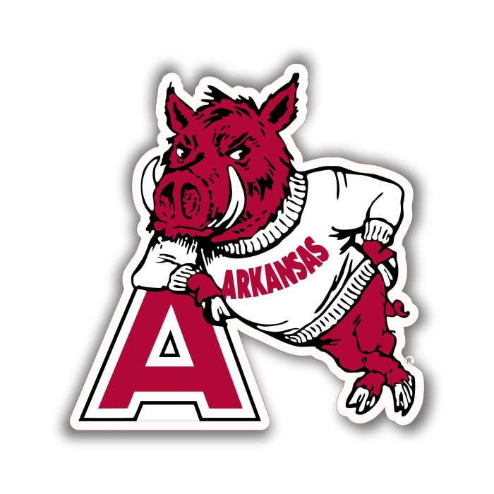
Has there been a goated slobberin' hog posted yet?
If not:

Also this. my personal favorite:
If not:
Also this. my personal favorite:

Posted on 3/6/26 at 6:50 am to SoonerMagic1
quote:
The interlocking OU logo is iconic. As iconic as the winged helmet of Michigan, the shiny gold helmet of Notre Dame, and the A of Alabama.
You can't actually believe this

Posted on 3/6/26 at 6:58 am to Arkyologist
quote:
UK - why not just a "K" with a better font
Cats sold their soul to Nike to sell more merchandise.
Basically got Northwestern's old logo updated to look like a stapler or 2 birds engaged in sexual congress.
Posted on 3/6/26 at 7:35 am to Freon
quote:that’s exactly what I thought of when I saw them too yet cool as hell is a huge stretch. Vast majority of public would consider that very outdated. I was thinking to myself how funny that’d be if Auburn was using that logo. There’s logos that stand the test of time and there’s a reason EA changed their logo
Those logos, particularly 41 and 11 that look like the late 80s early 90s EA logo, are cool as hell
Posted on 3/6/26 at 11:38 am to Who_Dat_Tiger
I myself am a sucker for the early 1990s aesthetic so I’m probably more fond of those than most. Would they look good on a helmet or something? frick no. Would it look good on a backwards baseball cap doing coke with strangers in the bathroom of a bar in Opelika? Debatable but I’d say yes. Yes it would.
Posted on 3/6/26 at 1:23 pm to Arkyologist
Hot take - everybody’s baseball logo is better than their football logo.

Posted on 3/6/26 at 5:08 pm to UKWildcats
That's bad arse
I liked the old "K" Kentucky helmets from the 80's
I liked the old "K" Kentucky helmets from the 80's

Posted on 3/6/26 at 5:36 pm to Arkyologist
You left off the most baffling of all
U = Miami
Aso GT Georgia Tech is a very solid logo for lettered logos
U = Miami
Aso GT Georgia Tech is a very solid logo for lettered logos
This post was edited on 3/6/26 at 5:38 pm

Posted on 3/6/26 at 6:04 pm to baytiger11
quote:
Hot take - everybody’s baseball logo is better than their football logo.
Indeed

Posted on 3/6/26 at 7:31 pm to Arkyologist
quote:
Since we just had the most horrifying mascots, how about the most uninspired or poorly designed brand/logos?
As long as our logo never has a pig on it I'm good...talk about uninspiring.
Posted on 3/6/26 at 7:39 pm to Mosnowman
To be fair, Arkansas has actually won national championships
Posted on 3/6/26 at 8:02 pm to Arkyologist
OU - why not just an "O" with a bold font?
We kinda like the interlocking OU we have now.
We kinda like the interlocking OU we have now.

 Page 3 of 4

Back to top