Started By
Message
re: School logos/brands
Posted on 3/4/26 at 9:06 pm to Gunny Hartman

Posted on 3/4/26 at 9:06 pm to Gunny Hartman
There's a lotta shite talking about uteruses on here. Think these guys just prefer dicks. It is an A&M fan tho...
 1
1


Posted on 3/5/26 at 5:48 am to Auburn80
quote:Why wouldn't we? They don't call it a Kentucky waterfall for nothing...
Kentucky may not want a mullet on their K.
Posted on 3/5/26 at 6:25 am to paperwasp
Those logos, particularly 41 and 11 that look like the late 80s early 90s EA logo, are cool as hell. It’d be cool to find something similar for the gamecocks, what unused ideas they had cooking at one point.
Posted on 3/5/26 at 6:41 am to TEXAS_1836
quote:
There's a lotta shite talking about uteruses on here. Think these guys just prefer dicks. It is an A&M fan tho...
Insecure LOGO smack about Texas iconic LOGO from teams that are constantly pushing alternate uniforms and helmets.
I'll tell you one thing, you could show the Longhorn LOGO to a 5 year old in Laos or BF Egypt and they'd know that LOGO represents the University of Texas.
Posted on 3/5/26 at 7:24 am to Victor R Franko
I for one welcome our new Tyson Razornugget alternate uni’s.
Posted on 3/5/26 at 7:27 am to Arkyologist
This was the best one Kentucky has had. Brings me back to those classic 90s basketball teams
Posted on 3/5/26 at 7:31 am to Arkyologist
OU already did the "O" thing.

The interlocking OU started when they chalked it in the end zone in beginning in the 1950s. They started putting the logo on the helmets in 1966..
The interlocking OU started when they chalked it in the end zone in beginning in the 1950s. They started putting the logo on the helmets in 1966..
This post was edited on 3/5/26 at 7:33 am
Posted on 3/5/26 at 8:03 am to Arkyologist
Branding works when a logo becomes easily recognizable by a large percentage of your total market and beloved by your core target audience. The fans buying the tickets.
The ones that stand out for me as top tier design are
Tennessee
Texas
Florida
Arkansas
Auburn
OU
The best LSU logo is actually their secondary Tiger logo, which is the tiger you see on the helmet.
Color also plays a huge part in branding. Texas, Tennessee, LSU and Florida have big advantages here due to the use of orange, gold and their bold combinations. LSU and Florida's uniforms really pop and show well on TV. That attracts new fans, especially young ones.
This post was edited on 3/5/26 at 8:04 am
Posted on 3/5/26 at 8:15 am to paperwasp
Never knew about the triangles logo (lower right),
Posted on 3/5/26 at 8:17 am to SoonerMagic1
quote:
As iconic as the winged helmet of Michigan,
I’ve never understood what that was nor its appeal.
Posted on 3/5/26 at 8:18 am to tBrand
quote:
buyest
Posted on 3/5/26 at 8:32 am to southernboisb
quote:
I’ve never understood what that was
It originated as two tone school colors of the original seams on a leather helmet.


Posted on 3/5/26 at 11:29 am to Arkyologist
quote:
OU - why not just an "O" with a bold font? - see Tennessee
quote:
UK - why not just a "K" with a better font - see Alabama
Would have been confusing back in the day when K-Mart covered the land with large Capital Ks.
quote:
SC - Why not a gamecock without the "C" - it's too busy
quote:
Mizzou - screams "cheap"
It's actually improved
quote:
Florida - see above (actually, is not that terrible)
Posted on 3/5/26 at 11:39 am to PappyGarcia
quote:
Our logo is sick. Used to be a bigger block C which I like better.
Agree, and to that point I actually like our old 50's logo with the Gamecock mid attack, inside of the big block C. It's so much better than the meth chicken that was never a logo
This post was edited on 3/5/26 at 11:40 am
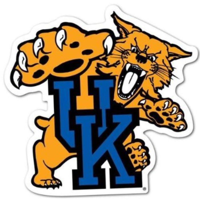
Posted on 3/5/26 at 12:31 pm to bbeck
That’s the PG version of the UK wildcat logo. In 1994, UK edited out the infamous penis tongue.
This post was edited on 3/5/26 at 12:32 pm
Posted on 3/5/26 at 12:58 pm to paperwasp


Posted on 3/5/26 at 3:06 pm to Arkyologist
Florida's logo is a got-danged masterpiece. You shut your whore mouth.
Nothing but indifference for the school and its teams, but that logo is legit.
Nothing but indifference for the school and its teams, but that logo is legit.
Posted on 3/5/26 at 5:32 pm to southernboisb
quote:
I’ve never understood what that was nor its appeal.
When Coach Fritz Crisler first came to Michigan, he designed the winged helmet so that his passer could find his receivers down field.
This post was edited on 3/5/26 at 5:34 pm
Posted on 3/5/26 at 5:50 pm to madmaxvol
Question/thought......
I'm looking at the two gator head logos at bottom of madmaxvol post. Not much changed except the color contrast and vividness became more pronounced in the 2011- now logo.
Does anyone know if the change was done because HDTV and HD broadcast became the standard in the summer of 2009?
Just curious.
I'm looking at the two gator head logos at bottom of madmaxvol post. Not much changed except the color contrast and vividness became more pronounced in the 2011- now logo.
Does anyone know if the change was done because HDTV and HD broadcast became the standard in the summer of 2009?
Just curious.

Posted on 3/5/26 at 9:11 pm to Gunga Din
That oU guy with leather helmet looks like he got hit in the face with a shovel.

 Page 2 of 4

Back to top