Started By
Message

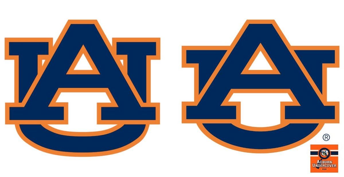
Auburn changed their logo - the font was changed to "Sabon"
Posted on 8/8/19 at 9:40 pm
Posted on 8/8/19 at 9:40 pm
What a terrible idea by somebody in your administration.
This post was edited on 8/9/19 at 11:04 am
 48
48


Posted on 8/8/19 at 9:42 pm to Vegetative State
Looks better. It’s just going to suck to have to change every piece of equipment from Pens to Jumbotrons for such a minute difference.
ETA: Just read Auburn’s thread on their board. I may want to duck ... I’m definitely in the minority in liking it.
ETA: Just read Auburn’s thread on their board. I may want to duck ... I’m definitely in the minority in liking it.
This post was edited on 8/8/19 at 9:45 pm
Posted on 8/8/19 at 9:42 pm to Vegetative State
frick Auburn

Posted on 8/8/19 at 9:42 pm to Vegetative State
Posted on 8/8/19 at 9:43 pm to Vegetative State
Makes cake icing/cookie decorating easier.
No need to insert those itty bitty triangles.
/chickcomment
No need to insert those itty bitty triangles.
/chickcomment
This post was edited on 8/9/19 at 8:59 am
Posted on 8/8/19 at 9:44 pm to Vegetative State
Looks worse.
Posted on 8/8/19 at 9:47 pm to Vegetative State
I could spot Auburn’s logo from a mile away, but I’ve never looked at it this closely and considered its details. I don’t think I would have noticed a difference.
Posted on 8/8/19 at 9:48 pm to EKG
This is terrible. Why change the logo? Alt unis, even altering stripes or something I might accept, but if this goes, I’ll be furious
Posted on 8/8/19 at 9:49 pm to Vegetative State
Left looks better.
Posted on 8/8/19 at 9:50 pm to Vegetative State
The Auburn logo is literally perfect. Why change it?
Posted on 8/8/19 at 9:51 pm to Vegetative State
All they did was widen the A out??
And they tightened up the U so their aint as much white
And they tightened up the U so their aint as much white
This post was edited on 8/8/19 at 9:53 pm
Posted on 8/8/19 at 9:54 pm to mistaken4193
quote:
And they tightened up the U so their aint as much white
and took out some orange.
Posted on 8/8/19 at 10:03 pm to Vegetative State
Good luck with that. They changed the K and all hell broke loose.
Posted on 8/8/19 at 10:03 pm to Vegetative State
It’s bad...but it sure as hell isn’t Toonces bad.
Posted on 8/8/19 at 10:08 pm to OleManDixon
quote:
Good luck with that. They changed the K and all hell broke loose.
Same with us and the bevel.
It remains ridiculously controversial.

Posted on 8/8/19 at 10:08 pm to Vegetative State
Sometimes it is good to remember the old saying: "If it ain't broke, don't fix it."
Posted on 8/8/19 at 10:08 pm to Vegetative State
The new one is ugly.
Posted on 8/8/19 at 10:11 pm to Vegetative State
That's not real right? That's abysmal. I hope they don't screw up our logo because I like our current version rn.
Posted on 8/8/19 at 10:13 pm to Vegetative State
Looks like shite. So does the new one.
This post was edited on 8/8/19 at 11:12 pm
Posted on 8/8/19 at 10:21 pm to Vegetative State
If you look at the one of the left long enough, it looks like a pig.

 Page 1 of 5

Popular
Back to top