




 22
22










Started By
Message

Sweet 16 teams retro logos
Posted on 3/24/25 at 4:04 pm
Posted on 3/24/25 at 4:04 pm
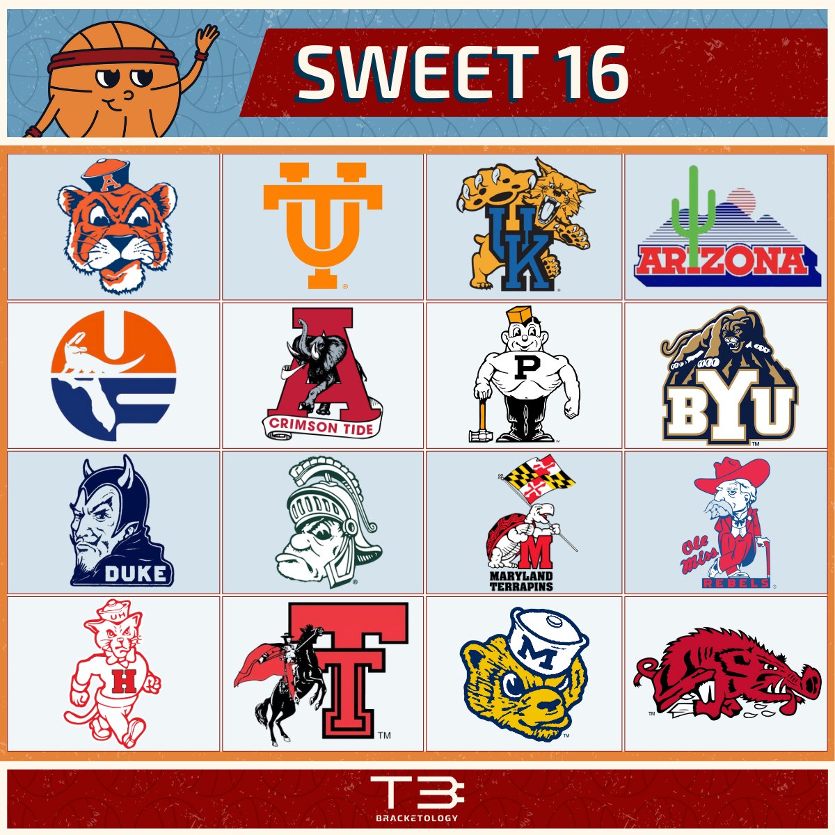
UK should go back to their old logo.
I like the old Bama too.
Vols did good dropping that "U" in their logo.
Posted on 3/24/25 at 4:12 pm to Go Go Gata
quote:
UK should go back to their old logo.
The one with the peenus for a tongue?
Posted on 3/24/25 at 4:12 pm to Go Go Gata
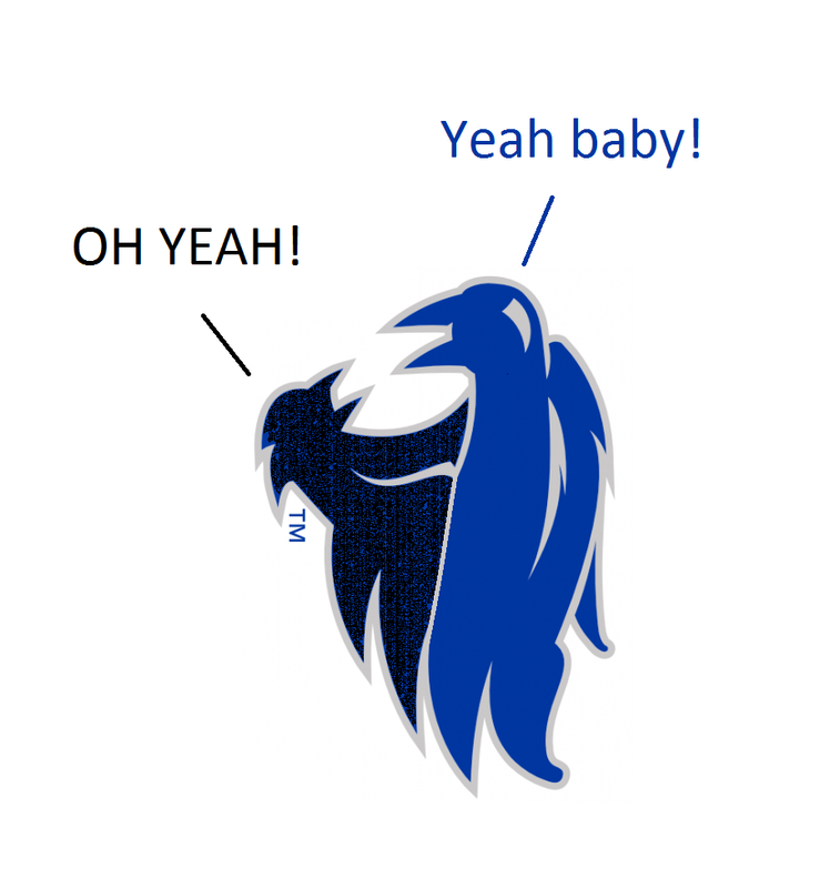
Our new logo looks like two birds having sex
Posted on 3/24/25 at 4:12 pm to Go Go Gata
Ughhh Bamas old logo brings a tear and tips my hat to the Bear.
This post was edited on 3/24/25 at 4:13 pm
Posted on 3/24/25 at 4:15 pm to Go Go Gata
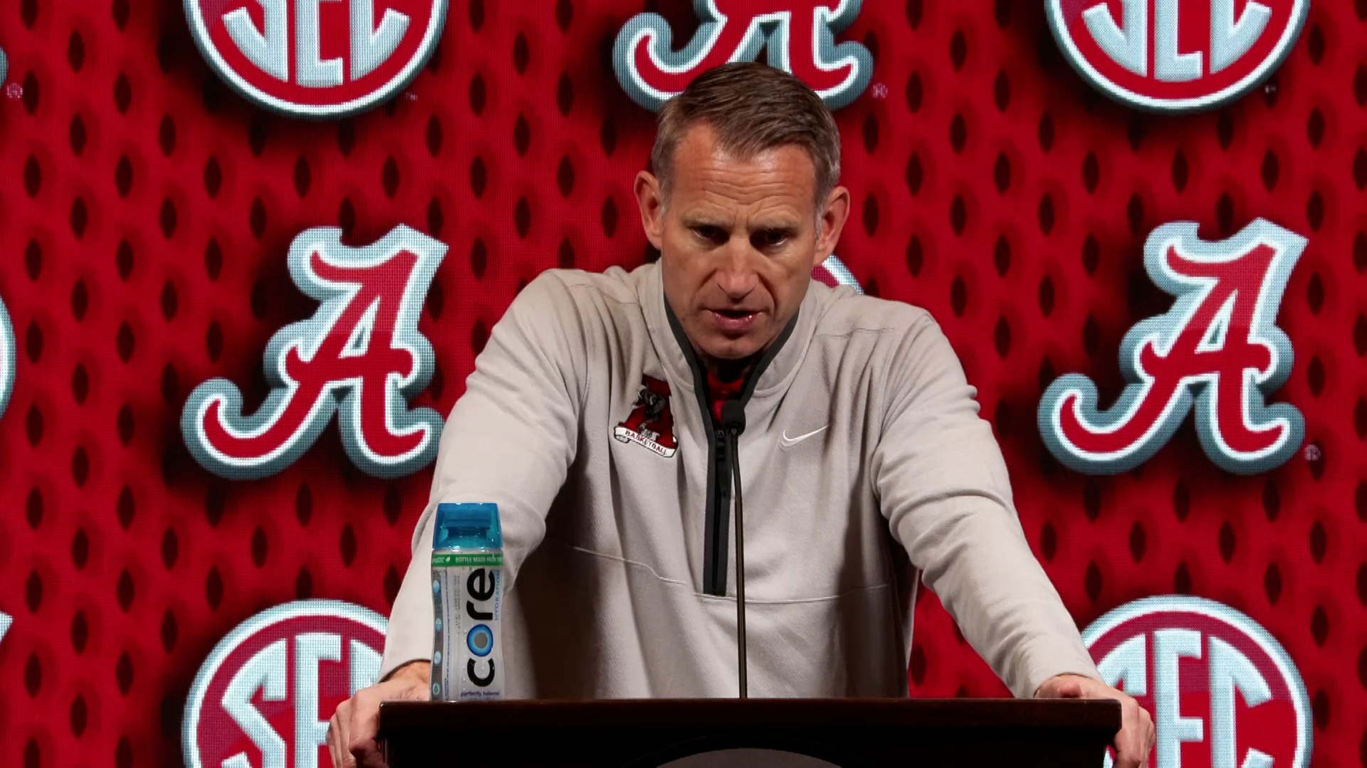
We use the old logo a ton these days, especially in basketball.



This post was edited on 3/24/25 at 4:17 pm
Posted on 3/24/25 at 4:17 pm to RTRnFlorida
Love that they brought back the vault A on the alternates last year but they really need to make this the primary across the board. Would love to see the A/elephant at midfield on NSF at BDS and at center court at Coleman.

This post was edited on 3/24/25 at 4:18 pm
Posted on 3/24/25 at 4:18 pm to Ukfan9
Wasn't there a dust up a while back about the tongue of the wildcat?
Posted on 3/24/25 at 4:19 pm to Ukfan9
quote:
Our new logo looks like two birds having sex

Posted on 3/24/25 at 4:21 pm to paperwasp
Damn it. Cannot unsee that now.
Posted on 3/24/25 at 4:23 pm to Go Go Gata
it's pretty much Colonel Reb - then rabid Hog - then everyone else -
Purdue needs some time to self-reflect if that's actually one of their old logos
Purdue needs some time to self-reflect if that's actually one of their old logos
Posted on 3/24/25 at 4:24 pm to Go Go Gata
That UF one is so cheesy yet I can't stop looking at it.
Posted on 3/24/25 at 4:25 pm to Go Go Gata
At least 12 of them are slam dunks better than today's. Old logos were more unique and had more character
Posted on 3/24/25 at 4:25 pm to Ukfan9
quote:
Our new logo looks like two birds having sex
I hate Nike changing UK's logo to sell m0ore gear then using the old Northwestern logo as the starting point.
Posted on 3/24/25 at 4:25 pm to Bengalbio
quote:
Arizona is unique.
T-shirt design from the 80s you’d find in Daytona Beach
Posted on 3/24/25 at 4:26 pm to Go Go Gata
I would shoot that hog quickly and then burn it.
Posted on 3/24/25 at 4:28 pm to Go Go Gata
damn - that Duke logo just looks plain evil!
Posted on 3/24/25 at 4:35 pm to Go Go Gata
Slobber Hawf finna whoop your arse baw 
Posted on 3/24/25 at 4:38 pm to Harry Rex Vonner
quote:
Slobber Hawg finna whoop your arse baw

Posted on 3/24/25 at 4:38 pm to paperwasp


 Page 1 of 4



Back to top
 Follow SECRant for SEC Football News