Started By
Message
Best color combinations among SEC schools
Posted on 7/12/23 at 4:35 pm
Posted on 7/12/23 at 4:35 pm
#1 -- Red & Black (UGA)....hardly needs mentioning; it's the best color combo on the planet; even the Fashion Institute in Paris says there's nothing better looking. Dawgs always look good on the field. Don't you wish you and your fellow fans looked as good and classy as Georgia fans do!
For the rest of the SEC I will spare my lengthy commentary, but here are my favorites in order:
#2 -- Navy & Burnt Orange (Auburn -- classic combo; wish AU would get away from any bright shade of orange)
#3 -- Gold & Black (Vanderbilt uses "Old Gold" shade which looks great next to black)
#4 -- Royal Blue & White (Kentucky always looks great)
#5 -- Navy & Cardinal Red (Ole Miss has another classic look)
#6 -- Gold & Black (Missouri uses "yellow" gold shade)
#7 -- Cardinal & White (Arkansas has a clean look)
#8 -- Crimson & Cream (Oklahoma -- love the vanilla shade of white they use)
#9 -- Crimson & White (Alabama -- Bama does it right, very clean look)
#10 - Garnet & Black (South Carolina colors are the closest to what their actual mascot shares, looks so good)
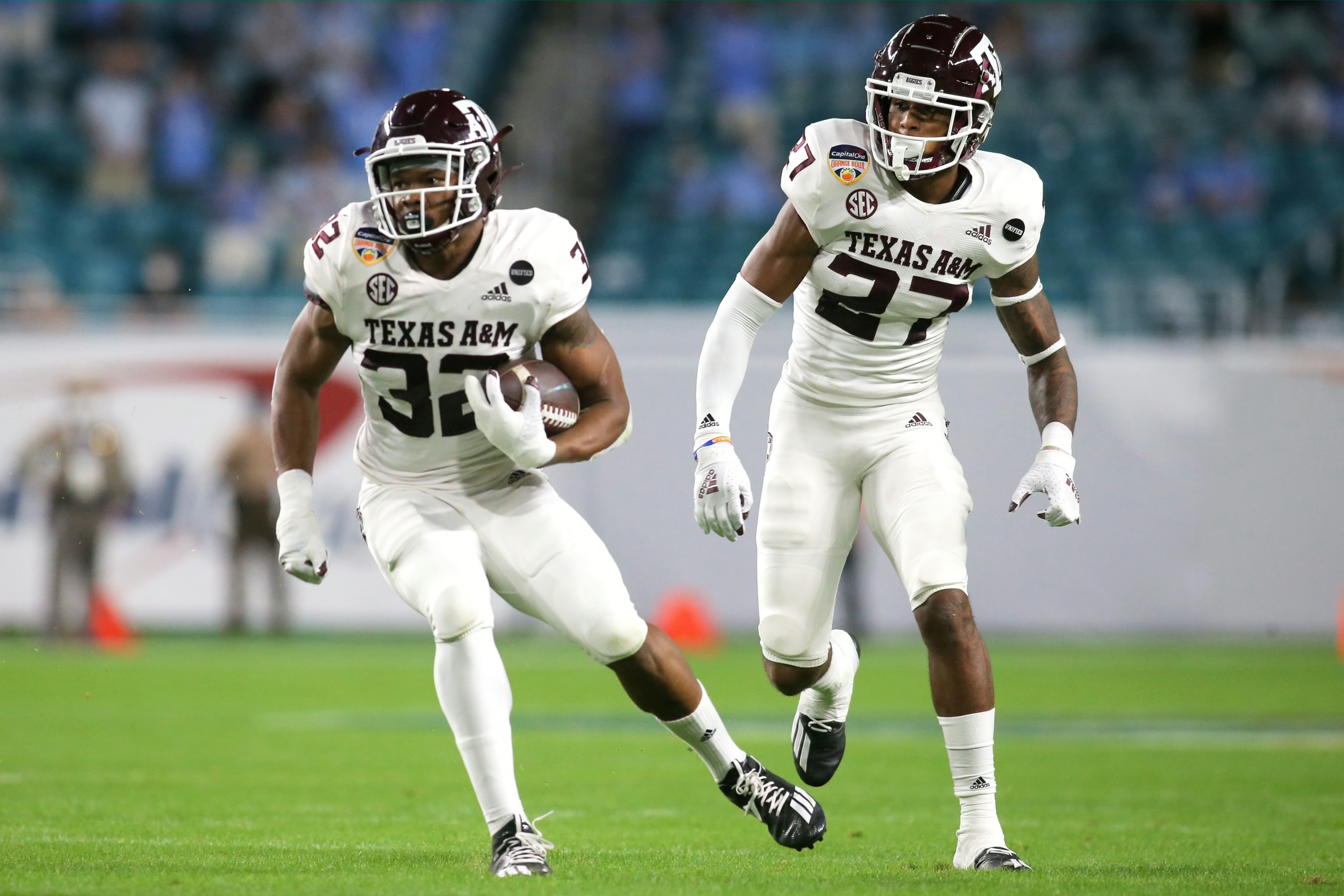
#11 - Maroon & White (MSST & Texas A&M classic combo, very clean looking)
#13 - Purple & Gold (LSU uses "yellow" gold shade -- wished they used an "Old Gold" shade, tho, next to purple -- I would have them near the top if they did)
#14 - Burnt Orange & White (Texas is tastefully done)
#15 - Orange & White (Tennessee looks equally good)
#16 - Blue & Orange (Florida uni's would look a bit better to me if they went with blue helmets to go along with blue tops and use orange more as a trim/accent, otherwise looks good)
Everyone has good looking colors; I've just never been a fan of orange in any shade except in AU's case -- burnt orange has that classic college look next to navy and have always liked it.
For the rest of the SEC I will spare my lengthy commentary, but here are my favorites in order:
#2 -- Navy & Burnt Orange (Auburn -- classic combo; wish AU would get away from any bright shade of orange)
#3 -- Gold & Black (Vanderbilt uses "Old Gold" shade which looks great next to black)
#4 -- Royal Blue & White (Kentucky always looks great)
#5 -- Navy & Cardinal Red (Ole Miss has another classic look)
#6 -- Gold & Black (Missouri uses "yellow" gold shade)
#7 -- Cardinal & White (Arkansas has a clean look)
#8 -- Crimson & Cream (Oklahoma -- love the vanilla shade of white they use)
#9 -- Crimson & White (Alabama -- Bama does it right, very clean look)
#10 - Garnet & Black (South Carolina colors are the closest to what their actual mascot shares, looks so good)
#11 - Maroon & White (MSST & Texas A&M classic combo, very clean looking)
#13 - Purple & Gold (LSU uses "yellow" gold shade -- wished they used an "Old Gold" shade, tho, next to purple -- I would have them near the top if they did)
#14 - Burnt Orange & White (Texas is tastefully done)
#15 - Orange & White (Tennessee looks equally good)
#16 - Blue & Orange (Florida uni's would look a bit better to me if they went with blue helmets to go along with blue tops and use orange more as a trim/accent, otherwise looks good)
Everyone has good looking colors; I've just never been a fan of orange in any shade except in AU's case -- burnt orange has that classic college look next to navy and have always liked it.
This post was edited on 7/12/23 at 4:38 pm
 37
37

Posted on 7/12/23 at 4:38 pm to JetDawg
quote:
#13 - Purple & Gold (LSU uses "yellow" gold shade -- wished they used an "Old Gold" shade, tho, next to purple)
Agreed, but I don’t think it’ll ever happen. I’ve heard they used to use old gold before color television forced them to change to canary yellow. I could be wrong.
2009 against Arkansas they used the old gold helmets.. Loved it so much I wish they would’ve made it permanent.
This post was edited on 7/12/23 at 4:40 pm

Posted on 7/12/23 at 4:39 pm to JetDawg
quote:
#13 - Purple & Gold
Posted on 7/12/23 at 4:42 pm to JetDawg
I do like that Georgia fans still hate us this much but you sir are hilariously wrong.
Posted on 7/12/23 at 4:42 pm to JetDawg
Thank you Queer Eye for the Straight Guy.
Posted on 7/12/23 at 4:44 pm to JetDawg
This is gold:
This is yellow:

LSU’s colors would be sharp if they dropped the lemon.

This is yellow:
LSU’s colors would be sharp if they dropped the lemon.

Posted on 7/12/23 at 4:45 pm to JetDawg
quote:
Florida uni's would look a bit better to me if they went with blue helmets to go along with blue tops and use orange more as a trim/accent, otherwise looks good
Florida needs an alternate uniform where the pants look like cutoff denim jorts, the jersey looks like a tank top, and the helmet has a bleach blonde mullet painted on it.
Posted on 7/12/23 at 4:57 pm to JetDawg
As always, a very classy objective analysis

Posted on 7/12/23 at 5:08 pm to JetDawg
Everyone but Tennessee looks good in some form or fashion.
Posted on 7/12/23 at 5:11 pm to JetDawg
I like this list with one exception. LSU Purple and yellow should be at 6 and everyone below move down a spot.
Posted on 7/12/23 at 5:17 pm to JetDawg
That G looks better in the original Green Bay colors.

Posted on 7/12/23 at 5:58 pm to JetDawg
quote:
#13 - Purple & Gold (LSU uses "yellow" gold shade -- wished they used an "Old Gold" shade, tho, next to purple -- I would have them near the top if they did)
Sorry for being original

Posted on 7/12/23 at 6:05 pm to JetDawg
quote:
Don't you wish you and your fellow fans looked as good and classy as Georgia fans do!
Pretty obvious you haven't seen me.

Posted on 7/12/23 at 6:30 pm to JetDawg
quote:
#5 -- Navy & Cardinal Red (Ole Miss has another classic look)
Do you hate the great United States of America?
Posted on 7/12/23 at 6:40 pm to JetDawg
Missouri's was better when they used the "Old Gold" shade. Why they went to the bumblebee yellow no one knows, but we have hopes of going back.

Posted on 7/12/23 at 6:57 pm to JetDawg
Red and black and also Bama’s crimson are good looking.
But the “best” is relative to how the uniforms look as well.
But the “best” is relative to how the uniforms look as well.
Posted on 7/12/23 at 7:09 pm to JetDawg
I wish we wore this every game.

Posted on 7/12/23 at 7:33 pm to JetDawg
1. LSU
2. Auburn
3. Texas
4-16. Subject to homerism
2. Auburn
3. Texas
4-16. Subject to homerism
Posted on 7/12/23 at 7:40 pm to JetDawg
Red and black is generic
Gold and black deserves better than college team with that combo can seem to do
Crimson and white just scream college football
Orange and White is instantly recognizable anywhere you see it (Tamp Bay Bucs are going back to it it seems)
Garnet and black can be sharp
Blue and white is mid
Purple and yellow fit Louisiana
Navy blue and orange works
Blue and red is ruined as soon as you realize it’s a homage to Harvard and Yale by a school in Mississippi.
Black and yellowish looks cheap
Orange and blue looks Hollywood. It seems to be the choice of teen and romantic comedy films.
Shade of maroon/crimson seem to be the dominant color way in the SEC now.

 Page 1 of 2

Popular
Back to top