Started By
Message
 1
1


Posted on 3/9/22 at 7:35 am to VFL1800FPD
quote:
dude what that thing is the GOAT
I agree. That Tenn one looks pretty good, especially compared to some of the other ones shared in this thread.
Posted on 3/9/22 at 7:36 am to BranchDawg
Worst:

Best:

Best:

Posted on 3/9/22 at 7:39 am to BranchDawg
I love the eye on midfield. I hate it everywhere else.

Posted on 3/9/22 at 7:40 am to BranchDawg
Stroke Dawg FTW
Posted on 3/9/22 at 7:42 am to TigerinKorea
When I was younger and they first did the Eye at midfield I was amazed. Thought it was the coolest design.
Posted on 3/9/22 at 7:45 am to TigerinKorea
I’ve always liked that one
Posted on 3/9/22 at 7:55 am to BranchDawg
The new UGA logo politely asks you to stop smoking, the old UGA logo tells you to give him a cigarette NOW, doesn’t care if it’s your last one either
This post was edited on 3/9/22 at 7:56 am
Posted on 3/9/22 at 8:02 am to Freon
Popcorn Hog


Posted on 3/9/22 at 8:09 am to Mainieri Fan
quote:
Popcorn Hog
Worst F'ing logo in the history of sports.
Posted on 3/9/22 at 8:31 am to BranchDawg
Toonces.
Posted on 3/9/22 at 8:37 am to TigerinKorea
Yes
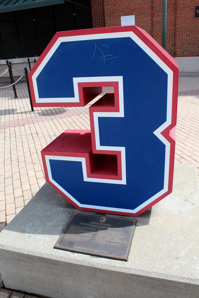
That logo on your field is awesome. Saw it the first time my fish year at our game in Baton Rouge. My roommate from Opelousas dad’s got us sweet tickets. Filled up on jambalaya, met shaq! He called me little dude. Got called several other names leaving the stadium. I was from a small town in the Texas panhandle so it was quite the fun new experience.
On the drive to LA, I still remember those apocalyptic love bugs everywhere. Had to stop and clean off head lights.
Posted on 3/9/22 at 8:43 am to BranchDawg

I can’t believe this was an official logo. It’s just bad.
Posted on 3/9/22 at 8:44 am to BranchDawg
Always loved our baseball logo.

Wasn't a fan of the old USC logo.

Wasn't a fan of the old USC logo.
Posted on 3/9/22 at 8:48 am to red sox fan 13
Looking at this thread, the 2000s was a brutal time for SEC logos.
This post was edited on 3/9/22 at 8:50 am
Posted on 3/9/22 at 8:52 am to Harlan County USA
This is two birds engaged in the missionary position.
You can’t unsee it now.
Posted on 3/9/22 at 8:53 am to Smokeyone
I love this old school logo.
Posted on 3/9/22 at 8:54 am to red sox fan 13
/cdn.vox-cdn.com/uploads/chorus_image/image/26141611/bc_27g6iuaagpqj.0.jpg)
tGOAT hat.
Posted on 3/9/22 at 9:00 am to BranchDawg
quote:
The old Dawg was a nasty-looking motherfricker. Looked like he had been through some shite and he wanted your arse. He was daring you to start some shite.
Except most English Bulldogs are short, little, mostly docile animals.
If UGA wanted badass dogs, why not a pit bull or other breed?
This post was edited on 3/9/22 at 9:02 am

Posted on 3/9/22 at 9:04 am to BranchDawg
Call me crazy, I don't like the one with the hat at all. I understand the new direction, personally.

 Page 2 of 4

Back to top