Started By
Message

What is your least favorite logo your team has used?
Posted on 3/9/22 at 6:18 am

Posted on 3/9/22 at 6:18 am
Currently, I hate this new Bulldog head:
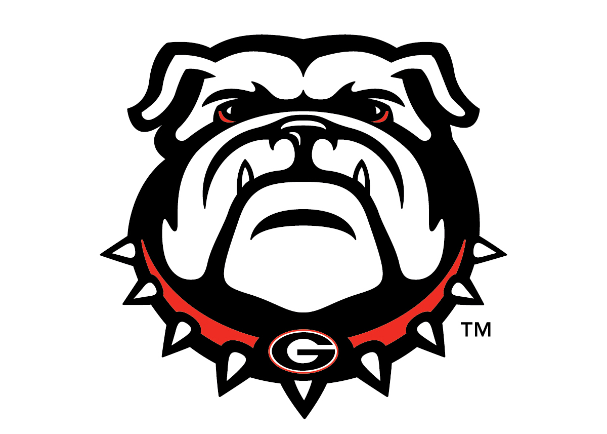
Just looks wrong. This is the true Bulldog head:

Just looks wrong. This is the true Bulldog head:
 29
29

Posted on 3/9/22 at 6:20 am to BranchDawg
I agree, the old Bulldog has far more character and dates back to hand drawing instead of 5 minutes in illustrator.

Posted on 3/9/22 at 6:23 am to BranchDawg
What about this one?


Posted on 3/9/22 at 6:24 am to BranchDawg
Bottom one looks vaxxed

Posted on 3/9/22 at 6:24 am to BranchDawg
What I love is that they knew you wouldn't be able to tell it was the Georgia Bulldog without the "G" logo too, so they just slapped in on there as a dog tag.
Posted on 3/9/22 at 6:24 am to KaiserSoze99

Just a dumb change.

Posted on 3/9/22 at 6:24 am to BranchDawg


Posted on 3/9/22 at 6:25 am to BranchDawg

Posted on 3/9/22 at 6:26 am to Gifman
Shite I can’t read… this is my favourite over the current abomination with the banner
Posted on 3/9/22 at 6:30 am to TMRebel
quote:
What I love is that they knew you wouldn't be able to tell it was the Georgia Bulldog without the "G" logo too, so they just slapped in on there as a dog tag.
That’s not really the issue to me, because you could argue the same thing about the old Dawg having the “G” just slapped onto the hat.
The issue is, as a previous poster mentioned, the new Dawg has no character. It’s a soulless, corporately designed NFT-looking JPEG.
The old Dawg was a nasty-looking motherfricker. Looked like he had been through some shite and he wanted your arse. He was daring you to start some shite.
If you ran up on the old Dawg in a back alley, you’d be high-tailing it the frick out of there.
This post was edited on 3/9/22 at 6:31 am

Posted on 3/9/22 at 6:33 am to BranchDawg
The completely unnecessary bevel on the A&M logo is the consensus least favorite logo of Texas A&M

Anything Ol’ Sarge related is my favorite:
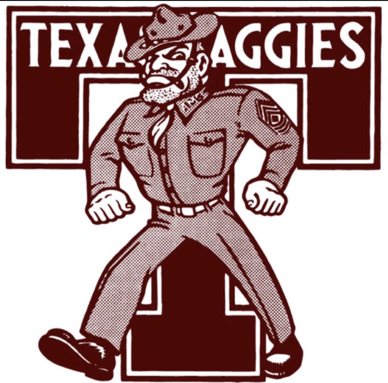
Anything Ol’ Sarge related is my favorite:
Posted on 3/9/22 at 6:37 am to Colonel Ingus


Posted on 3/9/22 at 6:37 am to BranchDawg
This one.
Posted on 3/9/22 at 6:39 am to BranchDawg

Posted on 3/9/22 at 6:40 am to BranchDawg
Terrible.
Posted on 3/9/22 at 6:42 am to BranchDawg

This one, and it's not even close.
frick you Jeff Long!
Posted on 3/9/22 at 6:51 am to ArHog
This one because of the font.
Posted on 3/9/22 at 7:10 am to Smokeyone
Needs mustard bottle and butt funnel.

Posted on 3/9/22 at 7:13 am to SECdragonmaster
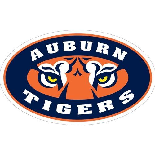
I'm sure Auburn makes a lot of money on this logo from little league teams using it without the Auburn Tigers on it.

Posted on 3/9/22 at 7:23 am to Bama Bird
Ugh, how I despise that logo. Not only does it look awful, but its prevalence coincides almost exactly with our "wandering through the wilderness" decade from 1997-2007.

 Page 1 of 4

Popular
Back to top