Started By
Message
The angled/crooked script A
Posted on 5/16/18 at 12:35 pm
Posted on 5/16/18 at 12:35 pm
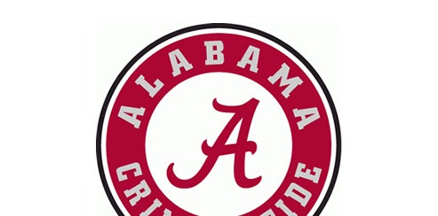
I see cars all the time that have a script A decal or magnet and the A is turned at an angle. Is there some reason for this or do people just slap them on there and don’t care how it looks?
Posted on 5/16/18 at 8:02 pm to Roll Tide Ravens
To be perfectly honest, I'm not a big fan of the script A and never have been. It's not very eye-catching, it looks like we ripped of the Atlanta Braves, and how does it really represent Alabama? There's NOTHING about it that says Alabama. It's really a lame logo. The old school block A with the elephant stepping through it said Bama. I get that we needed a more modern emblem and I have no problem with that, but the script A is about as generic and MEH! as they come. Try again.
Posted on 5/16/18 at 8:55 pm to phil4bama
quote:
The old school block A with the elephant stepping through it said Bama.
If by old school you mean 1980's then I agree
Posted on 5/16/18 at 10:01 pm to phil4bama
quote:
The old school block A with the elephant stepping through it said Bama
That's the best. I got a vintage flatbill with it and it's super fly.
Posted on 5/17/18 at 12:40 am to phil4bama
quote:We had it before Atlanta ever had a baseball team. You seriously thought this was new?
it looks like we ripped of the Atlanta Braves

This post was edited on 5/17/18 at 12:45 am
Posted on 5/17/18 at 12:46 am to phil4bama
quote:
it looks like we ripped of the Atlanta Braves
We tradmarked a script A and started using it as a secondary logo in 1976. The Braves were using a lower case cursive a back then and didn't start using the script A again until 1981.
ETA - That pic of Bryant above was from 18 years before we even trademarked it.
This post was edited on 5/17/18 at 1:53 am
Posted on 5/17/18 at 6:20 am to Evolved Simian
I know we had it first and that was never an issue, but the logos are still too close. Can’t we come up with something more representative?
Posted on 5/17/18 at 7:38 am to diggyson

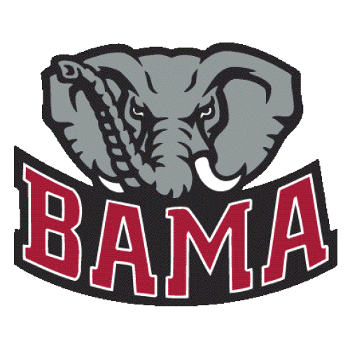
anything that involves this variation of the mean elephant is terrible and has been around way too long.
This is the best

This post was edited on 5/17/18 at 7:41 am
Posted on 5/17/18 at 9:24 am to bamaphan13
Elephant Logos are the best though. They are the only thing other than Big AL that keeps our mascot in the limelight. Plus they look badass.
This post was edited on 5/17/18 at 9:25 am
Posted on 5/17/18 at 10:29 am to _Hurricane_

I always liked the simple look of this A
**not sure if the pic is working, but it's the A that was on the basketball uniforms in the early 2000s
This post was edited on 5/17/18 at 8:16 pm
Posted on 5/17/18 at 1:28 pm to phil4bama
I like the script A and I just think people who can't tell the difference between Alabama and Atlanta just aren't the kind of people that really matter when it comes to such things.
I live in Arizona and have a script A on the front. I'm sure people confuse it with Arizona teams and it's not even close to their logo's.
I live in Arizona and have a script A on the front. I'm sure people confuse it with Arizona teams and it's not even close to their logo's.
Posted on 5/17/18 at 1:29 pm to Evolved Simian
quote:
We tradmarked a script A and started using it as a secondary logo in 1976. The Braves were using a lower case cursive a back then and didn't start using the script A again until 1981.
ETA - That pic of Bryant above was from 18 years before we even trademarked it.
It's the letter A.
It doesn't even matter who "did it first", there are only a few options because it's the same letter.
Hell, the block A would be even worse in this way.
Posted on 5/17/18 at 2:12 pm to Roll Tide Ravens
The only letter I care about is W.
Posted on 5/17/18 at 7:22 pm to prevatt33
Exactly why the elephant should be incorporated somehow.
Posted on 5/17/18 at 8:16 pm to 3down10
quote:
It doesn't even matter who "did it first", there are only a few options because it's the same letter.
The Simpsons already did it.
Posted on 5/17/18 at 11:16 pm to Roll Tide Ravens
Less is more, IMO.
elephants and other items mixed in is just too busy.
Can anyone really tell what's going on in the Proctor and Gamble logo, whereas the AT&T with just the globe is much more succinct.
elephants and other items mixed in is just too busy.
Can anyone really tell what's going on in the Proctor and Gamble logo, whereas the AT&T with just the globe is much more succinct.
Posted on 5/18/18 at 10:39 am to lion
quote:
You seriously thought this was new?
To be fair, it's not that old. Is it?
The current Script A wasn't trademarked until 2001 when they updated the Primary Alabama and Elephant graphic.
Primary Logos:
1952-1958

1974-2000

2001-2003

2004-Present

Secondary Logos:
1974-2000

1976-2000

2001-present

2001-2003

2004-Present

LINK
Posted on 5/18/18 at 12:16 pm to 3down10
quote:
who can't tell the difference between Alabama and Atlanta just aren't the kind of people that really matter when it comes to such things.
It's easy. Ours has a mullet.
Posted on 5/18/18 at 1:28 pm to _Hurricane_
quote:
Elephant Logos are the best though.
Latest Alabama News
Popular
Back to top


 4
4


