Started By
Message
re: Top 5 best SEC field designs/layout
Posted on 5/22/20 at 5:12 pm to WG_Dawg
Posted on 5/22/20 at 5:12 pm to WG_Dawg
quote:
. I loved our endzones with the old block letters with shadows, just screamed old school. I
Agree - the new Nike font for you guys being everywhere sucks.
The old GEORGIA shadow font was great
 1
1

Posted on 5/22/20 at 5:19 pm to Elleshoe
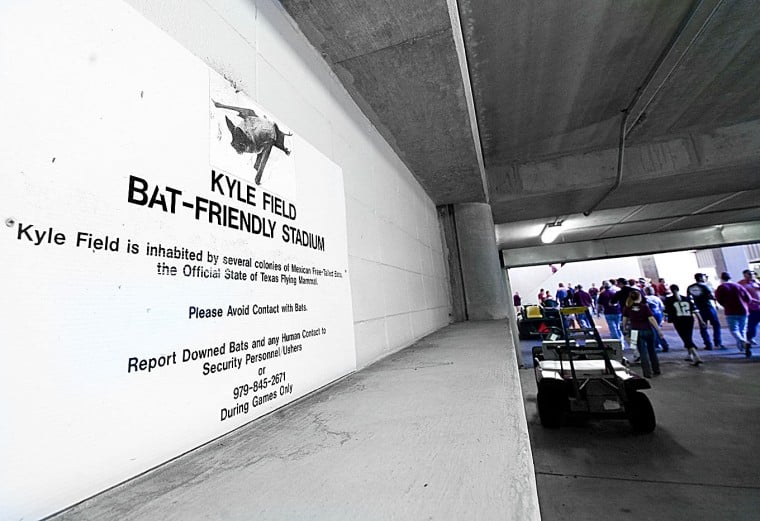
The entire state is infested with bats.
They eat all those dang crickets and such.
The Congress Avenue Bridge Bat Colony in Austin (largest urban colony in Texas) is a site to behold.
Sweet babies.
Austin:

College Station:
They eat all those dang crickets and such.
The Congress Avenue Bridge Bat Colony in Austin (largest urban colony in Texas) is a site to behold.
Sweet babies.
Austin:
College Station:

Posted on 5/22/20 at 5:22 pm to EKG

Posted on 5/22/20 at 5:25 pm to WG_Dawg
quote:
Thats an older (or rather, not current) pic of Sanford btw. I loved our endzones with the old block letters with shadows, just screamed old school. I still don't like our current font that started in 2013
my bad. I got it changed

Posted on 5/22/20 at 5:28 pm to RadarTiger
Florida
Tenn
Ole Miss
Tenn
Ole Miss
Posted on 5/22/20 at 5:32 pm to David Ricky
quote:
Florida’s orange is an abomination imo. They either need a blue background with an orange Gators or go back to how they used to be. I also think the old block F at midfield looked better
I like both the blue and Orange. The F in midfield and the old enzones were always atrocious to me. Looks like a SWAC field imo. But maybe if you are nostalgic about it I'd get it.
I also am not a fan of the current font they have. Feel like they can find something better.

Posted on 5/22/20 at 5:35 pm to EKG
Armadillos eat a lot of pests in Texas and southwestern La too; unfortunately they can't figure out two-way traffic

Posted on 5/22/20 at 5:37 pm to RadarTiger
quote:
bad. I got it changed
Thanks but still old lol. Starting in 2018 they cut out some of the West endzone after the new locker room and and that's where the players now run out. Also enlarged the scoreboard
ETA: I guess it doesn't matter though if you're just talking about fields
This post was edited on 5/22/20 at 5:39 pm
Posted on 5/22/20 at 5:47 pm to TigerintheNO
UGA did it for years as well. Certainly in the Herschel era and after for a good while.
For years, we had no logos at all on the field; it was blank end zones and no midfield logo. First midfield logo I recall was for the UGA centennial in '92.
For years, we had no logos at all on the field; it was blank end zones and no midfield logo. First midfield logo I recall was for the UGA centennial in '92.
Posted on 5/22/20 at 5:49 pm to Floyd Dawg
We also had a red g at midfield for years that looked crappy. They painted it black for Vince's last game as ad for kenucky 2003 and I think they left it black ever since thank goodness
Posted on 5/22/20 at 5:50 pm to SummerOfGeorge
quote:
The old GEORGIA shadow font was great
If I'm not mistaken, didn't the Alabama font in yalls endzones used to be similar? Maybe in the early 2000s or 90s
Posted on 5/22/20 at 5:53 pm to RadarTiger
I guess I don’t really care. They’re all mostly green, rectangular, with painted end zones. Works for me.
If I had to pick, I’d go with Kentucky just because the striped shades of grass is kind of cool.
If I had to pick, I’d go with Kentucky just because the striped shades of grass is kind of cool.
Posted on 5/22/20 at 6:25 pm to WG_Dawg
quote:
I loved our endzones with the old block letters with shadows, just screamed old school. I still don't like our current font that started in 2013
I’m the same way. The previous font for the numbers just fit some of those early 2000s bad arse defenses perfectly. Can’t envision Odell, Thomas Davis, Greg Blue, or Pollack wearing that curved font stuff.
The superstitious part of me can’t help but point out our worst defense in history (possibly) was 2013.
Posted on 5/22/20 at 6:29 pm to RadarTiger
Take the LSU tag off your profile. You just linked a picture of the stadium in 2014. Your missing the upper deck in the south end zone
Posted on 5/22/20 at 6:31 pm to EKG
LSU yard markers are traditional. They marked every 5 back in the day. Same as the H style goal post. The old girl may have a few new twists, but the intent was to keep to it’s traditional form in every way. Greco Roman coliseum on the outside facade, gridiron on the field.

Posted on 5/22/20 at 6:35 pm to RadarTiger
Miss these end zones

Posted on 5/22/20 at 6:54 pm to RadarTiger
Won't include LSU so top 5:
UF
Ole Miss
Aubur
uGA
Tenn (glad to see them stick with classic checkerboard)
UF
Ole Miss
Aubur
uGA
Tenn (glad to see them stick with classic checkerboard)
Posted on 5/22/20 at 6:59 pm to lsufball19
quote:
Miss these end zones
Those were great
Posted on 5/22/20 at 6:59 pm to Mithridates6
quote:
If I'm not mistaken, didn't the Alabama font in yalls endzones used to be similar? Maybe in the early 2000s or 90s
Yep, I posted a picture earlier.
80s through like 2007 I think
Posted on 5/22/20 at 7:00 pm to RadarTiger
I wish it would return to "Texas Aggies".

 Page 2 of 5

Back to top