Started By
Message
Georgia's logo is basically the same as those of Green Bay and Grambling
Posted on 3/6/26 at 10:24 pm
Posted on 3/6/26 at 10:24 pm
They should update it to something more unique and representative of Georgia football.
Here's my humble submission -
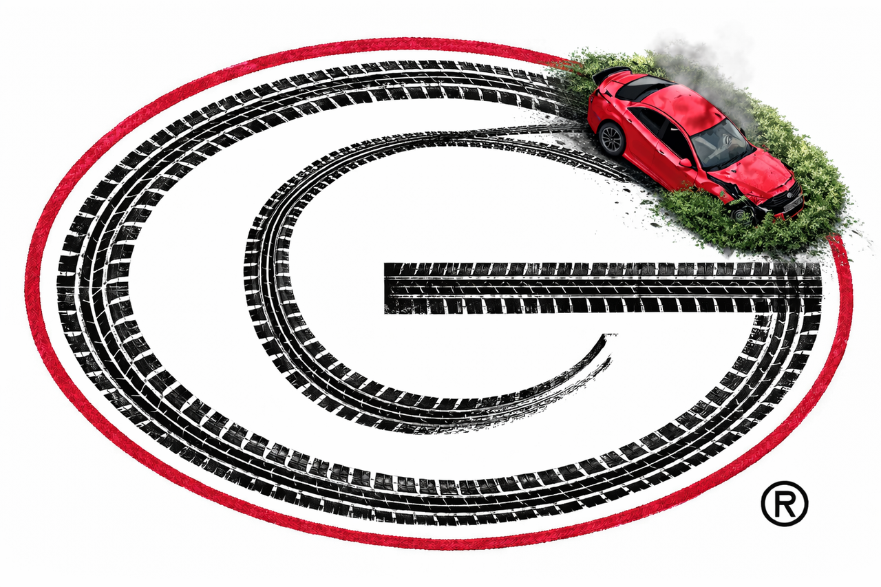
Here's my humble submission -
 13
13


Posted on 3/6/26 at 10:37 pm to SidewalkTiger
That’s nice, Tennessee State
Posted on 3/6/26 at 10:41 pm to CNB
My my my

Posted on 3/6/26 at 10:50 pm to ParkRanger
The LSU helmet is so bad. The "LSU" lettering looks like an equipment manager put it on with purple duct tape. The tiger decal looks like a chrysanthemum if you're more than 10' away. Just awful design.
Posted on 3/7/26 at 1:25 am to SidewalkTiger
quote:
Here's my humble submission
Oh shite, here we go, another Boomer found Chat GPT Images.
Posted on 3/7/26 at 1:34 am to InternationalPlayboy
quote:
Oh shite, here we go, another Boomer found Chat GPT Images.
Just trying to get on your level, Altie.
Posted on 3/7/26 at 1:39 am to SidewalkTiger
quote:
Just trying to get on your level, Altie.
Wheezing geezer is having delusions.
Posted on 3/7/26 at 1:42 am to InternationalPlayboy
You're older than me 
Posted on 3/7/26 at 1:52 am to SidewalkTiger
I’ll accept it, frick Georgia
Posted on 3/7/26 at 2:45 am to SidewalkTiger
quote:
You're older than me
Does paw-paw need to take some fish oil and relax?

Posted on 3/7/26 at 6:17 am to SoFla Tideroller
When the helmet vents seem to be part of the LSU lettering its really odd looking.
Cyrillic script almost . Maybe Comrade Golesh could try this for Aubie ?


Cyrillic script almost . Maybe Comrade Golesh could try this for Aubie ?
Posted on 3/7/26 at 6:45 am to Trumansfangs
The helmet vents have fricked up so many logos and the overall aesthetics.
Posted on 3/7/26 at 7:15 am to SoFla Tideroller
quote:
The LSU helmet is so bad. The "LSU" lettering looks like an equipment manager put it on with purple duct tape. The tiger decal looks like a chrysanthemum if you're more than 10' away. Just awful design.
You described the LSU helmet perfectly. The mum description is spot on.
And don't even LSU fans called it "the electrical tape" logo?
I've always felt like LSU's helmet is interesting because as you say... close up when you can see it... it looks good. But from further away... it really doesn't.
I feel the same way about Mizzou's Tiger helmet... Looks okay close up. You can tell it is a Tiger.
But from far away that Tiger insignia looks like a couple of pot leaves inside an image of a football.
I like a lot better when they break out the block M helmets. Particularly the old school black ones with the gold M.

Posted on 3/7/26 at 7:27 am to SidewalkTiger
quote:
Georgia's logo is basically the same as those of Green Bay
This shite again?

Posted on 3/7/26 at 7:28 am to Rex Feral
quote:
This shite again?
Man walks on moon.
You would think our rivals would be all caught up on this stuff.
Posted on 3/7/26 at 7:31 am to SidewalkTiger
Your team sucks and mine doesn't...have a nice day.
This post was edited on 3/7/26 at 8:20 am

Posted on 3/7/26 at 9:45 am to SidewalkTiger
This from the school that’s one of a gazillion “Tigers”?
Though you did jump on the bandwagon before Clemson did, so you at least have that.
quote:
Princeton (1880s): Originated the nickname and used it for, among other things, a student humor magazine in 1882.
Missouri (1890): Adopted the name to honor a local Civil War militia unit.
Auburn (1892): Used the nickname from the start of their football program.
LSU (1896): Adopted the name in honor of the "Louisiana Tigers" Civil War infantry unit.
Though you did jump on the bandwagon before Clemson did, so you at least have that.
Posted on 3/7/26 at 9:51 am to SidewalkTiger
I like it....now replace grown men barking with something next.

Posted on 3/7/26 at 10:12 am to SidewalkTiger
Posted on 3/7/26 at 10:43 am to PistoleroPerro
Further it's a stylized font.... Like whining about everyone who uses block letters being copy cats.....

 Page 1 of 3

Popular
Back to top