Started By
Message
re: Old logos of your school that you miss
Posted on 7/21/23 at 11:47 am to MetroAtlantaGatorFan

Posted on 7/21/23 at 11:47 am to MetroAtlantaGatorFan
that gator with his chest puffed out is a good one. i like #12 from the graphic the lsu poster put up.
This post was edited on 7/21/23 at 11:48 am
 1
1

Posted on 7/21/23 at 11:49 am to Soda City Spur
Posted on 7/21/23 at 11:49 am to CBandits82


ETA:
This post was edited on 7/23/23 at 9:59 am
Posted on 7/21/23 at 11:53 am to Tornado Alley
I agree completely 

Posted on 7/21/23 at 11:53 am to jiffyjohnson


Posted on 7/21/23 at 12:07 pm to TideSaint
Posted on 7/21/23 at 12:35 pm to dcbl
I wouldn’t break for that dog even if my wife was in the car
Posted on 7/21/23 at 12:41 pm to CBandits82

Posted on 7/21/23 at 12:41 pm to GeorgeReymond
you can get some solid merch with 15 and 16 on it.
wearing a Peter Millar polo with 15 in it right now
wearing a Peter Millar polo with 15 in it right now
Posted on 7/21/23 at 12:42 pm to five_fivesix
That was the best Bama logo I've seen...it was great.
Posted on 7/21/23 at 12:44 pm to mckibaj
That was the best Auburn logo....looks great.
Posted on 7/21/23 at 12:45 pm to ManBearSharkReb
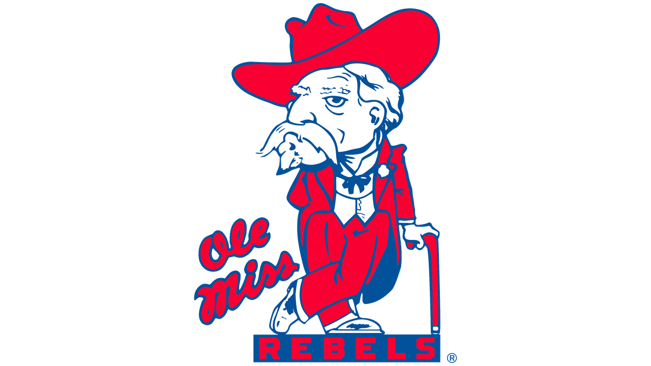
Ole Miss had a great logo.
Posted on 7/21/23 at 12:46 pm to Matts El Rancho
Love the arched Texas and longhorn logo....great looking.

Posted on 7/21/23 at 12:50 pm to CBandits82

Posted on 7/21/23 at 1:04 pm to Aggie Dynasty


Posted on 7/21/23 at 1:21 pm to Dr RC
"T Star" and Marching Old Sarge over the cap "T" are my favorites from A&M.. Get rid of the new bevels on the modern logo, solid block is a much cleaner look.
Posted on 7/21/23 at 1:21 pm to Dr RC
A&M has some real good-looking classics.

Posted on 7/21/23 at 1:25 pm to JetDawg

Posted on 7/21/23 at 1:26 pm to BurntOrangeMan
quote:
Get rid of the new bevels on the modern logo
One can only hope. I don't know single person that likes those beveled ones.

Posted on 7/21/23 at 1:31 pm to CBandits82
The M State banner is terrible.


 Page 2 of 5

Popular
Back to top