Started By
Message
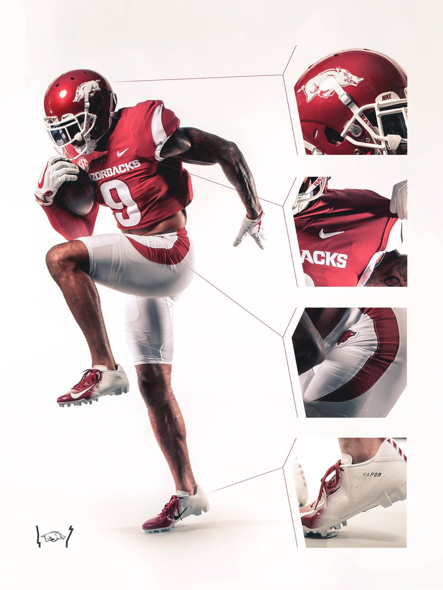
New FB Uniforms
Posted on 7/10/18 at 9:40 am
Posted on 7/10/18 at 9:40 am
@RazorbackFB
What's new?
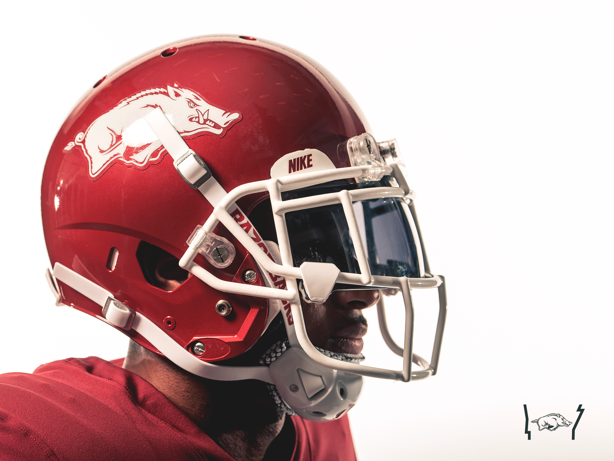
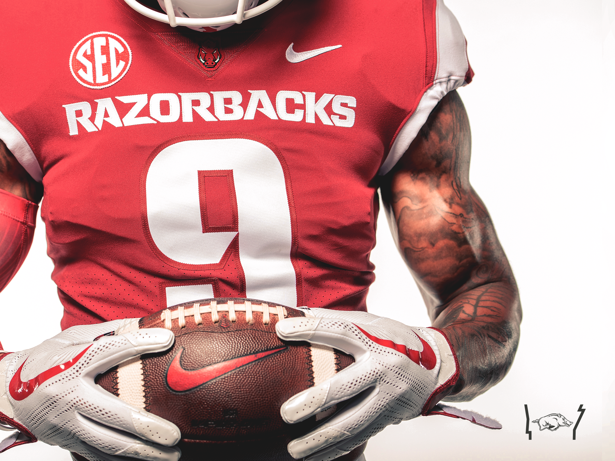
Helmet: Returning to “Pearl Cardinal” look
Jersey: Removed the white "chest tusks”
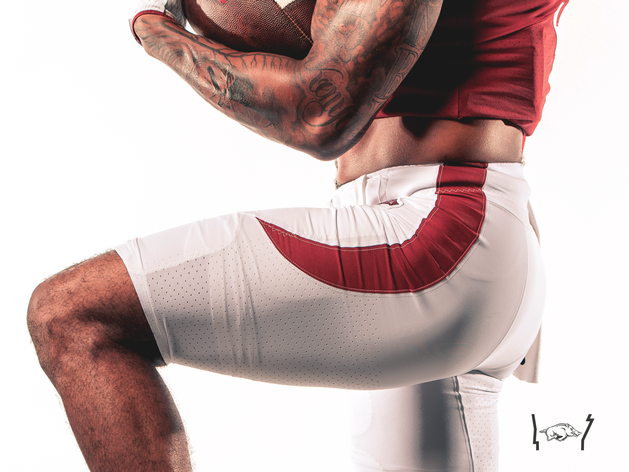
Pants: Stripe was moved up to connect at the waist
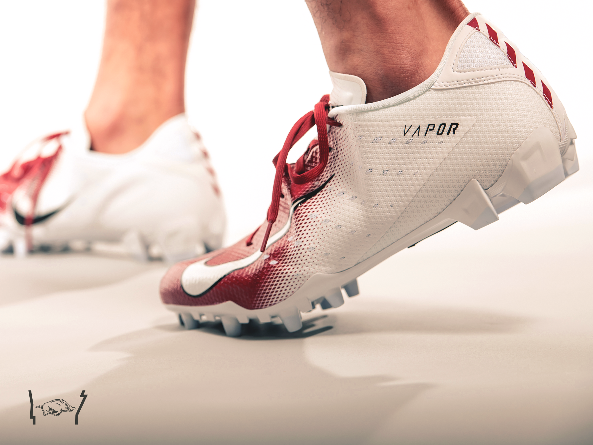
Cleats: white
LINK
Last years for comparison
EDIT: Press release on official website LINK
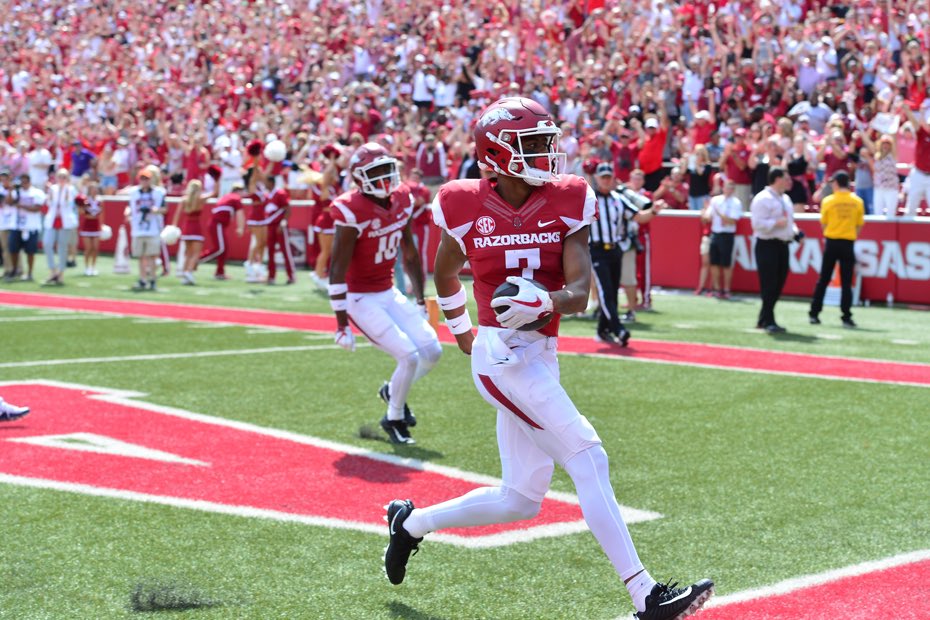
More pics:
What's new?
Helmet: Returning to “Pearl Cardinal” look
Jersey: Removed the white "chest tusks”
Pants: Stripe was moved up to connect at the waist
Cleats: white
LINK
Last years for comparison
EDIT: Press release on official website LINK
quote:
The Helmet. What’s new? The iconic Razorback helmet is returning to the historic “pearl cardinal” look, most recently sported during the Darren McFadden era. The Hogs had been wearing a “matte finish” helmet in recent years. While the “pearl cardinal” helmets have a bit more gloss to them, they do not have nearly the sheen seen on the “red chrome” helmets worn in the 2015 Liberty Bowl.
The Jersey. What’s new? Other than the actual jersey template from Nike being an updated version, the only modification to the jersey is the removal of the “white chest tusks.” This less cluttered look more prominently displays Razorbacks across the chest.
The Pants. What’s new? The pant stripe was moved up to connect at the waist as opposed to appearing mid leg in the most recent Razorback uniform.
More pics:
This post was edited on 7/10/18 at 9:48 am
 13
13


Posted on 7/10/18 at 9:47 am to BarkRuffalo
Much better.
Posted on 7/10/18 at 9:54 am to BarkRuffalo
quote:
Jersey: Removed the white "chest tusks”
Good, looked like that was added just to add something
Looks cleaner now
Posted on 7/10/18 at 9:59 am to BarkRuffalo
I am hoping that the white helmet "storm trooper" uniforms can make a reappearance for at least one road game this season. These changes definitely look better. Helmet change and pants look better.
Posted on 7/10/18 at 10:04 am to BarkRuffalo
These look good
I’d love to see the Cowboys themed ones again, those were great
I’d love to see the Cowboys themed ones again, those were great

Posted on 7/10/18 at 11:38 am to BarkRuffalo
Much better, and no more matte helmets. 
Glad that fad died out here over the last few years I grew to hate the matte helmets pro and college.
Glad that fad died out here over the last few years I grew to hate the matte helmets pro and college.

Posted on 7/10/18 at 12:05 pm to rockiee
Much better. I always hated the "tusks" on the front of the shoulder pads due to clutter. I'm also so glad they're getting away from matte helmets. By far the best jerseys since the McFadden days.
Posted on 7/10/18 at 12:20 pm to hogSS
I know I will be in the minority here, but I don't care what they uniforms look like at the beginning of a season.
For whatever they were at the beginning, they will all look so much better at the end when we begin winning again.
For whatever they were at the beginning, they will all look so much better at the end when we begin winning again.
Posted on 7/10/18 at 12:40 pm to Razorback Reverend
At this point Uni’s don’t do much for me. Just show me 8-10 win seasons.
ETA: Those chrome helmets were badass.
ETA: Those chrome helmets were badass.
Posted on 7/10/18 at 1:07 pm to BarkRuffalo
Moving in the right direction. Need to get red of the tusks (jersey and pants) though. Solid red jersey and just make the tusk on the pants a straight stripe all the way down would look a lot better. Less is more.
Posted on 7/10/18 at 1:30 pm to BarkRuffalo
Good, been wanting the glossy helmet and red/white shoes back for a while now. Not a fan of the stripe on the pants though. The matte helmet just looked almost maroon in certain lighting.

This post was edited on 7/10/18 at 1:31 pm
Posted on 7/10/18 at 3:14 pm to gohogs141
I loved the 1964 throwbacks that they used in 2014 against Bama. Those were my favorite. These are much less busy than last years which is good.

Posted on 7/10/18 at 3:29 pm to BarkRuffalo
I still think it should say Arkansas on the chest and the stripe still just looks awkward. Still improvement.
Posted on 7/10/18 at 3:33 pm to Columbia
quote:I like how we currently do it:
I still think it should say Arkansas on the chest
RAZORBACKS for home games. ARKANSAS for away games.

Posted on 7/10/18 at 4:04 pm to hogSS
quote:I agree. I didn't dislike the matte look, but I definitely preferred the chrome look when we broke it out. Made me realize our helmets just look much better when they shine. Thank god the chest stripes are gone. Those looked so arena footbally.
By far the best jerseys since the McFadden days.
Posted on 7/10/18 at 5:21 pm to BarkRuffalo
Now just get rid of the stupid arse forward facing hog on the front and these uniforms are perfect.
Posted on 7/10/18 at 5:39 pm to BarkRuffalo
OU unveiled their Jumpman uniforms yesterday, the only thing that changed was the logo from the swoosh to the jumpman.
Posted on 7/10/18 at 5:42 pm to BarkRuffalo
I always hated the matte helmet as anything more than an alternate look. Those pearly reds are iconic
Posted on 7/10/18 at 5:47 pm to hilltophog
quote:
RAZORBACKS for home games. ARKANSAS for away games.
This is how it should be. Only change id make to the Dmac era uniforms.

Posted on 7/11/18 at 6:19 pm to GoldenSombrero
quote:
Dmac era uniforms
Nike needs to swallow it's pride and just copy these.

 Page 1 of 2

Latest Arkansas News
Popular
Back to top