Started By
Message

 0
0


Posted on 10/12/22 at 10:41 am to KingOfTheWorld
The script could be improved to look a lot better. Something about the ‘t’s looks sloppy
Posted on 10/12/22 at 10:49 am to OBReb6
quote:
The script could be improved to look a lot better. Something about the ‘t’s looks sloppy
I can't unsee this now. It's the crosses of the Ts. They're not serifed, and it doesn't match the rest of the font.

Posted on 10/12/22 at 10:59 am to OBReb6
quote:
The script could be improved to look a lot better.
Baby steps
Posted on 10/12/22 at 11:02 am to rec207
Those are sexy

Posted on 10/12/22 at 11:52 am to anc
Bring back the damn MSU helmets, tired of this crap.
Posted on 10/12/22 at 11:54 am to Mstate
quote:
That’s the lie we were told for years but it is not true.
Figures. Everyone hated the 2004 and forward logo from the start but it kinda just grew on everyone.
I don’t know why they were so damn gung no about changing it then if it wasn’t trademarked. I guess Templeton and Croom loved it.. so that was going to be it.
Posted on 10/12/22 at 11:56 am to rec207
Looks awesome

Posted on 10/12/22 at 12:24 pm to Murph4HOF
quote:
Michigan State already did this last season.
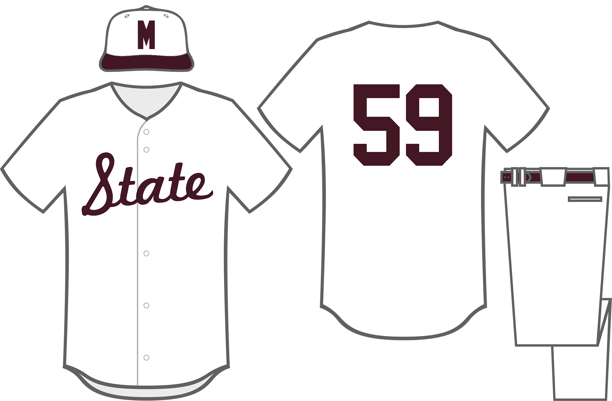
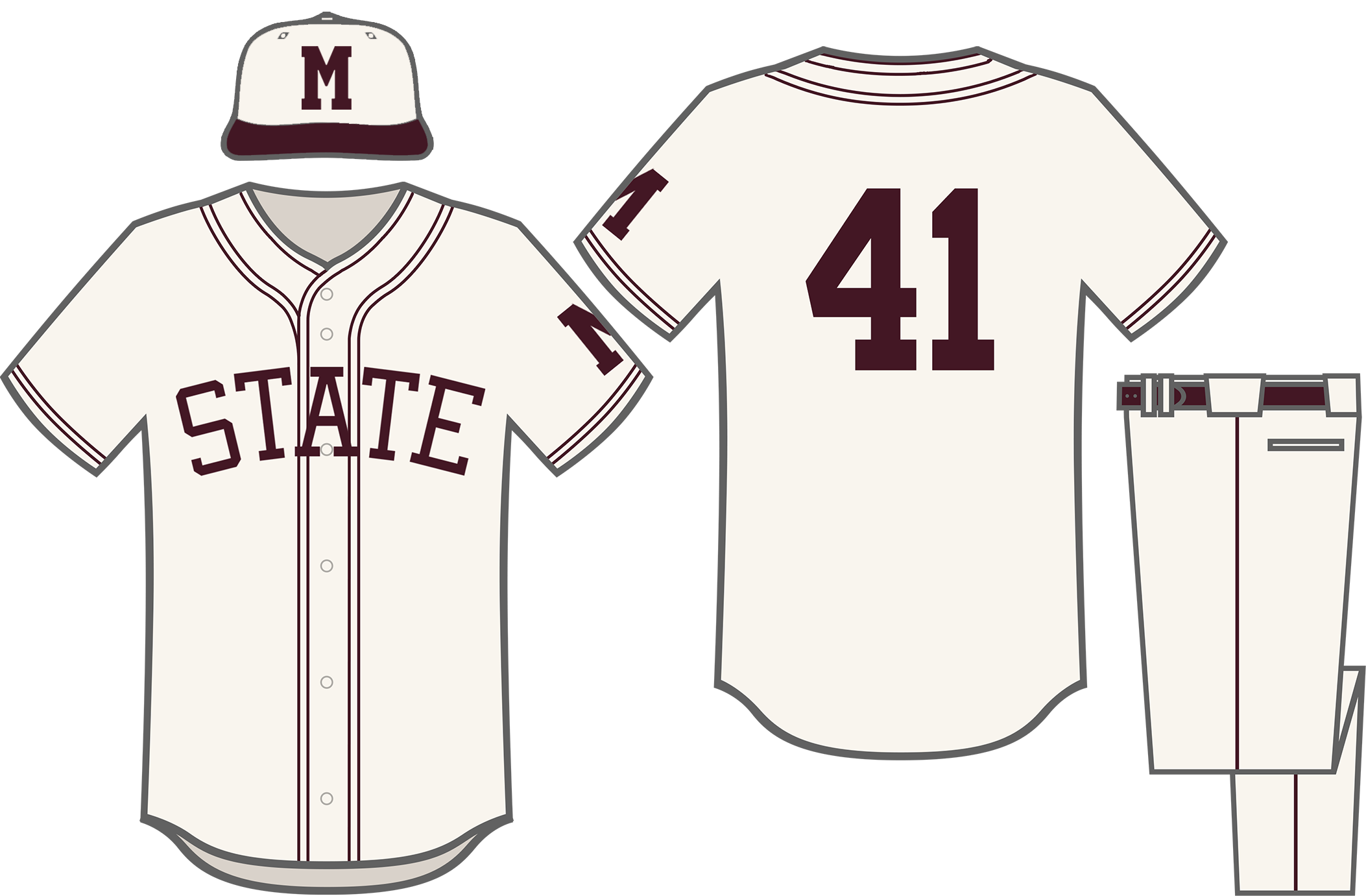
We’ve been “State” since at least 1941, with the script version introduced in 1959.
LINK
quote:
White "State" Script 1959-1961 Plain white jerseys with a "State" script were worn from 1959 to 1961. The white hats from the previous uniforms were worn in 1959; the switch to maroon hats with a white block "M" was made in 1960.
quote:
Introduced in 1941: Thin Block "State" w/ Piping 1941-1943, 1946-1949 The Bulldogs' 1940s uniforms were the first to feature "State" on the chest, in thin block letters. The uniforms featured thin, double piping and a block "M" on the left sleeve. The hats were white with a maroon bill and maroon block "M." Worn by Mississippi State legend Dave "Boo" Ferris in 1941 and 1942.
Posted on 10/12/22 at 1:19 pm to DingLeeBerry
Having the banner M logo on our baseball feild needs to go too...
Posted on 10/12/22 at 1:23 pm to CleverUserName
Why not go back to Nike?
Posted on 10/12/22 at 1:39 pm to RawDog84
since we are talking logos, i noticed that there is a "96" in the M over S logo...
beware...it cant be unseen...

beware...it cant be unseen...
Posted on 10/12/22 at 1:49 pm to CleverUserName
Banner M has always been rough. They changed it ever so slightly in 2009 from a more ribbony banner to what it is now. It was only a marginal improvement.
Posted on 10/12/22 at 1:53 pm to rec207
Sharp unis. Love the helmet. This should be the look going forward.
Posted on 10/12/22 at 1:59 pm to Shamoan
quote:
beware...it cant be unseen
Damn. Now I see it.
Y'all should go back to this helmet:
It won't render so posting the link

 Page 2 of 2


Popular
Back to top