Started By
Message
re: What is your least favorite logo your team has used?
Posted on 3/9/22 at 9:07 am to BranchDawg
Posted on 3/9/22 at 9:07 am to BranchDawg
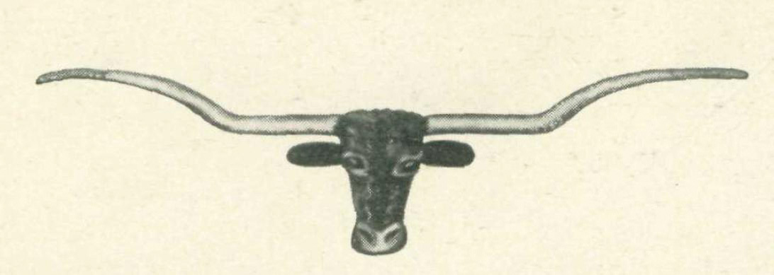
Looks familiar.....

I see a lawsuit
I see a lawsuit
 2
2

Posted on 3/9/22 at 9:07 am to BranchDawg
I hate that one too. So bad and it made me sick that most of the national championship gear incorporates it. But nothing can touch this monstrosity 

Posted on 3/9/22 at 9:08 am to BLG
quote:
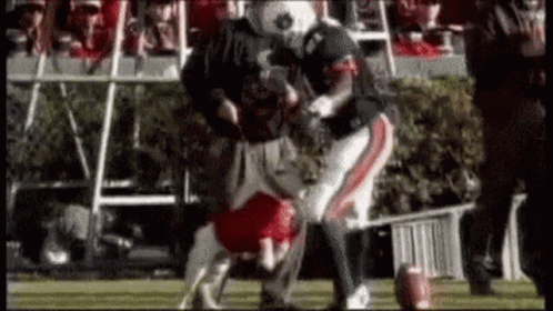
English Bulldogs are short, little, mostly docile
Posted on 3/9/22 at 9:10 am to BranchDawg
This thing looked like something out of
Frankenstein.
Frankenstein.
Posted on 3/9/22 at 9:21 am to BamaRoo
Best Script A:
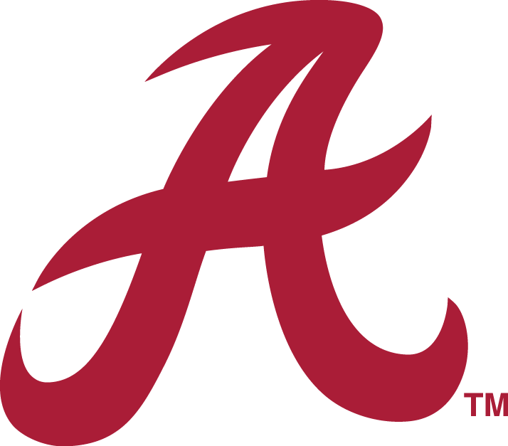
Worst Script A:

I wish the university would adopt something more like the logo on Hot Rod Grizzard's uniform

Worst Script A:
I wish the university would adopt something more like the logo on Hot Rod Grizzard's uniform

Posted on 3/9/22 at 9:31 am to BranchDawg
Posted on 3/9/22 at 9:38 am to BranchDawg

Posted on 3/9/22 at 9:48 am to dmaginnisiv
Nah the Red Dog is way cooler
Posted on 3/9/22 at 9:54 am to red sox fan 13
You can thank Skip for that abortion. And if you remember, they’d customize it by adding whatever sport name right underneath it in the black area. Total garbage. Plus they eventually made the cartoon Tiger a full bodied logo that looked worse.
Posted on 3/9/22 at 9:56 am to In The Know
It’s been posted already but the Davy Crocket one is my favorite. Looks like he’s getting ready to save Texas from the Mexicans
Posted on 3/9/22 at 10:00 am to SECFan413
Now that I see the 2 script As I noticed TD uses the first one. Wasn’t aware of that one

Posted on 3/9/22 at 10:00 am to Harlan County USA
Yep, that one is dumb.

Posted on 3/9/22 at 10:06 am to XWing atAliciousness
quote:
:format(webp)/cdn.vox-cdn.com/uploads/chorus_image/image/64132743/lep.0.jpg)
This post was edited on 3/9/22 at 10:07 am
Posted on 3/9/22 at 10:18 am to HogX

The new one is so much cleaner.

Posted on 3/9/22 at 10:20 am to Smokeyone
You are an idiot. The rifelman is tn best logo ever

Posted on 3/9/22 at 10:28 am to Smokeyone
I didn't know fake VOLS fans existed, but here you are...
Posted on 3/9/22 at 10:47 am to HogX
To be fair, I think that was the first logo ever used, so for sure not in my lifetime
Posted on 3/9/22 at 11:46 am to BranchDawg
Florida’s main two logos are both sweet and don’t need changes. I’d probably want to change the F.

Should have just kept the block F
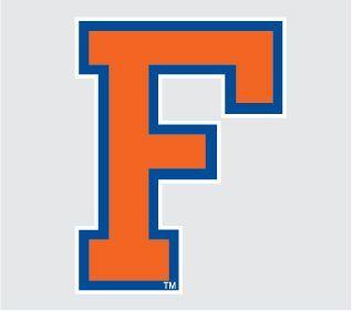
Should have just kept the block F

Posted on 3/9/22 at 12:00 pm to HogX
quote:

Posted on 3/9/22 at 12:03 pm to BranchDawg
My favorites...


This post was edited on 3/9/22 at 12:08 pm

 Page 3 of 4

Popular
Back to top