by
43 Comments
Auburn is updating their shield logo ahead of the 2019-20 season.
Kim Klement-USA TODAY Sports
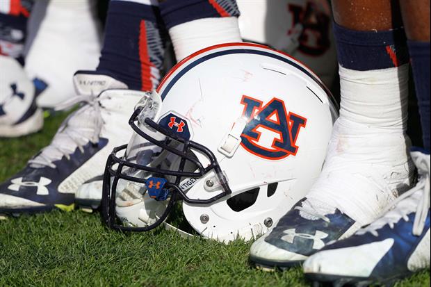
Auburn is updating their shield logo ahead of the 2019-20 season. Per The Spun...
quote:

The updated logo uses the old “AU” which saw the “A” and “U” as the same size. Instead of keeping the letters the same size, Auburn decided to emphasize the “A” by making the “U” smaller and overlaying the “A” for a more seamless fit.

Filed Under: Auburn Sports
43 Comments
user avatar
user avatar
Pole14270 months
Gezzus Criminy, get out the freaking ruler.
user avatar
bamagreycoat70 months
I never buy anything from Under Armor because they sponsor Auburn and I only buy Nike because they sponsor Bama. I was taught that was how to help your favorite program. Buy from their sponsors.
user avatar
luciouslou70 months
They oughta put a huge douche on the helmet
user avatar
DaBindahBaw70 months
Dumb
user avatar
BBATiger70 months
It’s more about the efficiency of printing and graphics. Look closely at the shapes and triangles. There is a tiny space between the middle of the A and corner of the U in the old design. New design much more manufacturing friendly. Not meant to notice a change, more to save $$$.
user avatar
MaroonNation70 months
That’s what’s wrong with the world now. What happened to producing what the customer ordered instead of getting contract then telling customer you can’t produce what he wants unless he lowers his expectations.
user avatar
Cobb Dawg70 months
Fascinating
user avatar
SECdragonmaster70 months
Yes. This is the last piece of the puzzle we needed to win another national championship. Thanks AU athletic department, you did it!
user avatar
jeff7012170 months
You're kidding, right?
user avatar
WITCH DOCTOR70 months
That is unbelievable...
user avatar
Space Cowboy70 months
The only discernible difference I notice is the U is slightly smaller, but I didn't want to waste my time looking any closer cause I don't really care.
user avatar
tketaco70 months
First one looks like a Klansmen doing splits in the air. The 2nd, looks like a Klansmen bathroom sign.
user avatar
ezride2570 months
Toonces > this
user avatar
RswlGaTiger70 months
Should have brought U on top of A. Its not University of Auburn.
user avatar
Kong70 months
That's funny, they actually paid someone to come up with that, typical!!
user avatar
Rex Feral70 months
It reminds me of when a caterpillar makes a cocoon but then it gets stepped on and there’s nothing left but bug guts.
user avatar
Stud Bud70 months
This gives me inspiration to request changing my user name from: Stud Bud to Stud Bud
user avatar
tigerfoot70 months
This is a case of someone tinkering with something to justify their job
user avatar
Drizzt70 months
No noticeable improvement. Typical Auburn.
user avatar
ScaryClown70 months
Wow nobody cares
user avatar
VoxDawg70 months
Lame. Fitting.
Popular Stories
logoFollow SECRant for SEC Football News
Follow us on X and Facebook to get the latest updates on SEC Football and Recruiting.

FacebookTwitter