Started By
Message
re: What are the best and worst official SEC team colors?
Posted on 8/4/21 at 1:02 am to Blackie LeBlanc
Posted on 8/4/21 at 1:02 am to Blackie LeBlanc
For reference (I also looked through the Brand Guidelines for the schools):
16. Texas. Burnt Orange is an ugly arse color with white.
15. Florida. Both the UF Orange and UF Blue are odd and ugly colors on their own. Together, it's really garbage.
T-13. Miss St. and TAMU. Maroon and white isn't a really exciting color pair.
T-11. Bama and Arkansas. Red and White is a boring pair, but these are down here because they use a range of boring greys as secondaries.
10. Oklahoma. Red and White is boring, but they stick to these colors, so I'll concede it's better.
9. Tennessee. It's a prettier orange, and intended to stand alone.
8. Georgia. Red and Black are really awesome colors, but that light blue secondary drags it here.
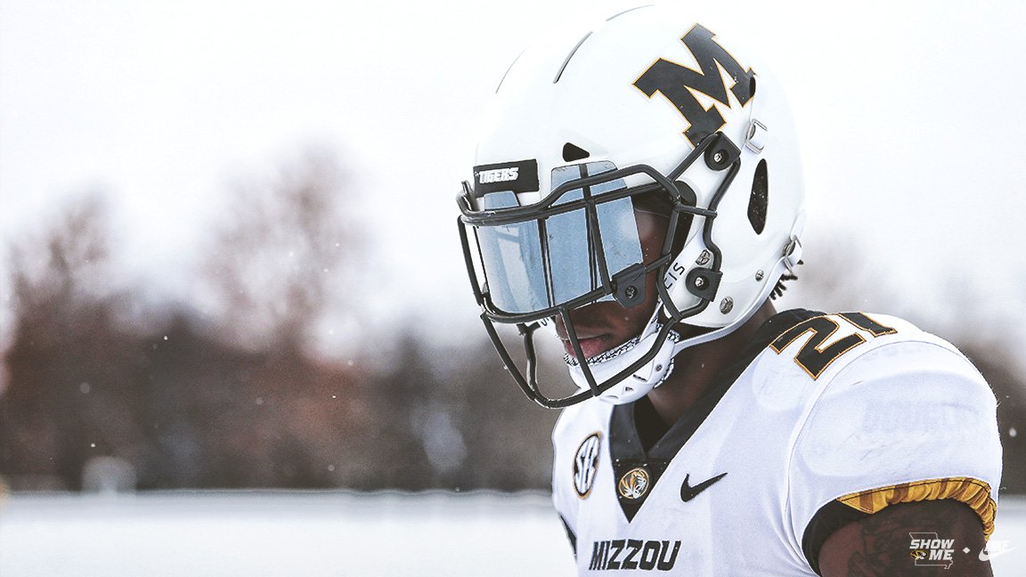
7. Missouri. The gold is just a little too yellow.
6. South Carolina. Garnet is unique, but kinda boring. I like the commitment to the colors
5. Vanderbilt. Great colors, but the range of golds brings this down.
4. Ole Miss. It's in the top five, it's the use of the powder blue that brings it to here.
3. Auburn Good complementary color pair, but not the most vibrant colors.
2. LSU Good complementary color pair with vibrant colors, but sometimes those colors cancel each other too much.
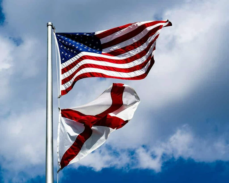
1. Kentucky. Blue and White is a really nice combo.
quote:
Red/White
Alabama: Crimson and White
Arkansas: Cardinal Red and White
Oklahoma: Crimson and Cream
Bama includes a ton of greys as accents. Arkansas has a ton of official colors I never see used outside of the Red/White. Oklahoma dabbles in black, but it's pretty strict about Crimson and Cream.
Blue/Orange
Auburn: Burnt Orange and Navy Blue
Florida: Orange and Blue
Auburn has two other official colors that are lighter versions of the Blue/Orange that make for nice accents, but don't belong on anything official. UF's problem is putting the Orange first. It's not a pretty orange, and the official blue doesn't really fit it either. Sidenote: They have my favorite uni (Blue shirt, white pants, orange helmet) and my least favorite uni (Orange shirt and Helmet, white pants)
Maroon/White
Mississippi State: Maroon
Texas A&M: Maroon and White
Mississippi State uses a light and dark grey as support colors. A&M sticks to Maroon and White as Primary colors
Black/Gold
Missouri: Black and Gold
Vanderbilt: Black and Gold
Interesting bit here is that Mizzou seemingly puts Black before Gold, with Greys put forward as neutral colors. Vandy has a range of gold colors, but are always first before Black.
Orange/White
Tennessee: Orange and White
Texas: White and Burnt Orange
Both schools use a dark grey as a third color. Tennessee emphasizes use of Orange as the primary, with white and dark grey to enhance the boldness. Texas uses Burnt Orange and White as official colors, with the former to be implemented consistently, and a special note to use no tints of it.
Black/Red
Georgia: Red and Black
South Carolina: Garnet and Black
USC sticks to it's colors, but has a nice range of Neutrals and Accents. Georgia has good colors too, but has the worst secondary colors of the conference (Glory Glory, a lighter red, and Lake Herrick, a light blue/teal color)
quote:
Other
Kentucky: Blue and White I like the colors, but I don't understand why when I search for "Kentucky Colors" in Google, I don't get the brand guide immediately.
LSU: Purple and Gold Complementary Colors, and about tree-fiddy stories behind where they came from. The pair sometimes has a blur that I don't like.
Ole Miss: Red and Navy Blue Adopted from a mix of Yale and Harvard. Not a bad mix. Powder Blue on the other hand...
16. Texas. Burnt Orange is an ugly arse color with white.
15. Florida. Both the UF Orange and UF Blue are odd and ugly colors on their own. Together, it's really garbage.
T-13. Miss St. and TAMU. Maroon and white isn't a really exciting color pair.
T-11. Bama and Arkansas. Red and White is a boring pair, but these are down here because they use a range of boring greys as secondaries.
10. Oklahoma. Red and White is boring, but they stick to these colors, so I'll concede it's better.
9. Tennessee. It's a prettier orange, and intended to stand alone.
8. Georgia. Red and Black are really awesome colors, but that light blue secondary drags it here.
7. Missouri. The gold is just a little too yellow.
6. South Carolina. Garnet is unique, but kinda boring. I like the commitment to the colors
5. Vanderbilt. Great colors, but the range of golds brings this down.
4. Ole Miss. It's in the top five, it's the use of the powder blue that brings it to here.
3. Auburn Good complementary color pair, but not the most vibrant colors.
2. LSU Good complementary color pair with vibrant colors, but sometimes those colors cancel each other too much.
1. Kentucky. Blue and White is a really nice combo.
 1
1

Posted on 8/4/21 at 1:49 am to Blackie LeBlanc
Lol Texas' orange color looks like a horse's post taco bell shite.

Posted on 8/4/21 at 1:57 am to BradPitt
quote:
Lol Texas' orange color looks like a horse's post taco bell shite.
I don’t know why but that made me bust out laughing. Thank you.
Posted on 8/4/21 at 6:21 am to Blackie LeBlanc
Miss State and Aggie are by far the ugliest. Couple Miss State having by far the ugliest campus, and you gotta wonder if it’s by design.
Miss State co-eds being at the bottom makes you wonder if it’s all an attempt to be noticed for SOMETHING, like the ugly goth girls giving herself a scar-tat with a razor because daddy didn’t pay any attention to her.
Miss State co-eds being at the bottom makes you wonder if it’s all an attempt to be noticed for SOMETHING, like the ugly goth girls giving herself a scar-tat with a razor because daddy didn’t pay any attention to her.
Posted on 8/4/21 at 9:14 am to superwolf
quote:
Mizzou?
Black and yellow are good colors. Mizzou has used them in some godawful uniform combinations since coming to the SEC, but there’s absolutely nothing wrong with the colors themselves.
Posted on 8/4/21 at 9:20 am to Blackie LeBlanc
The worst is that puke, inside of a pumpkin orange that Tennessee wears.
Posted on 8/4/21 at 9:22 am to UTprideofTX
quote:
Worst: MSU, USC, Mizzou
The Mizzou all-whites are fricking clean and I don't care what you say.

Posted on 8/4/21 at 9:23 am to Blackie LeBlanc

The most aesthetically pleasing game of the season. 1 vs 2 best color schemes in the leaugue.
Say what you want, Aubbie home unis Pop!
Posted on 8/4/21 at 9:23 am to Blackie LeBlanc
Best: Texas, LSU, Ole Miss, UGA, & Auburn
Worst: Mizzou & Tennessee
Worst: Mizzou & Tennessee
This post was edited on 8/4/21 at 9:28 am
Posted on 8/4/21 at 9:27 am to GeorgeReymond
quote:
Best: Texas, LSU, Ole Miss, & Auburn
Worst: Mizzou & Tennessee
Wrong.
Best: Mizzou (pick your poison of combo, just include the block M)
Worst: Auburn, Mississippi State, Tennessee.

Posted on 8/4/21 at 9:44 am to Blackie LeBlanc
Nothing screams power and class like the color purple.
Posted on 8/4/21 at 10:20 am to Tiger_Claw
I hate you, but you are right. The all white is pretty awesome

Posted on 8/4/21 at 10:26 am to Catsfan159
Why do people like UGA's?! Their red packers uniforms are awful.

Posted on 8/4/21 at 10:28 am to GeorgeReymond
quote:
Best: Texas, LSU, Ole Miss
I would call those the worst. I’ll give lsu some props for being different but we all know it’s yellow not gold and the purple is sometimes blue looking.
Ole Miss is faded looking.
And Texas - holy shite my eyes.
Posted on 8/4/21 at 10:31 am to Irons Puppet
Meet aggy lol

Posted on 8/4/21 at 10:34 am to Blackie LeBlanc
Oddly, I've felt that team colors look better for some schools for different sports.
For example, LSU has the best football color scheme, but for some reason it always looks weird to me on the the baseball diamond.
Adversely, State has the worst football colors, but there is something about that Maroon and White on the '85 unis we wear that are just *chef's kiss*
For example, LSU has the best football color scheme, but for some reason it always looks weird to me on the the baseball diamond.
Adversely, State has the worst football colors, but there is something about that Maroon and White on the '85 unis we wear that are just *chef's kiss*
This post was edited on 8/4/21 at 10:35 am
Posted on 8/4/21 at 10:42 am to Blackie LeBlanc
Vandy & Mizzou definitely have the most classic and eye pleasing colors with USC and Ole Miss right behind.
Tennessee's baby shite yellow and white are just plain hideous.
Purple and yellow are tacky too.
Tennessee's baby shite yellow and white are just plain hideous.
Purple and yellow are tacky too.
This post was edited on 8/4/21 at 10:45 am
Posted on 8/4/21 at 10:44 am to piggilicious
I love LSU purple and yellow. Beautiful. Mizzou has some great black and gold uniforms and our all white is stellar. I like the classics in the league, too. UGA, Bama, Arky, OU. I like Tenner's creamy orange sickle. Not a fan of any maroon type colors, but Tejas colors look like a 70 year old pockmarked, faded and rusty red sign laying in the dirt in an abandoned town that you just can't wait to get in the rearview mirror; sun faded and covered with roach shite. It's depressing.
Posted on 8/4/21 at 10:48 am to Judah Mann
DKR changed the Texas uniforms from bright orange to burnt orange. Why? They were better able to hide the pigskin against the jersey while running the new Wishbone formation. It worked for 30 games or so lol.
Posted on 8/4/21 at 11:21 am to Judah Mann
If I see a dude wearing purple and yellow on the street, I immediately assume he's playing for the other team.

 Page 4 of 6

Back to top