Started By
Message
re: Best standard helmet in the SEC...
Posted on 12/27/21 at 12:17 pm to Sub Par SUPERSTAR
Posted on 12/27/21 at 12:17 pm to Sub Par SUPERSTAR
quote:
LSU's helmet is ugly and busy.
I'm being unbiased here. A lot of people think our standard helmet looks good, but I completely disagree. You should take off the biased glasses.
It’s not being biased if somebody has a different option than yours.
LSU’s iconic white jersey uniforms and helmets have been rated some of the best in the country
In many National polls
National polls are not biased.
Not just the SEC
Floridas orange helmets are ugly
The Gators script is just so yesterday
And looks even worse with the modern helmets
Gators is too forward and crooked
I would suggest going to your white helmets with the modern F
Also
The numbers on your jerseys suck
They are copies of outdated San Diego Chargers #’s that the Saints copied for a few years
This post was edited on 12/27/21 at 12:20 pm
 3
3

Posted on 12/27/21 at 12:18 pm to El Magnifico
quote:
LSU easily
Of course...The 1 team that can't give another team credit for schit. The best helmet ever, the greatest season ever, the greatest everything of all time. L fricking SU. I see every other team on here that will give another team credit where credit is due except for the insecure LSU!
It's like being in grade school,"My daddy can beat your daddy" mentality. LOL
All hail the greatest program in the history of all sports LSU!!! LSU! LSU!
Feel better fella?

Posted on 12/27/21 at 12:20 pm to Tornado Alley
quote:
Auburn's helmet was better before the orange became metallic.
Disagree it looks so much better with that now and they were already pretty great

Posted on 12/27/21 at 12:22 pm to KD Burner Account
Biased of course, but...
Auburn
Ole Miss (powder blues)
LSU
UGA (classic look, even if a Packers rip off)
Auburn
Ole Miss (powder blues)
LSU
UGA (classic look, even if a Packers rip off)
Posted on 12/27/21 at 12:24 pm to SpotCheckBilly
quote:I can’t get over this.
UGA (classic look, even if a Packers rip off)
Posted on 12/27/21 at 12:29 pm to Number1Gump
WOW
That’s the fastest escalation of InsecureU I’ve ever seen
Posted on 12/27/21 at 12:31 pm to beaverfever
quote:
UGA (classic look, even if a Packers rip off)
I can’t get over this.
My daughter taught school up north for awhile. On spirit day, she wore a UGA hoodie to class (she's a UGA grad). One of the kids raised her hand and asked where she got a red Packers hoodie?
Posted on 12/27/21 at 12:33 pm to SpotCheckBilly
quote:
Biased of course, but...
Auburn
Ole Miss (powder blues)
LSU
UGA (classic look, even if a Packers rip off)
You do have awesome helmets and uniforms
Georgia is awesome too
Posted on 12/27/21 at 12:38 pm to Rohan Gravy
quote:
You do have awesome helmets and uniforms
We look mahvelous, even when we play like crap.
Posted on 12/27/21 at 12:51 pm to Sub Par SUPERSTAR
I don’t like the script A that Alabama uses at all. I wish that they would have gone with the one that is used on here. Plus I wish that they would enlarge the numbers on the helmets since they continue to go with the traditional look.
Posted on 12/27/21 at 1:05 pm to Sub Par SUPERSTAR
Obviously I'm biased, but the Razorback helmet looks great. Clean and unique.
I also love:
Ole Miss (powder blues)
Auburn
Georgia
LSU
Posted on 12/27/21 at 1:08 pm to Sub Par SUPERSTAR
I wont Rank LSU because even though it has everything I’m looking for I have An insane amount of bias
Top Tier - Elite
Florida- the script is something you don’t see outside the helmet and the blue pops on the orange. The white outline actually makes it look better even though I’m generally anti-outlines.
A&M - great use of a clean white logo on a dark background. No outlines. No fuss.
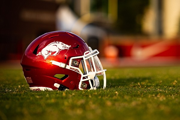
Arkansas- similar reasons to A&M. Logo isn’t as clean but it is more unique than just letters.
Great Helmets
Alabama- checks a lot of the boxes for good color contrast and a clean look. It unique now, but it wasn’t when it was designed so I dont Put it in the elite category. Still a great helmet.
Auburn- everyone loved this one and it’s just feels like more of a great logo than a great helmet. It’s not bad, or even mediocre but it’s not elite
Good not Great
Tennessee: checks a lot of boxes but a light orange T on a white background doesn’t pop. Hard to fix it (the black outline version is not a fix) but it’s still a good helmet
UGA: great helmet dropped to good because they stole the GreenBay G (I assume If some UGA fan wants to prove they had it first I’ll bump them to great)
South Carolina: gets points for being a unique logo, but it’s busy and it’s dark on dark. You lose the shape of gamecock.
Ole Miss classic Navy: like the scripts. I think It would be better without the outline. Idk. Maybe this should be in the great category.
Mediocre
Vandy- oh cool a star. Anchor is interesting but also busy, new school nonsense.
UK: logo slapped on a helmet. Not a super strong logo either. Drop the outline and it’s instantly better
Bad helmets
Missouri with any version of their new school tiger. Just sucks. Generic looking tiger.
Miss State: it’s an M. And a scroll. And the scroll has state. Oh and let’s add an outline. It’s a boring busy mess. Made even worse by the existence of the Baseball logo which is great.
Top Tier - Elite
Florida- the script is something you don’t see outside the helmet and the blue pops on the orange. The white outline actually makes it look better even though I’m generally anti-outlines.
A&M - great use of a clean white logo on a dark background. No outlines. No fuss.
Arkansas- similar reasons to A&M. Logo isn’t as clean but it is more unique than just letters.
Great Helmets
Alabama- checks a lot of the boxes for good color contrast and a clean look. It unique now, but it wasn’t when it was designed so I dont Put it in the elite category. Still a great helmet.
Auburn- everyone loved this one and it’s just feels like more of a great logo than a great helmet. It’s not bad, or even mediocre but it’s not elite
Good not Great
Tennessee: checks a lot of boxes but a light orange T on a white background doesn’t pop. Hard to fix it (the black outline version is not a fix) but it’s still a good helmet
UGA: great helmet dropped to good because they stole the GreenBay G (I assume If some UGA fan wants to prove they had it first I’ll bump them to great)
South Carolina: gets points for being a unique logo, but it’s busy and it’s dark on dark. You lose the shape of gamecock.
Ole Miss classic Navy: like the scripts. I think It would be better without the outline. Idk. Maybe this should be in the great category.
Mediocre
Vandy- oh cool a star. Anchor is interesting but also busy, new school nonsense.
UK: logo slapped on a helmet. Not a super strong logo either. Drop the outline and it’s instantly better
Bad helmets
Missouri with any version of their new school tiger. Just sucks. Generic looking tiger.
Miss State: it’s an M. And a scroll. And the scroll has state. Oh and let’s add an outline. It’s a boring busy mess. Made even worse by the existence of the Baseball logo which is great.
This post was edited on 12/27/21 at 1:12 pm

Posted on 12/27/21 at 1:14 pm to woodhog14
quote:Honestly Arkansas' unis have looked like hot dog arse while y'all used Adidas. The new jerseys with Nike have looked a hell of a lot better. The block lettering on the front spelling Arkansas looks sooooooo much better now.
Obviously I'm biased, but the Razorback helmet looks great. Clean and unique.

Posted on 12/27/21 at 1:17 pm to LSU Grad Alabama Fan
All helmets in SEC look good except for those weird Mizzou ones (with the tiger face) though I do think Vandy should go back to gold helmets- black on black is way too hard to see
This post was edited on 12/27/21 at 1:18 pm
Posted on 12/27/21 at 1:22 pm to SammyTiger
quote:
I assume If some UGA fan wants to prove they had it first I’ll bump them to great
Green Bay created the logo, I believe they gave Georgia permission to use it though.
This post was edited on 12/27/21 at 1:23 pm
Posted on 12/27/21 at 1:25 pm to Bama Bird
So the history behind Georgia's G is semi correct. We used the old Green Bay oval G originally in 1961, but then modified and trade-marked our own oval G in 1964.
Green Bay's remodeled G is actually based off of Georgia's modified 1964. So, Georgia copied Green Bay, then modified it a little, then Green Bay copied Georgia lol.
Here's a reference pic of the two logos.
LINK
And here's a snippet from the Wiki:
"Vince Dooley was the first to incorporate a red helmet into the uniform in 1964, adopting the oval "G", a white stripe, and white facemasks. Anne Donaldson, who graduated from Georgia with a BFA degree and was married to Georgia assistant coach John Donaldson, was asked by Dooley to come up with a new helmet design to replace the previous silver helmet. Dooley liked the forward oriented stylized "G" Donaldson produced, and it was adopted by him. Since the Georgia "G" was similar to the Green Bay Packers' "G" used since 1961, Coach Dooley cleared its use with the Packers organization. Nonetheless, Georgia has a registered trademark for its "G" and the Packers' current, redesigned, "G" logo is modeled after the University of Georgia's redesign of Green Bay's original "G" logo. The helmet change was part of a drastic uniform redesign by Dooley, who also replaced the traditional silver pants with white pants that included a black-red-black stripe. The jerseys remained similar to the pre-1964 design, however, with a red jersey and white numbers."
LINK

Posted on 12/27/21 at 1:28 pm to NEOJoe
quote:
I like too many to have a favorite. Not one for uniform changes but I’d love to see these again.

Posted on 12/27/21 at 1:30 pm to User_Name
quote:
So the history behind Georgia's G is semi correct. We used the old Green Bay oval G originally in 1961, but then modified and trade-marked our own oval G in 1964.
Green Bay's remodeled G is actually based off of Georgia's modified 1964. So, Georgia copied Green Bay, then modified it a little, then Green Bay copied Georgia lol.
Here's a reference pic of the two logos.
LINK /
And here's a snippet from the Wiki:
"Vince Dooley was the first to incorporate a red helmet into the uniform in 1964, adopting the oval "G", a white stripe, and white facemasks. Anne Donaldson, who graduated from Georgia with a BFA degree and was married to Georgia assistant coach John Donaldson, was asked by Dooley to come up with a new helmet design to replace the previous silver helmet. Dooley liked the forward oriented stylized "G" Donaldson produced, and it was adopted by him. Since the Georgia "G" was similar to the Green Bay Packers' "G" used since 1961, Coach Dooley cleared its use with the Packers organization. Nonetheless, Georgia has a registered trademark for its "G" and the Packers' current, redesigned, "G" logo is modeled after the University of Georgia's redesign of Green Bay's original "G" logo. The helmet change was part of a drastic uniform redesign by Dooley, who also replaced the traditional silver pants with white pants that included a black-red-black stripe. The jerseys remained similar to the pre-1964 design, however, with a red jersey and white numbers."
LINK
Posted on 12/27/21 at 1:32 pm to 3down10
quote:
3down10
Our bun doesn't have sesame seeds!

Posted on 12/27/21 at 1:33 pm to Sub Par SUPERSTAR
quote:Whole heartedly believe that MSU/A&M color scheme is the WORST possible. If purple and brown had a god-awful love child it would be their color.
The color scheme is admittedly very good

 Page 3 of 7

Popular
Back to top