Started By
Message
re: Auburn changed their logo - the font was changed to "Sabon"
Posted on 8/9/19 at 10:18 am to Vegetative State

Posted on 8/9/19 at 10:18 am to Vegetative State
Just checked the AU website. The old interlocking AU is still the only one I see. 
I kinda like it. Looks cleaner. Looked at the thread on our forum, seems many like it or say it's growing on them.
Yeah, some hate it... not sure about their mental well being though. Some people don't like change, no matter how small.
I kinda like it. Looks cleaner. Looked at the thread on our forum, seems many like it or say it's growing on them.
Yeah, some hate it... not sure about their mental well being though. Some people don't like change, no matter how small.
This post was edited on 8/9/19 at 11:08 am
 0
0

Posted on 8/9/19 at 10:22 am to bbvdd
quote:
what is the PC bullsheet reason behind this change?
obviously its that there is less white in the logo
This post was edited on 8/9/19 at 10:23 am
Posted on 8/9/19 at 10:30 am to Vegetative State
They had to match the folks in Alabama. Yes, their girth is legendary, especially gump fans. Has anyone ever stopped at the Wal-mart near Dothan, AL on their way to the Florida beaches? O.M.G.
Posted on 8/9/19 at 10:47 am to jatebe
quote:
LOL, they changed it to a font called "Sabon".
This needs to be moved to the front page.
Posted on 8/9/19 at 10:58 am to jlovel7
both look like 

Posted on 8/9/19 at 11:02 am to Vegetative State
The AU is shorter and fatter.
tDecline.
tDecline.

Posted on 8/9/19 at 11:21 am to Vegetative State
All I see now is the "T" in the middle now from the removal of the white. Was this done on purpose?
Posted on 8/9/19 at 11:23 am to The Winner
quote:
That's not real right? That's abysmal. I hope they don't screw up our logo because I like our current version rn.
Auburn's change is like the opposite of when State in the 90's went from MSJ without gaps to MSU with gaps
First

Second

Posted on 8/9/19 at 11:46 am to Manzielathon
Looks fat.
Posted on 8/9/19 at 11:48 am to Vegetative State
If this is real, AU fans should petition.

Posted on 8/9/19 at 11:55 am to Darth_Vader
quote:
The Auburn logo is literally perfect. Why change it?
LOL. No it's not.

Posted on 8/9/19 at 12:00 pm to LATIDER
It could be worse fellas. At least you didnt get two birds fricking

Posted on 8/9/19 at 12:15 pm to Vegetative State
They look like logos for a woman's and a men's bathroom, respectively. Idea for an Auburn bar.

This post was edited on 8/9/19 at 12:31 pm

Posted on 8/9/19 at 12:17 pm to Vegetative State
This gets 4 page? Man I can't wait for the season.
They look very similar to me and wouldn't have even noticed if not pointed out.
They look very similar to me and wouldn't have even noticed if not pointed out.
Posted on 8/9/19 at 12:33 pm to Vegetative State
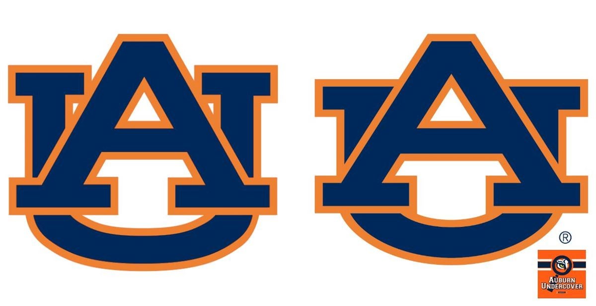
Am I the only one seeing the Klan robe and hat in the A?
Posted on 8/9/19 at 12:47 pm to Vegetative State
State did this a few years ago. Makes embroidery much easier and looks better.
Posted on 8/9/19 at 12:52 pm to Foreskinski
quote:
Am I the only one seeing the Klan robe and hat in the A?
Oh my! I will always see that from now on. Never noticed it before.

Posted on 8/9/19 at 1:32 pm to Vegetative State
quote:
Auburn changed their logo - the font was changed to "Sabon"
The font for the logo was not changed to Sabon. The Sabon font had to do with accompanying fonts.

This post was edited on 8/9/19 at 1:37 pm
Posted on 8/9/19 at 2:29 pm to Vegetative State
I wish Alabama would revert to this beauty:


Posted on 8/9/19 at 2:50 pm to Foreskinski
Thought it would look more like:


 Page 4 of 5

Popular
Back to top