Started By
Message
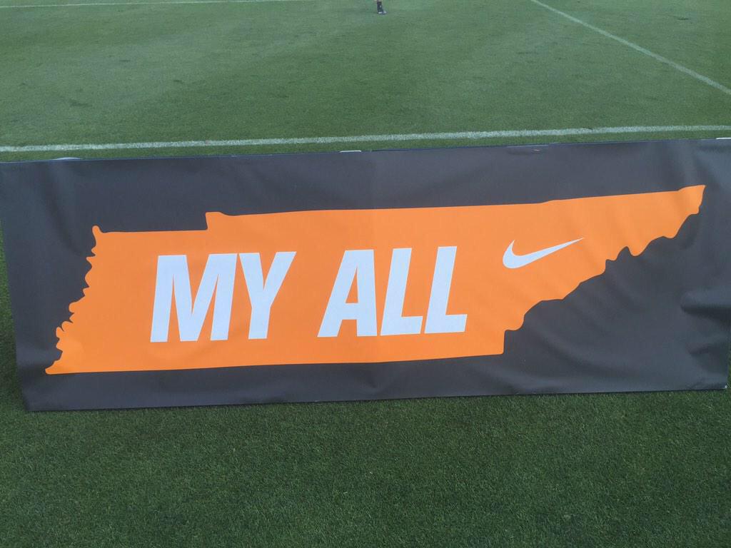
Tennessee's New Nike Font/Wordmark has been leaked
Posted on 6/3/15 at 2:14 pm
Posted on 6/3/15 at 2:14 pm
Full Nike Uniform Unveiling is July 1. But the wordmark has been leaked and the basketball court in the practice facility already features it.
Numbers on all of our uniforms will apparently use this same font.


The old font for reference

An improvement, but that middle N looks out of place imo.
Numbers on all of our uniforms will apparently use this same font.
The old font for reference
An improvement, but that middle N looks out of place imo.
This post was edited on 6/3/15 at 2:38 pm
 24
24

Posted on 6/3/15 at 2:16 pm to volfan30

Posted on 6/3/15 at 2:16 pm to volfan30
How do Tennessee fans feel about the change to Nike? Seems long overdue.
ETA: I like how all the letters look like the state. Makes it unique.
ETA: I like how all the letters look like the state. Makes it unique.
This post was edited on 6/3/15 at 2:18 pm

Posted on 6/3/15 at 2:19 pm to volfan30
I see what they are doing the T E and N form the shape of the state of Tennessee if you look at the the top of the letters. But I'd have to see it on an actual uni before I consider it good or bad.

Posted on 6/3/15 at 2:20 pm to volfan30
Looks terrible, and I usually like Tennessee stuff.

Posted on 6/3/15 at 2:26 pm to volfan30
quote:
Numbers on all of our uniforms will apparently use this same font.
NOOOOOOOOO!!!!!!
Posted on 6/3/15 at 2:28 pm to volfan30
cant really say i like or hate that font
Posted on 6/3/15 at 2:35 pm to volfan30
I can dig this.
Posted on 6/3/15 at 2:35 pm to volfan30
Honestly, looks like shite

Posted on 6/3/15 at 2:36 pm to volfan30
Their unis are going to be legit.
Posted on 6/3/15 at 2:37 pm to volfan30
Gross
Posted on 6/3/15 at 2:38 pm to volfan30
It's not that drastic of a change but I like it a little better. From the sound of things it seemed like they were going full Arkansas or Baylor font.
This post was edited on 6/3/15 at 2:40 pm

Posted on 6/3/15 at 2:44 pm to volfan30

This post was edited on 6/6/15 at 10:42 pm

Posted on 6/3/15 at 3:33 pm to volfan30
Eh, not feeling it.
Might grow on me later.
Might grow on me later.
Posted on 6/3/15 at 4:06 pm to volfan30
The 'N' that is not diagonal really bothers me.
Posted on 6/4/15 at 12:22 pm to volfan30
Turrible
Posted on 6/4/15 at 4:35 pm to volfan30
Its pretty good.
I love how they did ours.

I love how they did ours.

Posted on 6/6/15 at 10:38 pm to volfan30
Posted on 6/6/15 at 10:55 pm to volfan30
it looks like russian or some eastern european country's language in that font. holy crap that just looks bad...fyi, i have always liked the T logo, i think ut has the best football helmets besides lsu. that font has to go though.

 Page 1 of 2

Popular
Back to top