Started By
Message
Not a fan of our Championship Logo
Posted on 1/19/18 at 11:48 am
Posted on 1/19/18 at 11:48 am
Call me a curmudgeon, but it looks awful....especially when compared to the previous ones. Of course this is a good problem to have.
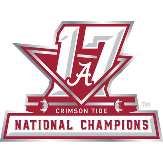
2017 Logo:
Past Logos:


2017 Logo:
Past Logos:
 27
27

Posted on 1/19/18 at 11:51 am to FairhopeTider
Looks good to me.

Posted on 1/19/18 at 11:51 am to FairhopeTider
Yea, I don't like it at all. 2012 and 2015 are my favorites.
I hate the incorporation of the total national titles thing. I've always vowed to never buy anything with that on it. I've told myself it's just for 2017 but clearly it isn't.
I hate the incorporation of the total national titles thing. I've always vowed to never buy anything with that on it. I've told myself it's just for 2017 but clearly it isn't.

Posted on 1/19/18 at 11:56 am to pvilleguru
they are trying to incorporate the stadium design into the logo...sort of failed

Posted on 1/19/18 at 11:58 am to FairhopeTider
Kind of has a NASCAR vibe
Posted on 1/19/18 at 11:58 am to McGregor
quote:
they are trying to incorporate the stadium design into the logo...sort of failed
Yeah...it doesn't work.

Posted on 1/19/18 at 12:04 pm to FairhopeTider
I like it. It's not great, and it's certainly no 2011 which is the goat IMO.

Posted on 1/19/18 at 12:05 pm to SummerOfGeorge
It's awful. I posted my thoughts on the SECr and was bombarded with downvotes. 
Posted on 1/19/18 at 12:07 pm to RollDatRoll
quote:
2011 which is the goat IMO.
2009 is my favorite. Classy and Simple. Seems like it could be the logo for a country club instead of a NASCAR Driver.

Posted on 1/19/18 at 12:15 pm to FairhopeTider
Everyone has a right to their opinion.
It's okay
It's okay
Posted on 1/19/18 at 12:16 pm to FairhopeTider
I. Like. Every. One. Of. Them.
The 17 has that dual message which is good to me.
It is borderline a little too edgy for me personally.
But I'm going to find something else to dislike today.
The 17 has that dual message which is good to me.
It is borderline a little too edgy for me personally.
But I'm going to find something else to dislike today.
Posted on 1/19/18 at 12:35 pm to FairhopeTider
It's okay. Maybe not as fancy as the others.
I did look it up and there were several things about the meaning of it.

Also here's a timelapse video showing the design process. The triangle was taken from the stadium. LINK
I did look it up and there were several things about the meaning of it.
Also here's a timelapse video showing the design process. The triangle was taken from the stadium. LINK
Posted on 1/19/18 at 12:38 pm to FairhopeTider
Yeah that asymmetric triangle doesn’t look good.
2011 is my favorite, simple and classy.
I like the roses on the 2009 logo, too
2011 is my favorite, simple and classy.
I like the roses on the 2009 logo, too

Posted on 1/19/18 at 12:39 pm to TroyTider
I like it but I’m hoping to have a nice back to back logo by this time next year that we can talk about liking or not liking
Posted on 1/19/18 at 12:46 pm to FairhopeTider
Not the best but acceptable IMO. My issue is with the playoff championship gear in general. Why do they have to be in black? It doesn't look good and it's like they think every team is UGA.
Posted on 1/19/18 at 12:54 pm to FairhopeTider
17 is by far the worst of the Saban bunch. Oh well, I'll take any national championship logo I can get.
Posted on 1/19/18 at 1:09 pm to FairhopeTider
I love it. I think they did a great job of incorporating the streamlined architecture of the MBS. They're pulling elements from each championship location into the logos. A classic look wouldn't be appropriate for this one.
Posted on 1/19/18 at 1:11 pm to FairhopeTider
That 2011 logo is a thing of beauty. The Superdome with sort of a design mimicking the balconies in the Quarter is awesome.

Posted on 1/19/18 at 1:24 pm to FairhopeTider
Yeah, it's probably my least favorite.
For me it's
1. 2015
2. 2012
3. 2011
4. 2009
5. 2017
For me it's
1. 2015
2. 2012
3. 2011
4. 2009
5. 2017

Posted on 1/19/18 at 1:26 pm to FairhopeTider
The triangle is representative of the Mercedes-Benz Stadium profile.

 Page 1 of 3

Latest Alabama News
Back to top