Started By
Message
 0
0

Posted on 5/20/21 at 3:19 pm to StopRobot
quote:
Florida's shade of orange and blue is ugly.
but boy does it look like CFB in the 3:30 CBS sunshine against LSU
Posted on 5/20/21 at 3:20 pm to GatorOnAnIsland
quote:
I’d say its the new baseball/pajama seersucker jersey with custom pinstripes.

"Even I'm not that gay."

Posted on 5/20/21 at 3:24 pm to GoldenGuy
toss up ...either will make you throw up


Posted on 5/20/21 at 3:28 pm to 1801

Those jerseys were comically bad

Posted on 5/20/21 at 3:33 pm to GoldenGuy
The LSU - UF colors when they play has to be one of the best in the sport. Just so different from each other. I love it
Posted on 5/20/21 at 3:34 pm to 1801
3 different shades of orange on one uniform.
Posted on 5/20/21 at 3:37 pm to 1801
Our stupid fan base wanted us to have black uniforms so bad it was stupid. That was on the middle of Oregon wearing different uniforms every game and shite like our black and orange and uga's power rangers uniforms were 2 of many poor attempts at "swagging up" up classic uniforms.
Posted on 5/20/21 at 3:37 pm to GoldenGuy
Tennessee's gray shite looked terrible

Posted on 5/20/21 at 3:41 pm to GoldenGuy
I hate all one color uniforms no matter what color it is.
Posted on 5/20/21 at 3:44 pm to Auburn80
quote:
I hate all one color uniforms no matter what color it is.
I like both of our all whites.
Posted on 5/20/21 at 3:47 pm to themicah85
quote:
I like both of our all whites.
I meant the primary color. Orange, Blue, Red, etc. All whites can look good.
Posted on 5/20/21 at 3:49 pm to GoldenGuy
Of the regular unis, LSU:
Purple and yellow is tacky, for starters. Looks like the interior of a Tijuana cathouse.
The helmets are just a fail. The "LSU" font looks like an equipment manager put it on with duct tape. The Tiger decal looks like a chrysanthemum if you're more than 5 feet away.
The 1950's shoulder striping looks like a generic jersey from one of those Boys' Life books you could buy at the Scholastic Books Fair.

Posted on 5/20/21 at 3:50 pm to SoFla Tideroller
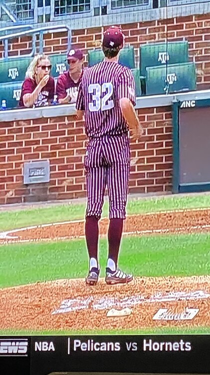
this just happened to come through my twitter feed today and thought it was relevant

quote:
The Flying M ™?
@MSUhistory
·
2h
7 years ago today- Mississippi State wore the worst jerseys in school history.
State beat Georgia 5-4 in the 10th inning of the opening round of the SEC Tournament.
This post was edited on 5/20/21 at 3:51 pm
Posted on 5/20/21 at 3:52 pm to SoFla Tideroller
quote:
The 1950's shoulder striping looks like a generic jersey from one of those Boys' Life books you could buy at the Scholastic Books Fair.
does an Alabama fan really want to get into archaic and generic uniform designs?
Regardless, the shoulder stripes are a pretty classic look. I take it you hate Ole Miss and UCLA unforms too?
This post was edited on 5/20/21 at 3:53 pm

Posted on 5/20/21 at 3:55 pm to SoFla Tideroller
quote:
Of the regular unis, LSU: Purple and yellow is tacky, for starters. Looks like the interior of a Tijuana cathouse. The helmets are just a fail. The "LSU" font looks like an equipment manager put it on with duct tape. The Tiger decal looks like a chrysanthemum if you're more than 5 feet away. The 1950's shoulder striping looks like a generic jersey from one of those Boys' Life books you could buy at the Scholastic Books Fair.

This is a thing of beauty that would make Michelangelo jealous.

I wish we wore these more
Posted on 5/20/21 at 4:08 pm to GoldenGuy
Yeah that LSU vs UF game usually has one of the better uniform matchups in CFB.
Posted on 5/20/21 at 4:10 pm to XWing atAliciousness
quote:
Seriously... what on earth were they thinking
For a one off they’ve kind of grown on me. If going to do it, why not be creative and try something unique? To me our worst we’re those stupid one shoulder blocks. What was the point of that? At least there was some thought behind these.

Posted on 5/20/21 at 4:17 pm to Drebin
quote:
Our colors were unique and clean until someone decided to let the carpetbaggers from SE Texas join us.


Posted on 5/20/21 at 4:20 pm to themicah85
quote:
I like both of our all whites.


 Page 2 of 5

Latest Alabama News
Popular
Back to top