Started By
Message
re: Bryant-Denny Stadium to receive major renovation
Posted on 8/16/18 at 5:44 pm to pvilleguru

Posted on 8/16/18 at 5:44 pm to pvilleguru
quote:
Sweet, we can host World Cup games in 2026.
quote:
Would be awesome, but I don't think we can get the field wide enough in the corners.
Other problem for the World Cup is that the stadium is in Tuscaloosa.
 1
1

Posted on 8/16/18 at 5:59 pm to elposter
It doesn't help that they've already narrowed the list down to ~15 sites.
Posted on 8/16/18 at 6:01 pm to Bamafan4evr12
quote:It's only symmetrical if you look at it from a long distance away.
One of the things I love about BDS is the symmetry of it,

Posted on 8/16/18 at 6:27 pm to mrbroker
quote:
What is your contribution outside of ticket purchases.
Guess it should be design and budgetary approvals for UA since others are asleep at their job.

Posted on 8/16/18 at 6:30 pm to PEPE
quote:
We have one of, if not, the most aesthetically pleasing stadiums n the country right now.
The new design has some very tacky elements to it.
It's more modern looking but I'm not sure modern is good.
Kind of reminds me of the new Soldier Field. They tried to keep the old traditional architectural elements then wrapped it in a space ship looking thing

Posted on 8/16/18 at 7:22 pm to The Spleen
I posted earlier about my idea for the video board. I propose installing a video screen above the field, a la Jerry World. This way you won't have to remove seating.
It can be supported by four frames coming from each of the spiral walking ramps in the corners.
It can be supported by four frames coming from each of the spiral walking ramps in the corners.
Posted on 8/16/18 at 7:27 pm to East Coast Band
quote:Sounds like it would be too low.
It can be supported by four frames coming from each of the spiral walking ramps in the corners.
Posted on 8/16/18 at 8:02 pm to 14&Counting
quote:
Kind of reminds me of the new Soldier Field.
I immediately thought of the new Solider Field as well looking at it.

Weird mix of old fashioned and modern that doesn't go together very well.
This post was edited on 8/16/18 at 8:03 pm
Posted on 8/16/18 at 8:15 pm to PEPE
Cecil Hurt mentioned something about the press box moving to another location. I thought that was interesting. Also, with the spirals being removed I hope they install escalators to get my arse up to my cheap seats in U4-qq.
Posted on 8/16/18 at 8:20 pm to PEPE
quote:
It's more modern looking but I'm not sure modern is good.
The thing about modern is that the definition/look of “modern” changes with the times. The new look won’t look modern 20 years. I’ve always felt that college stadiums should be more brick and have a more classical look. Kind of like the South Endzone addition.
Posted on 8/16/18 at 8:46 pm to JackieTreehorn
quote:
Also, with the spirals being removed
As best I can tell from the rendering they are still there, just enclosed to where you can't see them very well.
The extended concourse looks like they'll likely have elevators and stuff to the top in each corner, which will also help. It will likely replace those stupid arse golf carts and their constant honking. That's always been an annoying, low rent thing we can def. improve.
Posted on 8/16/18 at 9:54 pm to FairhopeTider
BDS Good:
Wider concourses
Walk of Champions tunnel
More variety in premium seating options
Covered ramps
BDS Bad:
Glass sides
Enormous Jumbotron
Split upper deck
Cornhole and picnic tables?
I liked most everything about Coleman. Just really don’t understand some of those expensive unnecessary changes to BDS. I understand downsizing, more premium seating, and updating the east and west sides. But glass?
Posted on 8/16/18 at 10:14 pm to ALtoID
Got some whiny fans up in here. Those renovations are badass. Glass, huge Jumbotron and all. Some of y’all sound like the old man screaming at the kids to get off his lawn!!
The future of sports stadiums across the board is going to be luxury and amenities. Not cramming as many butts as possible on tiny metal bleachers. This reno makes BDS one of the best stadiums in the country in that regard. Kudos to Bama for doing this and keeping us ahead of our competition.
The future of sports stadiums across the board is going to be luxury and amenities. Not cramming as many butts as possible on tiny metal bleachers. This reno makes BDS one of the best stadiums in the country in that regard. Kudos to Bama for doing this and keeping us ahead of our competition.
Posted on 8/16/18 at 10:42 pm to tider04
The Jumbotron would have been fine when the south endzone project was going on. But they went in a different direction 8 years ago. Adding one now would look tacky and not fit at all with the overall aesthetics of the stadium.
Posted on 8/16/18 at 10:54 pm to tider04
Trying to always be hip and with the times is a double edge sword as others have pointed out.
It generates buzz or excitement in the short run but often times looks tacky and dated as what's "in" has a way of changing.
Think of it as wearing a nice suit (something timeless) vs. trying to wear what's currently fashionable. In 20 years, the guy in the suit will look fine, the guy with the super hip 1995 clothes is going to look like a jackass.
An example from our very history...
Throughout the late 90's/early 2000's everyone was adopting large cartoonish logo's, and Bama did the same. We ended up with shite like this.


Which was thankfully retired after about 5-6 seasons.
It was the trend at the time. Arkansas had crap like this

LSU had this

It was happening the pros too. The Detroit Pistons somehow managed to go to this

The Houston Rockets went to this

Notice how they all sort of follow the same art style. Big, bright, cartoonish. That's what was "in" They were all adopted roughly in the same era too (late 90's, early 2000's).
Everyone was just imitating everyone else, these new logos were considering quite hip and exciting.
Almost all of them were retired very quickly because they are stupid as hell.
It generates buzz or excitement in the short run but often times looks tacky and dated as what's "in" has a way of changing.
Think of it as wearing a nice suit (something timeless) vs. trying to wear what's currently fashionable. In 20 years, the guy in the suit will look fine, the guy with the super hip 1995 clothes is going to look like a jackass.
An example from our very history...
Throughout the late 90's/early 2000's everyone was adopting large cartoonish logo's, and Bama did the same. We ended up with shite like this.
Which was thankfully retired after about 5-6 seasons.
It was the trend at the time. Arkansas had crap like this
LSU had this
It was happening the pros too. The Detroit Pistons somehow managed to go to this
The Houston Rockets went to this
Notice how they all sort of follow the same art style. Big, bright, cartoonish. That's what was "in" They were all adopted roughly in the same era too (late 90's, early 2000's).
Everyone was just imitating everyone else, these new logos were considering quite hip and exciting.
Almost all of them were retired very quickly because they are stupid as hell.
This post was edited on 8/16/18 at 10:58 pm
Posted on 8/16/18 at 11:28 pm to tider04
There’s a difference in “luxury and amenities” and transforming the largest building on campus into something that doesn’t have the same style, design, look, and feel as every other building on campus and the surrounding area. A giant glass facade next to the sorority houses, cemetery, and run down biscuit joint just looks out of place.
Posted on 8/17/18 at 12:07 am to ALtoID
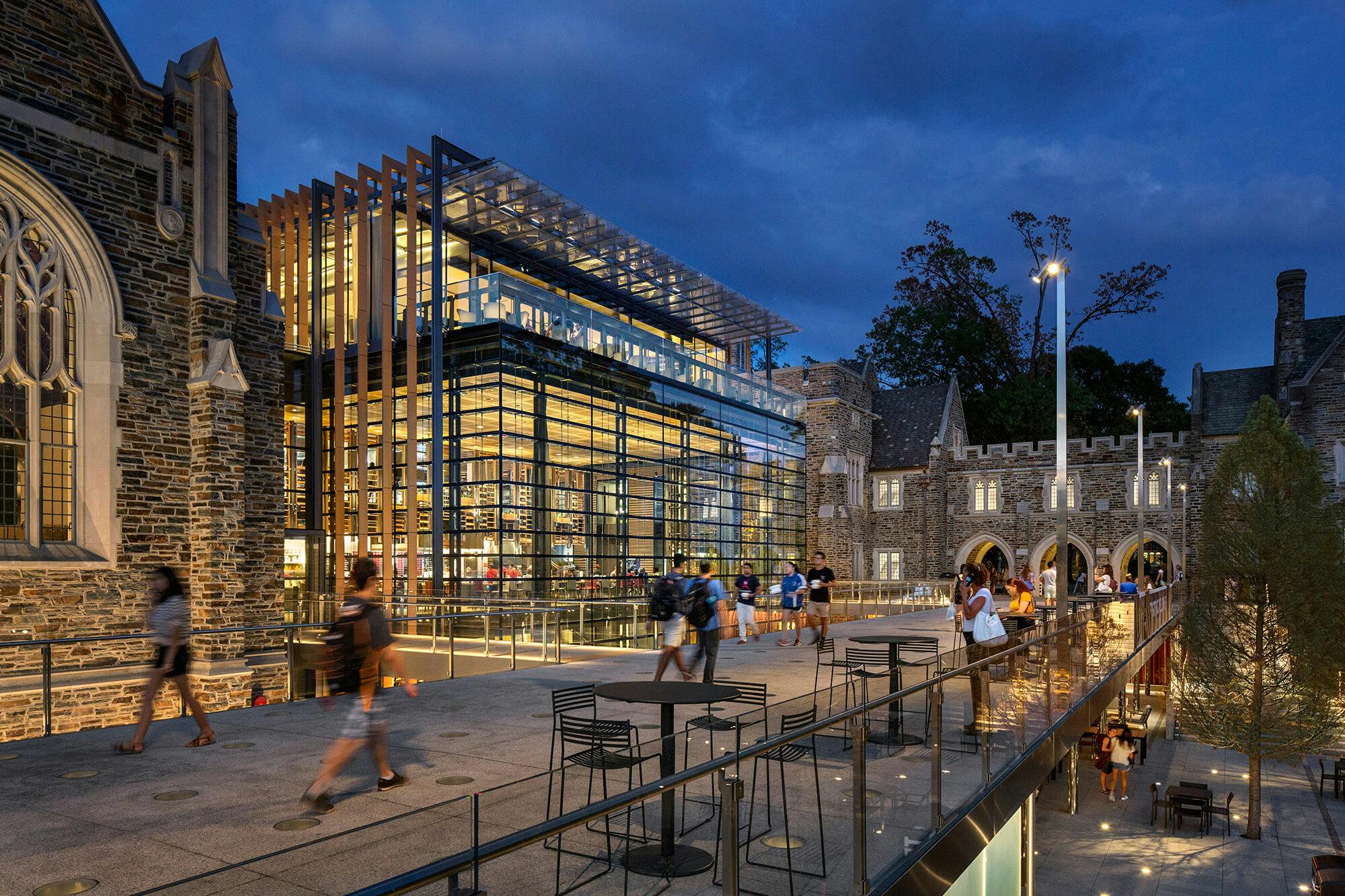
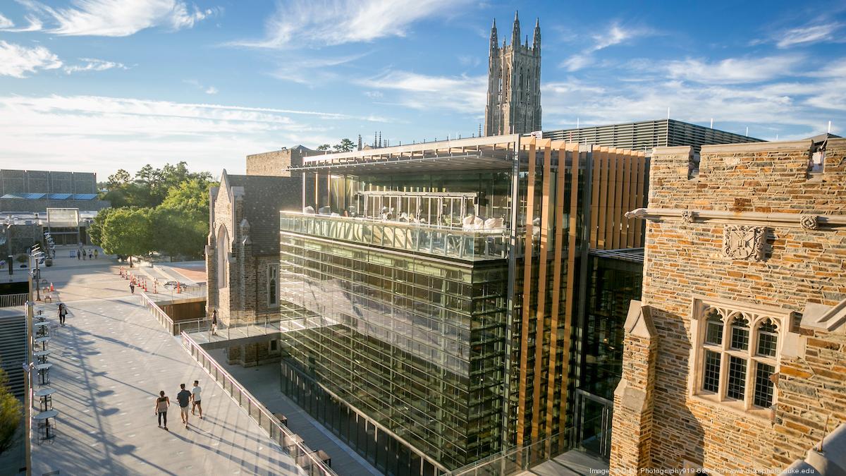
You can mix modern with traditional and still create a seamless look. One that comes to mind is Duke's Campus Union. Their campus is as traditional as it gets, but they were bold enough to incorporate some modern architecture.
Posted on 8/17/18 at 8:56 am to ALtoID
quote:
run down biscuit joint

This post was edited on 8/17/18 at 8:58 am
Posted on 8/17/18 at 9:00 am to Mobtro
Ferguson Center was a modern look when it was built and look how fugly it is now.

 Page 5 of 6

Latest Alabama News
Popular
Back to top