Started By
Message
 0
0

Posted on 2/1/24 at 5:40 pm to Chicken
Very cool! Appreciate the efforts

Posted on 2/1/24 at 5:51 pm to Chicken
I love the dark mode feature! I think it should be a toggle-able feature though, dark mode can be hard to read for those with worse eyesight. Also, I personally don't want to lose the quote function and sig features. I like being able to see everyone's quotes and sig pictures
This post was edited on 2/1/24 at 5:52 pm
Posted on 2/1/24 at 5:52 pm to Chicken
Small note: The team logo’s are harder to see on phone. With white background the colors pop but in dark mode they are harder to see unless you zoom in. Not a big deal but wanted to mention.
Other than that it seems fine.
Other than that it seems fine.

Posted on 2/1/24 at 5:52 pm to RebelTheBear
quote:Quote will still be there.
I personally don't want to lose the quote function and sig features.
No more sig image or quote.

Posted on 2/1/24 at 5:55 pm to RT58
You mean to tell me my Mrs. Doubtfire line on crabs has to go?
Posted on 2/1/24 at 5:55 pm to Wolfhound45
quote:Sad
No more sig image or quote.
Also, would it be possible to up the color contrast on dark mode? Idk about everyone else but I'm having a harder time reading in dark mode with how starkly dark the background is
inb4 that's racist

Posted on 2/1/24 at 5:55 pm to Wolfhound45
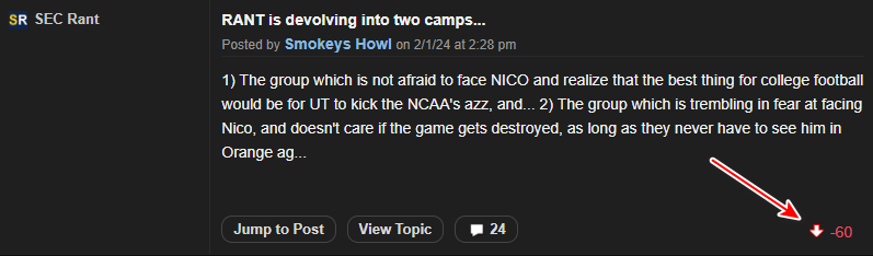
One thing I just noticed is when you go to your own posts or topics (at the very top on desktop, towards the bottom on mobile), the upvotes or downvotes for each now show off to the side.
Has that always been there?
ETA: It also works for other users' posts, like for this poor bastard:
Has that always been there?
ETA: It also works for other users' posts, like for this poor bastard:
quote:
This post was edited on 2/1/24 at 6:01 pm
Posted on 2/1/24 at 5:57 pm to Chicken
Well done, looks clean, wasn’t expecting the new buttons at all. 
Posted on 2/1/24 at 5:59 pm to RebelTheBear
quote:
I love the dark mode feature! I think it should be a toggle-able feature though, dark mode can be hard to read for those with worse eyesight. Also, I personally don't want to lose the quote function and sig features. I like being able to see everyone's quotes and sig pictures
Testing quote feature
Ok works. But on phone I can’t see my cursor so can’t see where I'm at. Hard to type as its like blind typing. Need to somehow figure out how to make the cursor white so I can navigate. If I want to add a line to existing sentences I can’t easily place my cursor since I can’t see it. Likely only a phone problem.
Posted on 2/1/24 at 6:02 pm to paperwasp
quote:He kind of brought that on himself
It also works for other users' posts, like for this poor bastard:
Posted on 2/1/24 at 6:03 pm to Chicken
I like dark mode; HOWEVER, there needs to be better separation between threads.. light mode has white and grey threads, which makes it easier to see.
This post was edited on 2/1/24 at 6:10 pm
Posted on 2/1/24 at 6:06 pm to Wolfhound45
I'll give someone a free upvote if they can identify the poster whose comments look like this:
quote:


Posted on 2/1/24 at 6:13 pm to Chicken
Went dark mode on iPhone. Like it. I keep it on dark mode with everything else.

Posted on 2/1/24 at 6:14 pm to Chicken
Very cool
Posted on 2/1/24 at 6:16 pm to Chicken
Waaay easier on the eyes. Yes imma noob and didn't know about this feature...but every legacy vbull (or whatever these days) forum needs dark mode. Cheers admin!
Posted on 2/1/24 at 6:35 pm to Chicken
What's the Blue circle next to some thread titles?
Posted on 2/1/24 at 6:36 pm to borotiger
Love it. Way easier on the eyes.
Posted on 2/1/24 at 6:40 pm to Chicken
Really like this!??
Posted on 2/1/24 at 6:42 pm to borotiger
quote:
What's the Blue circle next to some thread titles?
I think it means it’s unread. Instead of bolded.

 Page 4 of 9

Popular
Back to top