Started By
Message
re: Best looking alternate logo in the SEC...
Posted on 12/27/21 at 1:12 pm to mckibaj

Posted on 12/27/21 at 1:12 pm to mckibaj
No one likes the two birds fricking logo for Kentucky. bullshite Nike trash meant to sell new merchandise. It's fricking awful.
I think the entire SEC can agree that is our best logo, with or without My Old Kentucky Penis Tongue:
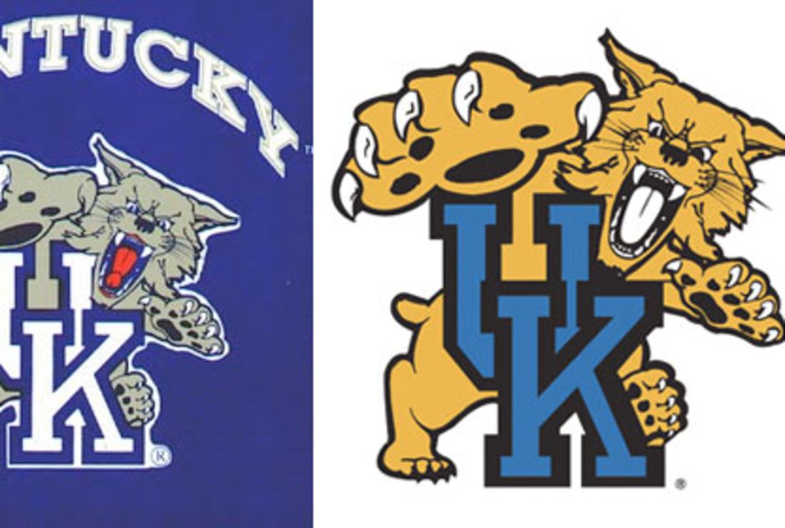
I think the entire SEC can agree that is our best logo, with or without My Old Kentucky Penis Tongue:
 0
0


Posted on 12/27/21 at 1:38 pm to SpotCheckBilly
quote:

What the hell is this? Did you just post some random Opelika county middle school's logo?
Posted on 12/27/21 at 1:39 pm to Tornado Alley
quote:
If you look at it from the side, Kentucky's alternate logo looks like two birds fricking missionary style.
Hahaha. I can’t unsee that.

Posted on 12/27/21 at 1:43 pm to dhuck20
quote:
What the hell is this? Did you just post some random Opelika county middle school's logo?
There is no Opelika county in Alabama or any other state.
Posted on 12/27/21 at 2:17 pm to SpotCheckBilly
quote:quote:There is no Opelika county in Alabama or any other state.
What the hell is this? Did you just post some random Opelika county middle school's logo?
FINE
What the hell is this? Did you just post some random LEE county middle school's logo?
Posted on 12/27/21 at 3:44 pm to Kansas City King
quote:
Tigers in real life are Black, Gold, and White. Would look way better with black instead of sissy purple
Tigers that live near swamp water are purple - fact

Posted on 12/27/21 at 3:51 pm to Roberteaux
quote:
the tiger eye looks good painted on the field. I think that's the only place it looks good.
quote:
But seeing the log on clothing, etc., it just looks like scrambled eggs
Totally agree. It's the best midfield logo in America. But on shirts, hats, stickers, license plates, cups, and etc, it doesn't look good.
This post was edited on 12/27/21 at 3:52 pm

Posted on 12/27/21 at 3:57 pm to aujerm
quote:
A&M’s alternate logo.

I thought it was this flag:

Posted on 12/27/21 at 4:01 pm to TigerinKorea
The issue with the eye outside the field is that you have to define it’s edges where as on the field it just fades away
The only good LSU logo on a had is the baseball script.
The only good LSU logo on a had is the baseball script.
Posted on 12/27/21 at 4:37 pm to KaiserSoze99

Posted on 12/27/21 at 4:46 pm to dhuck20
Can we all agree the retro logos look way better than todays

 Page 3 of 3


Popular
Back to top