Started By
Message
 3
3


Posted on 2/22/16 at 9:31 am to Hogwarts
quote:
2014 Fiftieth Anny Hog uniforms were awesome
Agree, liked them a lot

Posted on 2/22/16 at 9:32 am to Hogwarts
these were my favorite Arkansas uniforms

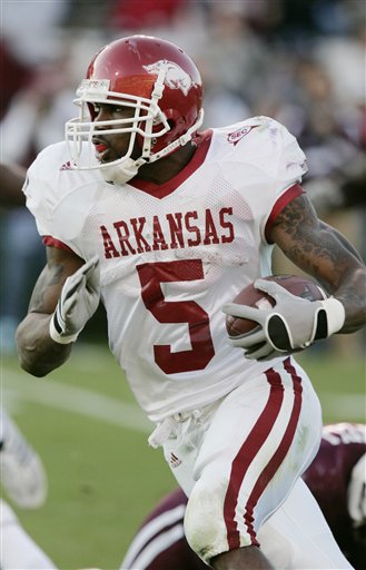
Posted on 2/22/16 at 9:33 am to lsufball19
I agree, I liked the "Arkansas" across the chest and the simplicity of them.
I will say, their current uniforms have grown on me. I didn't like them at first, but I don't mind them now. I like their new font.
I will say, their current uniforms have grown on me. I didn't like them at first, but I don't mind them now. I like their new font.
Posted on 2/22/16 at 9:34 am to SummerOfGeorge
quote:
State folks can correct me if I am wrong, but if I remember correctly that logo was created and owned by Nike, and when State left Nike in 2005ish they lost the interlocking MSU logo with it.
Sad if true, think that helmet is much better than their current one
Posted on 2/22/16 at 9:36 am to SummerOfGeorge
quote:
I will say, their current uniforms have grown on me. I didn't like them at first, but I don't mind them now. I like their new font.
yeah, they're ok, def better than they have been, but i'm just not a fan of all the crazy piping nike and other companies do these days
Posted on 2/22/16 at 9:36 am to Hogwarts
quote:
2014 Fiftieth Anny Hog uniforms were awesome
Ya, kinda wish we didn't pull them out against Alabama though. It looked like we were wearing Alabama colors in that game.
Posted on 2/22/16 at 9:38 am to SummerOfGeorge
quote:
I agree, I liked the "Arkansas" across the chest and the simplicity of them.
I will say, their current uniforms have grown on me. I didn't like them at first, but I don't mind them now. I like their new font.
Love the current uniforms when I look back at what we were wearing under Petrino. Hated that line that connected the pants and tops.
This post was edited on 2/22/16 at 9:40 am
Posted on 2/22/16 at 9:42 am to lsufball19
quote:
i'm just not a fan of all the crazy piping nike and other companies do these days
Same here
I also really dislike the changes Nike made to Georgia's numbers and font. They had one of the 3-4 best uniforms in football and Nike totally destroyed their logos and things with that miserable new bulldog logo and font. They messed with LSU's numbers too, but it isn't as bad.
2014-2015


2012


This post was edited on 2/22/16 at 9:44 am

Posted on 2/22/16 at 9:43 am to SummerOfGeorge

This uni is awesome.
That logo....
Posted on 2/22/16 at 9:46 am to CBandits82
LSU 2015

LSU 2012

LSU 2012
Posted on 2/22/16 at 9:48 am to SummerOfGeorge
I didn't like the stripes going under the shoulders when it was first released but it has grown on me.
Posted on 2/22/16 at 9:55 am to SummerOfGeorge
quote:
They messed with LSU's numbers too, but it isn't as bad.
yeah, LSU's is negligible, though. They used the same font but it's just distorted slightly from before. LSU actually has the exact same jersey template as ole miss. They also fixed our shoulder stripes to have them go all the way down again, which I like
2012 LSU

2013-present LSU

2012 Ole Miss

2013-present Ole Miss

Posted on 2/22/16 at 9:56 am to CBandits82
quote:
I didn't like the stripes going under the shoulders when it was first released but it has grown on me.
the stripes went under the shoulder until 2002. That's the way they're supposed to be, but the ways jerseys were constructed for awhile prevented that
Posted on 2/22/16 at 10:02 am to CBandits82
MISSOURI TIGERS
1978 - ROAD

1992 - HOME

1994 - HOME

1996 - HOME

1997 - HOME

1998 - HOME

2000 - ROAD

2000 - HOME

2001 - HOME

2002 - HOME

2006 - HOME

2007 - ROAD

2011 - ROAD

2012 - ROAD

2012 - HOME

2013 - HOME

2015 - HOME, GOLD

2015 - HOME, BLACK

2015 - WHITE OUT

1978 - ROAD
1992 - HOME
1994 - HOME
1996 - HOME
1997 - HOME
1998 - HOME
2000 - ROAD
2000 - HOME
2001 - HOME
2002 - HOME
2006 - HOME
2007 - ROAD
2011 - ROAD
2012 - ROAD
2012 - HOME
2013 - HOME
2015 - HOME, GOLD
2015 - HOME, BLACK
2015 - WHITE OUT
This post was edited on 2/22/16 at 10:03 am

Posted on 2/22/16 at 10:02 am to SummerOfGeorge
That new bulldog logo is hideous. Looks like a high school logo.
Disagree a about the number font though. I think it's an improvement.
Disagree a about the number font though. I think it's an improvement.
Posted on 2/22/16 at 10:04 am to SummerOfGeorge
can a Missouri fan explain to me why y'all changed your helmet?
Posted on 2/22/16 at 10:05 am to lsufball19
quote:
can a Missouri fan explain to me why y'all changed your helmet?
Yea, I don't get it. They ought to go back to the Winslow era black helmet with white M.
.jpg)
Posted on 2/22/16 at 10:06 am to SummerOfGeorge
Should of never gone away from the M helmet
This post was edited on 2/22/16 at 10:08 am
Posted on 2/22/16 at 10:10 am to SummerOfGeorge
Missouri's 2001 unis were the best

 Page 5 of 6

Popular
Back to top