Started By
Message

 1
1

Posted on 6/6/15 at 10:39 pm to BigOrangeBri

Posted on 6/6/15 at 10:44 pm to BigOrangeBri
Orange in general is pretty terrible. Looks like the whole fanbase is preparing for opening day of deer season..........and still get shot and killed...... 
Posted on 6/6/15 at 10:47 pm to Dlab2013
It's better than purple and yellow. I mean, purple and yellow, really?
Posted on 6/6/15 at 10:55 pm to volfan30
it looks like russian or some eastern european country's language in that font. holy crap that just looks bad...fyi, i have always liked the T logo, i think ut has the best football helmets besides lsu. that font has to go though.
Posted on 6/6/15 at 11:18 pm to ImayGoLesMiles
quote:
it looks like russian or some eastern european country's language in that font. holy crap that just looks bad...fyi, i have always liked the T logo, i think ut has the best football helmets besides lsu. that font has to go though.
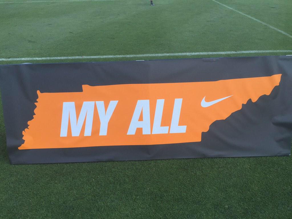
Yeah, the power T isn't going anywhere. The new font has kinda grown on me. I like how each letter incorporates the shape of Tennessee. Apparently, from what I've heard, we'll have to get used to it because it's gonna be around for the foreseeable future.
Posted on 6/6/15 at 11:32 pm to volfan30
i like solid letters without outlines.
So a solid white on orange and vice versa is strong.
I liked it alright originally, but i liked it a lot more once i realized it was supposed to look like tennessee.
Solid Movie.
Nike is starting to realize less is more and clean is better than busy with traditional teams.
So a solid white on orange and vice versa is strong.
I liked it alright originally, but i liked it a lot more once i realized it was supposed to look like tennessee.
Solid Movie.
Nike is starting to realize less is more and clean is better than busy with traditional teams.

Posted on 6/6/15 at 11:36 pm to volfan30
I like it. Pretty cool how they shaped it like the state.
Posted on 6/6/15 at 11:37 pm to BigOrangeBri
yeah i mean the lakers colors look pretty ugly and so do the minnesota vikings. i mean theyre just nasty colors. lol. look up college football uniform rankings and see where lsus ugly colors (royal purple and old gold) stand...just click the link
LINK
LINK
This post was edited on 6/6/15 at 11:42 pm
Posted on 6/6/15 at 11:45 pm to SammyTiger
quote:
i like solid letters without outlines. So a solid white on orange and vice versa is strong. I liked it alright originally, but i liked it a lot more once i realized it was supposed to look like tennessee. Solid Movie. Nike is starting to realize less is more and clean is better than busy with traditional teams.
I couldn't agree more.
Simplicity, man.

I hated it when our away jerseys had the black outline. So glad Adidas went back to the simple orange on white. Really hope Nike keeps it that way.

This post was edited on 6/6/15 at 11:52 pm
Posted on 6/6/15 at 11:49 pm to ImayGoLesMiles
quote:
yeah i mean the lakers colors look pretty ugly and so do the minnesota vikings. i mean theyre just nasty colors. lol. look up college football uniform rankings and see where lsus ugly colors (royal purple and old gold) stand...just click the link
For the record, I don't dislike LSUs colors at all. I was just returning the jerkoffs troll
Posted on 6/6/15 at 11:51 pm to madmaxvol
Our script is clean block letters. There is nothing new age or progressive about it.
Again, you can hate on our jerseys because they don't look like their from the 30's all you like, but the script is just a classic, clean looking font.
Again, you can hate on our jerseys because they don't look like their from the 30's all you like, but the script is just a classic, clean looking font.
Posted on 6/7/15 at 12:27 am to sugatowng
If Nike was smart they would dump any team that wears orange 
Posted on 6/7/15 at 12:33 am to bamaboy87
quote:
If Nike was smart they would dump any team that wears orange
Your teams main color looks like period blood. I wouldn't talk if I were you.
God made sunrises/sunsets and autumn leaves orange for a reason.
Posted on 6/7/15 at 12:38 am to BigOrangeBri
All of those things are also red at times
Posted on 6/7/15 at 12:39 am to BigOrangeBri
exactly. There is no reason for that black outline.
i like the checkerboard pattern which is traditional at Neyland.
I think using it instead of a stripe on the leg or helmet wouldn't be terrible.
i like the checkerboard pattern which is traditional at Neyland.
I think using it instead of a stripe on the leg or helmet wouldn't be terrible.
Posted on 6/7/15 at 12:40 am to bamaboy87
quote:
All of those things are also red at times
Not period blood bama colors. Not really anything close to y'all's shade of horrible
Posted on 6/7/15 at 12:41 am to BigOrangeBri
A fan of a team that wears puke orange calling another teams colors horrible. 
Posted on 6/7/15 at 12:42 am to SammyTiger
quote:
exactly. There is no reason for that black outline. i like the checkerboard pattern which is traditional at Neyland. I think using it instead of a stripe on the leg or helmet wouldn't be terrible.
I've heard we're going back to no stripes on the away pants. I'd be cool with that.
Posted on 6/7/15 at 12:45 am to bamaboy87
quote:
A fan of a team that wears puke orange calling another teams colors horrible.
I've never once seen puke that resembles Tennessee orange. If that's what you've had going on, then I recommend seeing a doctor.
Oh yeah, sorry about your living in Alabama and all.

 Page 4 of 5

Back to top