Started By
Message
Offseason topic - Uniforms and branding
Posted on 12/13/20 at 6:33 pm

Posted on 12/13/20 at 6:33 pm
I know we've still got 2 more football games left and the entire conference basketball slate...but Mizzou's recent revival of the Block M helmets has me interested and I've seen differing opinions on Twitter.
What are y'alls thoughts on what Mizzou should pursue from a marketing/branding perspective?
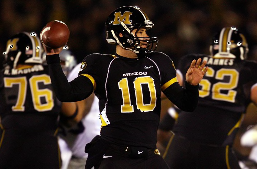
Personally, I'm 100% in the Block M camp. I'm ok with the NON-oval Tiger logo occasionally, but the primary helmets should be the Block M IMO. I also prefer the non-italicized yard lines on the field, although I am a fan of the black and gold endzones rather than the old white diamond "MISSOURI". For the uniforms, I'd prefer a "non-italic" font as well. My all-time favorite:
For basketball, it's a mixed bag. The practice jerseys they wore last night vs Illinois are my least favorite by far...they look terrible and are completely minor-league looking with the bright yellow and clownish Tiger logo. I don't love the "stripes" on the baseline of the court and I wish the center circle logo was still the state border outline. However, I do think the current "regular" uniforms look pretty good though. All-time favorite:

And no this isn't an "old man yells at cloud" about how things used to be better I actually graduated within the last 5 years, but strongly prefer the unis we had 10-15 years ago.
What are y'alls thoughts on what Mizzou should pursue from a marketing/branding perspective?
Personally, I'm 100% in the Block M camp. I'm ok with the NON-oval Tiger logo occasionally, but the primary helmets should be the Block M IMO. I also prefer the non-italicized yard lines on the field, although I am a fan of the black and gold endzones rather than the old white diamond "MISSOURI". For the uniforms, I'd prefer a "non-italic" font as well. My all-time favorite:
For basketball, it's a mixed bag. The practice jerseys they wore last night vs Illinois are my least favorite by far...they look terrible and are completely minor-league looking with the bright yellow and clownish Tiger logo. I don't love the "stripes" on the baseline of the court and I wish the center circle logo was still the state border outline. However, I do think the current "regular" uniforms look pretty good though. All-time favorite:
And no this isn't an "old man yells at cloud" about how things used to be better
 4
4

Posted on 12/13/20 at 6:42 pm to KCM0Tiger
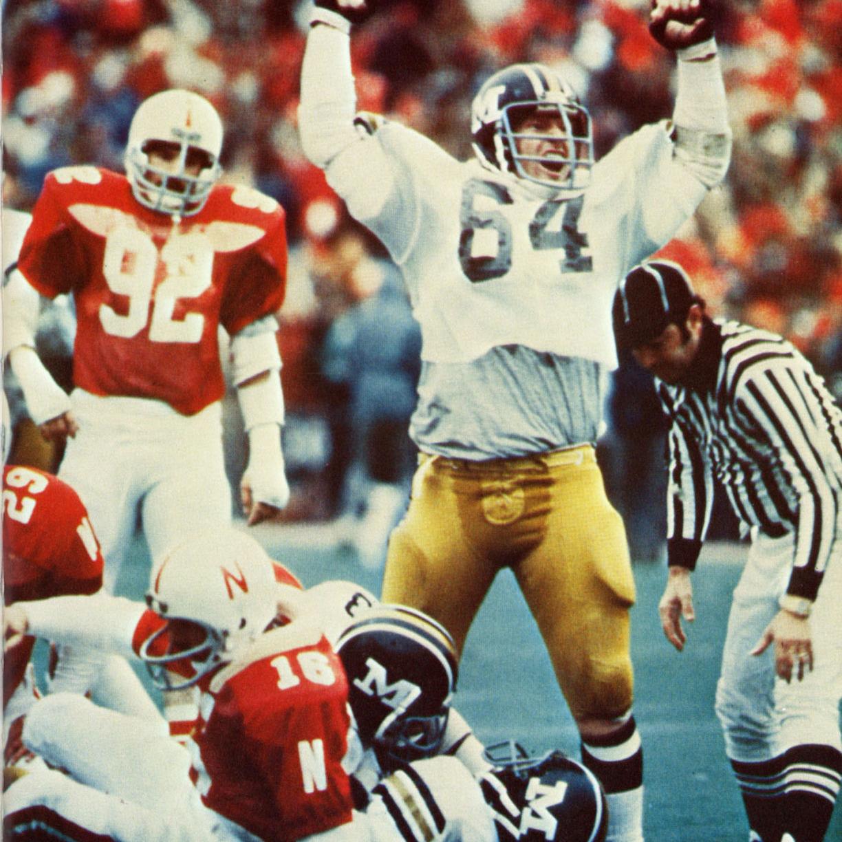
Def give should give Drink a rebrand. It’s very clear he and the team want the Block M. Every game but one it has appeared.
I’m fine with the lettering. Just bring back the real gold. You can easily modernize the old Chase Daniel era unis.
I’m fine with the lettering. Just bring back the real gold. You can easily modernize the old Chase Daniel era unis.
Posted on 12/13/20 at 8:17 pm to KCM0Tiger
Quit tinkering with the jerseys. They are fine the way they are. I hate all the unnecessary piping on the old jerseys in the first picture. A bland M on the helmets is so yawn inducing. The collar looks awful with the gold only going around the back half of the collar and abruptly stopping where the silly vertical white piping runs. The whole uniform can stay in the scrap heap. I hope it never comes back.
The only things I hate about the field is the shiny look to the turf, the odd looking track, and the low TV camera angle. I don't know why there isn't a way to raise the TV camera angle so the viewer can get a better look of the field.
I do like the old hoops jerseys from around 25 years ago with the vibrant shade of gold, a capitalized M with the rest of the name of the school in lowercase, with the awesome paw print logo on the side of the shorts. Those were sweet. I do prefer Missouri spelled out instead of Mizzou. I agree, I did like the outline of the state at midcourt. But I can live with the beautiful oval tiger logo too. I liked the jerseys worn last night. Creative logos that mimic whatever the team name is scores high with me over anything with boring text or anything that lacks an ounce of creativity. But the primary jerseys are still a big improvement over what was worn just a few years ago.
Posted on 12/13/20 at 8:41 pm to CRDNLSCHMCPSN11
quote:
I don't know why there isn't a way to raise the TV camera angle so the viewer can get a better look of the field.
This, over and over.
Posted on 12/13/20 at 9:07 pm to SEC. 593
My biggest problem with our football and basketball unis is the damn cartoonish tiger stripes they have ok all the jerseys. Our basketball jerseys would look so good if they did just a regular stripe instead of that weird tiger stripe print on it
Posted on 12/13/20 at 9:32 pm to SEC. 593
Seems like it wouldn’t be that hard to build a camera well a few dozen feet higher somewhere. Is this not a journalism school?

Posted on 12/13/20 at 10:02 pm to RamboMizzou
The uniforms would be fine if they get rid of all tiger stripe patterns
Posted on 12/13/20 at 10:32 pm to RamboMizzou
Yeah the tiger stripes are a bad gimmick. Need to get rid of it on Mizzou Arena’s baselines as well
Posted on 12/14/20 at 8:26 am to mouse_cop
These helmets and the variations of it should be the style moving forward. Generic "M" is boring as mentioned above.
Posted on 12/14/20 at 10:22 am to KCM0Tiger
I have liked (to different extents) all the football uniforms over the years, but favor the Block M helmet as the standard with the tiger head spread out for occasion.
I hate what we call our Basketball uniforms so much it makes me mad.
I hate what we call our Basketball uniforms so much it makes me mad.
Posted on 12/14/20 at 8:19 pm to blueprint_one
Lol those helmets STINK, those unis look very bush league
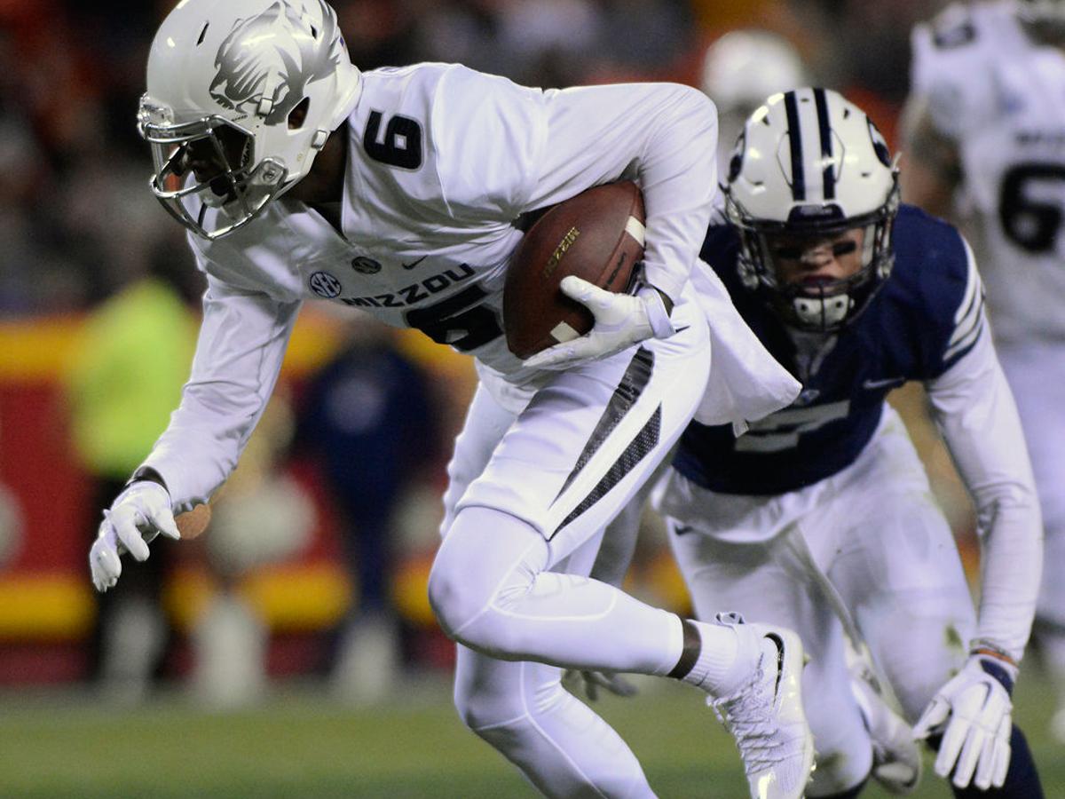
These are the cleanest Missouri uniforms:

These are the cleanest Missouri uniforms:
Posted on 12/14/20 at 9:55 pm to mouse_cop
Personally prefer the block M on the helmets. Am fine with the other ideas for branding. Putting them on tickets or billboards or whatever.
My son, whose a junior, surprised me. Him and a lot of his buddies at school love the return of the block M. I figured the block M would be favored by us old guys and some form of the tiger's head favored by the young guys.
My son, whose a junior, surprised me. Him and a lot of his buddies at school love the return of the block M. I figured the block M would be favored by us old guys and some form of the tiger's head favored by the young guys.
Posted on 12/15/20 at 9:19 am to blueprint_one
quote:
These helmets and the variations of it should be the style moving forward. Generic "M" is boring as mentioned above.
Fun for a game but that helmet decal sucks arse. You talk about boring and bring up a plain arse stencil outline? You’re definitely the younger generation of Tiger fans aren’t you?
Block M is back, and thank god. Brings a certain level of classiness back.
They need to complete it by burning the mustard yellows.
Posted on 12/15/20 at 9:58 am to Athos
I'm a big fan of Block M. Less is more - it's simple and classy. There's also some sort of hardcore sturdiness to it that I like.
No real issue with oval tiger head. Just prefer the M.
I'm 47 for reference if we're looking to see how the ages line up on this.
No real issue with oval tiger head. Just prefer the M.
I'm 47 for reference if we're looking to see how the ages line up on this.
Posted on 12/15/20 at 1:04 pm to Athos
quote:
You’re definitely the younger generation of Tiger fans aren’t you?
37 so not at all.

Posted on 12/15/20 at 1:04 pm to reedus23
Mizzou is bigger than just the football helmet. Nothing wrong with the other sports using the tiger head along with official publications and advertising. The block M can be used on the helmet only. Hell, the 06 uniform had the block M helmet and tiger head on jersey upper arms.
LINK
LINK
This post was edited on 12/15/20 at 1:11 pm
Posted on 12/16/20 at 7:52 pm to MIZtyler
A much better alternative to the tiger head.

 Page 1 of 1


Popular
Back to top