Started By
Message
re: Best old logos in the SEC
Posted on 8/26/18 at 10:59 am to Mizzou4ever

Posted on 8/26/18 at 10:59 am to Mizzou4ever
Yeah, KU did not. Said it infringed on their logo and UK did not fight it.

Simple but good. Now Nike has control and UK has this crap
They updated the Northwestern logo that looks like a staple puller or birds engaged in sexual congress

Simple but good. Now Nike has control and UK has this crap
They updated the Northwestern logo that looks like a staple puller or birds engaged in sexual congress
 1
1

Posted on 8/26/18 at 11:06 am to Cheese Grits
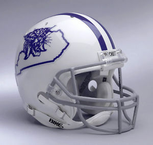
My favorite. Looks better in white on the blue helmet. It's 1973-74. I know the team wore the same design in a throwback uniform around 2003ish with this on one side and the UK on the other side. Looked amazing. Of course I wasn't around for 73-74

 Page 1 of 1


Popular
Back to top