Started By
Message
re: Who has the best and worst logo in our conference?
Posted on 7/28/17 at 1:56 am to RoyalAir

Posted on 7/28/17 at 1:56 am to RoyalAir
quote:
Don't know why people shite on a Carolina's logo. Before I was a student there, I thought it was one of the better and more recognizable logos in the conference. Busy, perhaps, but not a Nikefied shitburger like Angry Smokey or Fat Uga.
Not crazy about Miss State's current M/ribbon. Preferred the Sherrill-era MSU. Baseball MS is fire, though.
The irony: the Sherrill-era interlocking MSU logo was not owned by State, but by Nike. When Croom came in State switched over to Russell and gone was the "MSJ" logo.
I always liked the old "Flying M" logo, but that's just out of some weird nostalgia.
On State's baseball logo, years ago I ran across some guy wearing a hat with that logo and started talking to him, assuming he was a State fan. Turns out, he didn't even know what hat he was wearing, he just bought it because he thought the logo was cool.
 0
0

Posted on 7/28/17 at 2:21 am to David Ricky

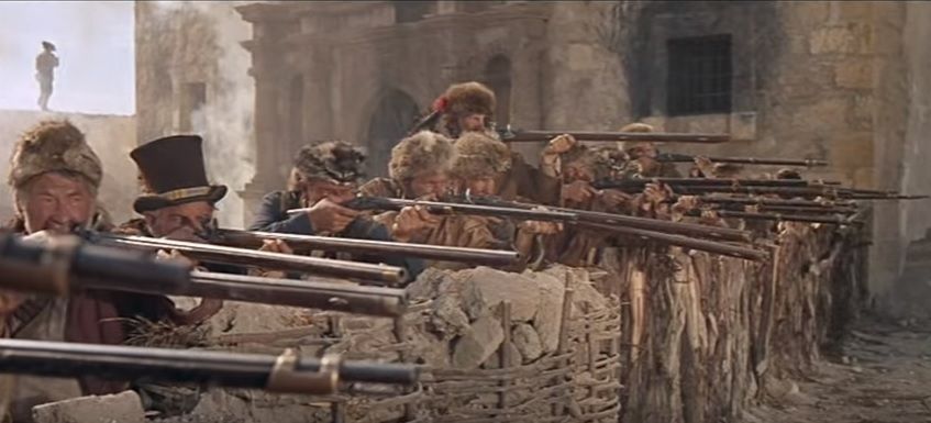
I like the rifleman motif a lot more than the dog. I wish they hadn't pushed that.

Posted on 7/28/17 at 3:48 am to Slackaveli
quote:I liked the matte look over the normal helmet sheen. But I like this new chrome look way more than matte. If we go that direction, I'm all for ditching the matte. We just have a shade of red that looks damn sexy chromed out.
Whoever decided on the matte helmets needs shot. I believe it was petrino, actually. Needs ditched , too.
Posted on 7/28/17 at 3:50 am to TheCheshireHog
quote:I bet you still wear plaid.
Get the frick out with this nonsense. The all reds are perfect.
This post was edited on 7/28/17 at 3:51 am

Posted on 7/28/17 at 6:41 am to EKG
That's cause you're from Texas which, while being located on the southern border is not the south but actually the south west
Posted on 7/28/17 at 6:42 am to TomRollTideRitter
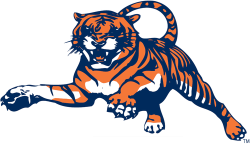
I see your cartoon bulldog and raise you Toonces the LSU cartoon tiger
Posted on 7/28/17 at 6:47 am to America1776
Those are all pretty damn strong. I wish everyone would stick with those
Posted on 7/28/17 at 7:26 am to DingDongEddieStrong
Best is Florida or USC.
Worst is Alabama or Ole Miss
Worst is Alabama or Ole Miss

Posted on 7/28/17 at 7:36 am to kbrake37
I wonder when PETA or some other group looking to protect all animals of the world, decides to dive in and fight to those knife spurs off that USCs game chicken.
Posted on 7/28/17 at 7:36 am to CrimsonCrusade
quote:
intersting how similar logos are in concept though:
Not really. More than likely the same company designed each logo. They use similar concepts for each.
For example, the company that designed the hated "tounces" logo for LSU also created around 20 other school logos that were equally as horrible.

Posted on 7/28/17 at 7:54 am to David Ricky
Crazy thing about the VOLS Rifleman - I and every other person under 50 hated that damned logo when it was used. The oldsters loved it. Fast forward and now that it's retro looking and reminiscent of 8-bit video games, Atari, and Nintendo and errbody loves it.
That and the VOLS star logo (often used with the Rifleman like w/your pic) aged really well. Those designs were wayy ahead of their time, imo.

That and the VOLS star logo (often used with the Rifleman like w/your pic) aged really well. Those designs were wayy ahead of their time, imo.
Posted on 7/28/17 at 8:04 am to America1776
Top image. Arky NEEDS to wear those regularly again. Best unis you ever had, imo.
Posted on 7/28/17 at 8:04 am to Prof
Auburn also used the classic leaping tiger:
Posted on 7/28/17 at 8:06 am to CNB
quote:
I saw where Princeton used it as well. I thought Clemson did too, but couldn't find any evidence of that.
Most likely Princeton was first. The Ivies were football for ages and Princeton was damn good wayyy back then.

Posted on 7/28/17 at 8:42 am to Rhymenoceros
quote:
Who had it first?
If you're seriously asking and not trolling, UGA had theirs in 1964 which predates that Georgetown logo.

Posted on 7/28/17 at 8:49 am to DingDongEddieStrong
State's baseball logo is special to Bulldog fans. The best, imo.
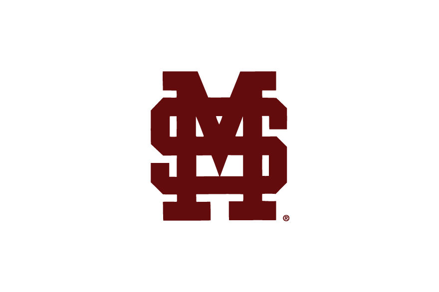
The worst is that damn StarkVegas thing thats on our basketball court. I refuse to post a pic
The worst is that damn StarkVegas thing thats on our basketball court. I refuse to post a pic

Posted on 7/28/17 at 8:50 am to ChexMix
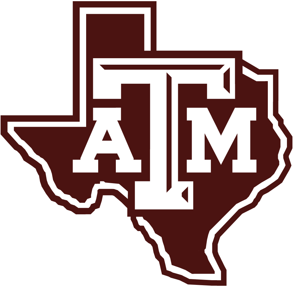
Best: Alabama
Worst: ATM
Worst: ATM

Posted on 7/28/17 at 8:59 am to RockyMtnTigerWDE
quote:

I like the 1991 design. It's grrrrrreat!

Posted on 7/28/17 at 9:00 am to DingDongEddieStrong
Best logo:
Worst logo:

Worst logo:
Posted on 7/28/17 at 9:09 am to TeLeFaWx
The current M-State logo only looks decent with the silver accent. Without the accent it looks terrible.

Here's a Bulldog humping a garbage M-State

Here's our 80s Walking Mascot logo

and for discussion, the greatest classic collegiate logo

Here's a Bulldog humping a garbage M-State
Here's our 80s Walking Mascot logo
and for discussion, the greatest classic collegiate logo

 Page 8 of 9

Popular
Back to top