Started By
Message
re: Your least favorite logo or mascot for your team
Posted on 5/10/15 at 6:01 pm to theGarnetWay
Posted on 5/10/15 at 6:01 pm to theGarnetWay
I never had a problem with the interlocking USC ligature.
Not as iconic as the Block C, but not as bad as some of the silly shite we've seen in this thread.
Not as iconic as the Block C, but not as bad as some of the silly shite we've seen in this thread.
 0
0

Posted on 5/10/15 at 6:16 pm to NorthGAVol
So can I assume you Aggies still like Ol Sarge? Seems like that guy is way underplayed, but I guess the branding bus may have left him behind.
Dude has a millions times more personality than that collie.
Dude has a millions times more personality than that collie.

Posted on 5/10/15 at 7:27 pm to Jenar Boy
I love toonces. He just wants a hug in that logo
Posted on 5/10/15 at 8:28 pm to Rebel Land Shark
That bear is terrible.

Posted on 5/10/15 at 10:28 pm to weagle99

Posted on 5/10/15 at 11:54 pm to throwingoranges
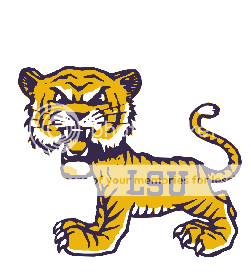
I'm still not a fan of our new tiger helmet logo....has always reminded me of the K-State Power Cat 
Posted on 5/11/15 at 12:48 pm to Rig
That friggin thing is hideous. Looks like a 70's cartoon character. So glad it's gone.
Posted on 5/11/15 at 1:25 pm to weagle99
Posted on 5/11/15 at 1:50 pm to Nix to Twillie
Looks familiar:
Posted on 5/11/15 at 2:12 pm to PrettyLights
Aggies logo and Richard Simmons as their mascot !
Posted on 5/11/15 at 2:29 pm to Aux Arc
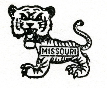
Mercifully this one is dead. You'll still see it from time to time on old merch.

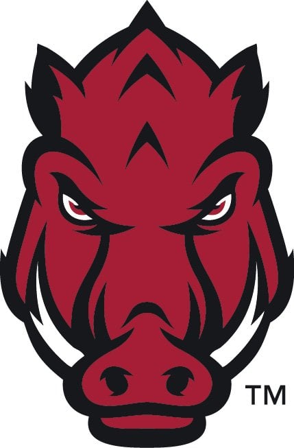
I don't think this one is much better, though. Reminds me of the Chicago Bulls for some reason. Players seem to like it.


I don't think this one is much better, though. Reminds me of the Chicago Bulls for some reason. Players seem to like it.
This post was edited on 5/11/15 at 2:33 pm
Posted on 5/11/15 at 2:51 pm to Numberwang
the problem is all of these new age cartoon "updated" logos. hate them all. they try so hard but fail to realize that classic works. most noted in the high level of sales in "vintage" mercandise versus that shite that looks aimed at 12 yr old boys.


Posted on 5/11/15 at 3:55 pm to rebelrouser
This thing is fricking hideous..
This one is beautiful IMO..
This one is beautiful IMO..
Posted on 5/11/15 at 4:29 pm to LAHog124
Cannot upvote enough. Only ones I like other than classic running hog is sweater hog, 90's A hog, and baseball hog

Posted on 5/11/15 at 4:33 pm to Numberwang
quote:
Looks like he's shooting popcorn out of his nose.

Posted on 5/11/15 at 4:36 pm to I Ham That I Ham
quote:
It's amazing how many variations of "aTm" yall have. None of them look very good either
lol, this.

Posted on 5/11/15 at 5:22 pm to theGarnetWay
never liked Holtz's interlocking USC. here's an old 90's attempt during Fat Brad's disaster...the Spur logo. just...not well executed. 

the official Cocky logo for kids might could use a little upgrade too.
Official University Logos...
I'm down with #10 & #11 as it brings back "Fighting Gamecocks"...
the official Cocky logo for kids might could use a little upgrade too.
Official University Logos...
I'm down with #10 & #11 as it brings back "Fighting Gamecocks"...
Posted on 5/11/15 at 5:37 pm to STLhog
The middle hog looks like he got trapped in the A
Posted on 5/11/15 at 5:44 pm to Darth_Vader
quote:
Looks like he's shooting popcorn out of his nose
That's why he is known as "popcorn hog". He's our fanbase's (much worse) version of "toonces".
This post was edited on 5/11/15 at 5:45 pm

 Page 5 of 6

Back to top