Started By
Message
re: Your least favorite logo or mascot for your team
Posted on 5/9/15 at 9:07 pm to BigOrangeBri

Posted on 5/9/15 at 9:07 pm to BigOrangeBri
Turrible
 0
0

Posted on 5/9/15 at 9:07 pm to BigOrangeBri
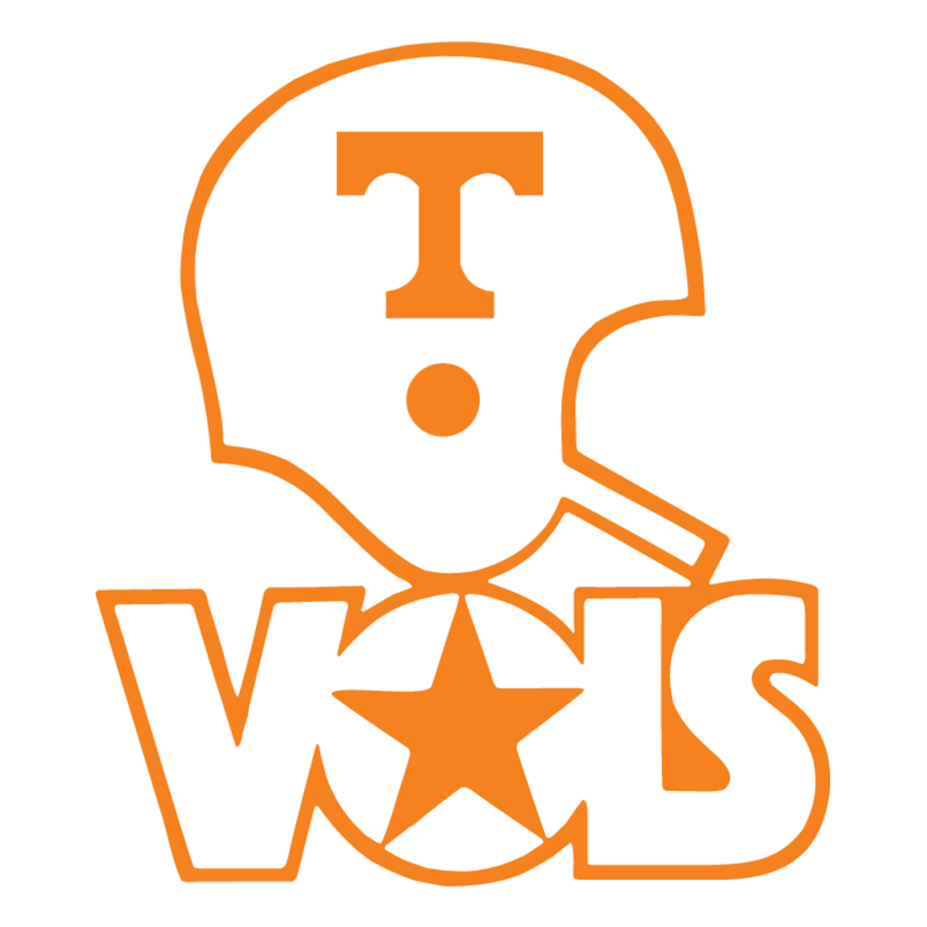
That shite makes my eyes bleed. Stick with the Power T, the VOLS star and the Rifleman. There's no sense in trying to frick with perfection.
I'm also a big fan of incorporating the tri-star logo that they've been showing off recently. It think that's pretty cool.

I'm also a big fan of incorporating the tri-star logo that they've been showing off recently. It think that's pretty cool.
This post was edited on 5/9/15 at 9:10 pm

Posted on 5/9/15 at 9:09 pm to NorthGAVol
Hopefully they'll use these more....


I've already seen the interlocking logo on stuff, but the more the better IMO
I've already seen the interlocking logo on stuff, but the more the better IMO
This post was edited on 5/9/15 at 9:13 pm
Posted on 5/9/15 at 9:10 pm to BigOrangeBri
Yes I totally forgot about that one. That's a classic as well

Posted on 5/9/15 at 9:10 pm to NorthGAVol
I don't know if Adidas ever used the rifleman (I've never seen them use the Smokey one -- well in the late 90s to early 00s I remember it but not on Adidas stuff) on fan gear. Adidas kept pretty well to our primary logo but you can find rifleman stuff on everything. I just googled and this turned up instantly: LINK so apparently Adidas did use it.
Posted on 5/9/15 at 9:11 pm to weagle99
This stupid thing

Posted on 5/9/15 at 9:13 pm to NorthGAVol

And these on some throwback gear
This post was edited on 5/9/15 at 9:15 pm
Posted on 5/9/15 at 9:21 pm to I Ham That I Ham
quote:
Looks like Pumbaa.

Posted on 5/9/15 at 9:26 pm to Vols&Shaft83

This post was edited on 5/9/15 at 9:28 pm
Posted on 5/9/15 at 9:27 pm to Prof
quote:
don't know if Adidas ever used the rifleman (I've never seen them use the Smokey one -- well in the late 90s to early 00s I remember it but not on Adidas stuff) on fan gear. Adidas kept pretty well to our primary logo but you can find rifleman stuff on everything. I just googled and this turned up instantly: LINK so apparently Adidas did use it.
I stand corrected but I think that was only used as some retro logo for that cap. I used to see the rifleman all over stuff back in the 90's.
I'll be interested to see what Nike does with the logos because I think everyone agrees angry Smokey and all of those cartoons are just embarrassing.
Posted on 5/9/15 at 9:30 pm to weagle99

Posted on 5/9/15 at 9:31 pm to Gary Busey
Tell me that's not a thing. That cannot be real.
Posted on 5/9/15 at 9:32 pm to weagle99

Posted on 5/9/15 at 9:33 pm to weagle99

When the A and the M aren't centered under the serif it kills my OCD.
It should be this:

Posted on 5/9/15 at 9:35 pm to tween the hedges
That is terrible. Georgia should've never changed from this imo

Posted on 5/9/15 at 9:37 pm to TeLeFaWx
It's amazing how many variations of "aTm" yall have. None of them look very good either
Posted on 5/9/15 at 9:40 pm to NorthGAVol
Did you see the mock up alternate helmets that some VQ'er did? He had a pretty cool helmet with the Tri-Star
Posted on 5/9/15 at 9:42 pm to TeLeFaWx

This is what y'all should be using

Posted on 5/9/15 at 10:07 pm to BigOrangeBri
State's best 3:


Worst:


Worst:
Posted on 5/9/15 at 10:07 pm to BigOrangeBri
quote:
you see the mock up alternate helmets that some VQ'er did? He had a pretty cool helmet with the Tri-Star
Yeah the white one with the Orange tri star was
Big if but if we ever use a alternate helmet I would love to see something like that

 Page 2 of 6

Popular
Back to top