Started By
Message
re: Rank the SEC helmets
Posted on 10/28/15 at 1:29 pm to Spaulding Smails
Posted on 10/28/15 at 1:29 pm to Spaulding Smails
I don't mind Alabama's helmet, particularly with their crimson jerseys. The helmet looks good when it is in a dome or at night, especially if it has a nice shine to it.
However, sometimes during day games and/or with the white uniforms, it appears to look like candle wax. The helmet below is an example:

However, sometimes during day games and/or with the white uniforms, it appears to look like candle wax. The helmet below is an example:
 0
0

Posted on 10/28/15 at 1:31 pm to Grim
1) Florida
Posted on 10/28/15 at 1:32 pm to Grim
quote:
but I was only ranking the primary helmets
We should make these helmets our primary helmets

Posted on 10/28/15 at 1:32 pm to Grim
Best uni combo in football.
Posted on 10/28/15 at 1:33 pm to white beans
He probably thinks Oregon is awesome with all their ridiculous unis
As you grow older you appreciate the sharp, classic, timeless, clean iconic look. And all the cutting edge too much going on badass x-treme mountain dew uniforms always becomes a joke in time.
As you grow older you appreciate the sharp, classic, timeless, clean iconic look. And all the cutting edge too much going on badass x-treme mountain dew uniforms always becomes a joke in time.
Posted on 10/28/15 at 1:34 pm to hogminer
I hate the tiger on the LSU helmet - looks stupid.
Could get behind this LSU helmet, although the whiney traditional folks will cringe...

Could get behind this LSU helmet, although the whiney traditional folks will cringe...
Posted on 10/28/15 at 1:34 pm to Grim
Auburn should be Top 3
Posted on 10/28/15 at 1:36 pm to DingDongEddieStrong
quote:
Best uni combo in football.
Lost to Memphis last time it was worn. That has to put a dent in the appeal of that combo, no?
Posted on 10/28/15 at 1:36 pm to CoachDon
Hope you're not serious
Posted on 10/28/15 at 1:36 pm to CoachDon
quote:
Could get behind this LSU helmet, although the whiney traditional folks will cringe...
No fricking way you're serious.
Posted on 10/28/15 at 1:39 pm to CoachDon
quote:
CoachDon
You are awful.
Posted on 10/28/15 at 1:40 pm to Grim
1. Alabama
2. LSU
3. Auburn
4. UGA
5. UF
6. UT
7. A&M
8. Ole Miss
9. Arky
10. USC
11. Vandy
12. UK
13. MSU
14. Mizzou
2. LSU
3. Auburn
4. UGA
5. UF
6. UT
7. A&M
8. Ole Miss
9. Arky
10. USC
11. Vandy
12. UK
13. MSU
14. Mizzou

Posted on 10/28/15 at 1:42 pm to RD Dawg
quote:
Do the Cinncinnati Reds pay the Chicago Bears for the oval "C"?...no,they don't BTW.
Probably because the Cincinnati Reds had been using the Wishbone C since 1905.
That's 15 years before the Chicago Bears came into existence in 1920, and a total of 57 years of Reds usage before the Bears adopted the C logo in 1962.
Posted on 10/28/15 at 1:44 pm to Grim
7. Georgia
5. Florida
1 LSU
5. Kentucky
6. Auburn
7. Ole Miss
8. MSU
9. Missouri
2 South Carolina
4. Tennessee
12. Arkansas
13. Texas A&M
14. Vanderbilt
5. Florida
1 LSU
5. Kentucky
6. Auburn
7. Ole Miss
8. MSU
9. Missouri
2 South Carolina
4. Tennessee
12. Arkansas
13. Texas A&M
14. Vanderbilt
Posted on 10/28/15 at 1:45 pm to AggieLandman
Regardless,they both use the same design and no one pays
another roylties on it.
another roylties on it.
Posted on 10/28/15 at 1:45 pm to Grim
1. LSU
2. Ole Miss Powder Blue
3. Rest are crap...
2. Ole Miss Powder Blue
3. Rest are crap...
Posted on 10/28/15 at 1:48 pm to LelandSU
Spoken like a true LSU fan.
Posted on 10/28/15 at 1:49 pm to LelandSU
1. Alabama
2. LSU
137. Erry one else.
2. LSU
137. Erry one else.
Posted on 10/28/15 at 1:54 pm to RD Dawg
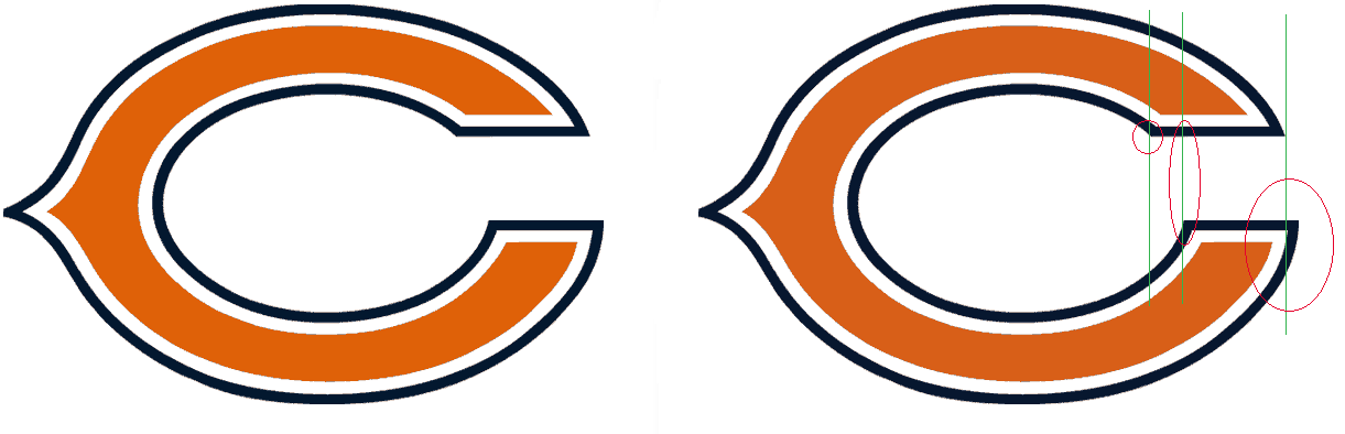
The Bears actually use a purposely asymmetrical version of the C in order to avoid conflicts of ownership. The intentional flaws make their logo unique to them. It's done in such a way as to appear symmetrical to the human eye like an optical illusion, but once you see the asymmetry pointed out it's pretty glaring:
Posted on 10/28/15 at 1:54 pm to LelandSU
I've always thought the LSU helmets were awful. the "LSU" font looks like the letters were put on with duct tape. The tiger emblem washes out if you're more than 10 feet away to look like a chrysanthemum.
I'm in the minority, but not a fan of the Ole Miss powder blues. If the stripe on the uniform pants matched they might look better. As it is, it looks like their helmets got lost in shipment to the game and they had to borrow a local JUCO's.
Plus, anything with cursive gets automatically DQ'd. (Looking at you, Gators)
1. Bama
2. Arkansas
3. Auburn

 Page 3 of 7

Back to top