Started By
Message
Our new baseball jerseys are a universal downgrade
Posted on 2/14/24 at 5:42 pm
Posted on 2/14/24 at 5:42 pm
Nike sucks. Could these be any more generic?
twitpic
Wasn't someone once trying to gaslight me on here saying they care deeply about individual schools, do detailed design, etc? Lol travel ball clubs have more design effort in them than these
twitpic
Wasn't someone once trying to gaslight me on here saying they care deeply about individual schools, do detailed design, etc? Lol travel ball clubs have more design effort in them than these
This post was edited on 2/14/24 at 5:47 pm
 5
5


Posted on 2/14/24 at 6:00 pm to Porker Face
Pinstripe ones are awful, but alumni hall does sell non official ones too so it may not be a game jersey. They still sell old ones from years back we haven't worn in ages.
As long as we didn't get rid of the cream throwbacks.
Also, Fanatics now makes the MLB jerseys for Nike (wonder if college too now?) this year and they are fricking awful as well. I mean bad bad, shrunk the names/numbers, made them basically skinny pants/tops form fitting, players already hate them a few days into Spring Training.
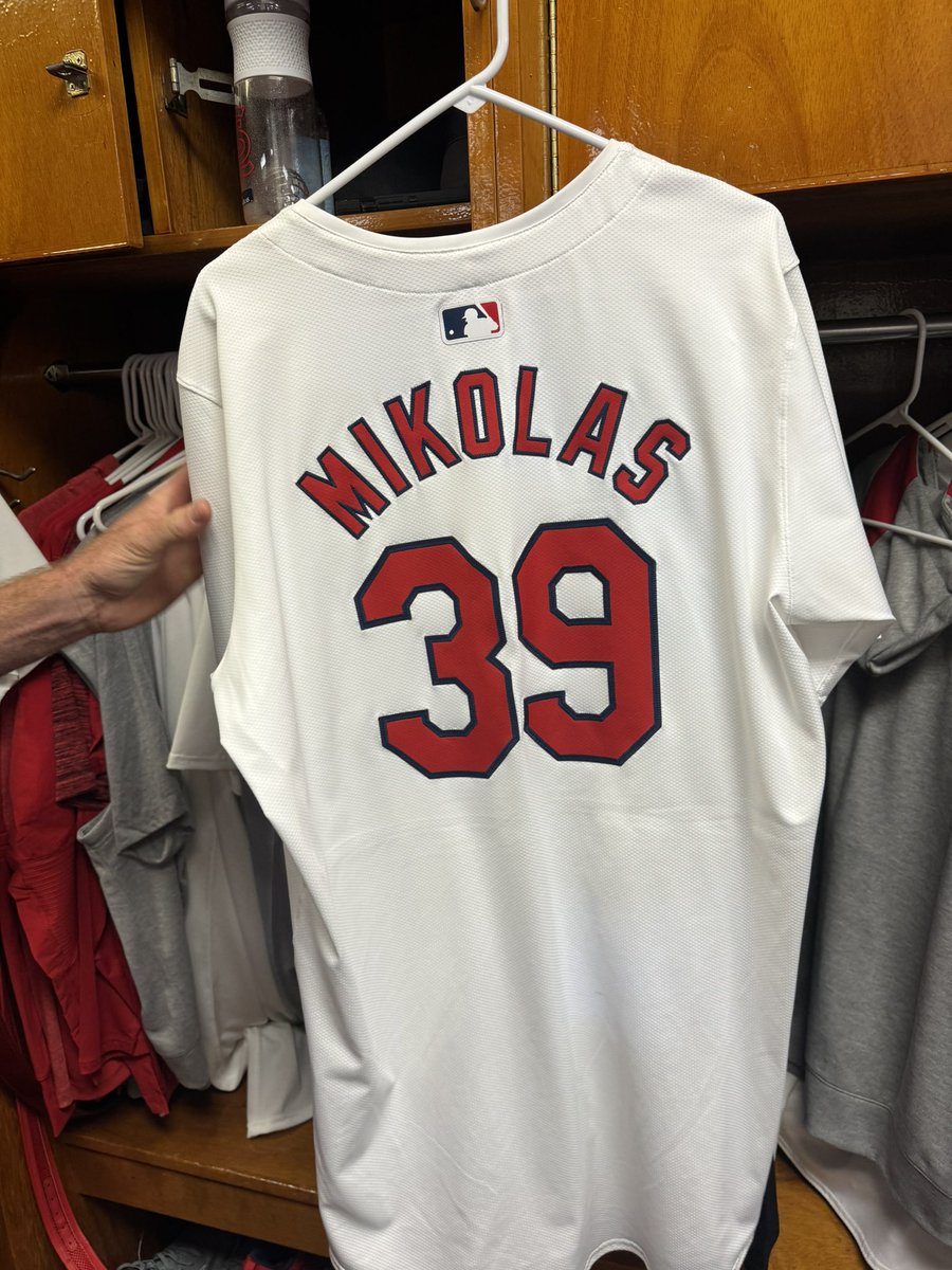
quote:
This is what the back of the white jerseys look like with the new template. Players are pretty unhappy. Miles Mikolas says they also don’t fit right; pants are no longer as customized, and the fabric is a very different consistency.
“They look cheap,” another player said.
This post was edited on 2/14/24 at 6:07 pm
Posted on 2/14/24 at 6:23 pm to UltimateHog
Yikes those are terrible
How can you screw up a MLB jersey? Many haven't changed in decades. We gave these fools the city connect and color out abominations to frick with and 'modernize'. I thought the tradeoff was they would leave the regulars alone
How can you screw up a MLB jersey? Many haven't changed in decades. We gave these fools the city connect and color out abominations to frick with and 'modernize'. I thought the tradeoff was they would leave the regulars alone
Posted on 2/14/24 at 6:26 pm to UltimateHog
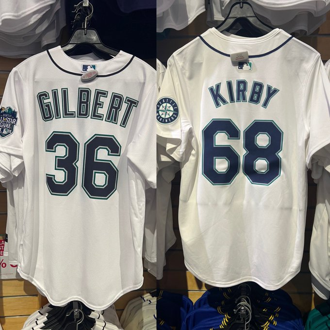
And as far as hoping they are not official, they seem to be modeling this new tiny font in official photos, although curiously with an old uni in the locker behind
I would like to see us wear this a few days a year

I would like to see us wear this a few days a year
This post was edited on 2/14/24 at 6:29 pm
Posted on 2/14/24 at 6:27 pm to Porker Face
The smaller font is universal this year it appears, MLB MiLB NCAA. For Nike at least.
The Nike check was on the right last year versus left now and was also white not red.
The Nike check was on the right last year versus left now and was also white not red.
This post was edited on 2/14/24 at 6:30 pm
Posted on 2/14/24 at 6:30 pm to UltimateHog
Anything we can do to line their pockets so their printer in Bangledesh can save a few bucks.
Appearances, fit, quality material, and customization, teams looking different from one another be damned
Appearances, fit, quality material, and customization, teams looking different from one another be damned

Posted on 2/14/24 at 6:33 pm to Porker Face

Posted on 2/14/24 at 6:33 pm to Porker Face
Fanatics is awful, so of course Nike outsourced all their baseball jerseys to them. And it's not going well, too late to fix but maybe next year MLB will force something with all the complaints.
I still haven't seen our red tops at all either surely we still have them.
I still haven't seen our red tops at all either surely we still have them.
Posted on 2/14/24 at 8:24 pm to UltimateHog

Posted on 2/15/24 at 2:09 am to Raz4back
I want to punch whoever agreed to "own" that font in the face.
Posted on 2/15/24 at 7:15 am to Porker Face
Naturals have new Unis too

On the right
On the right
Posted on 2/15/24 at 12:37 pm to Porker Face
Meh. I’ll stick with the Travelers.
Posted on 2/15/24 at 1:57 pm to Porker Face

Posted on 2/15/24 at 7:59 pm to PorkBelly
I prefer teams where there is not an ongoing safety hazard at the stadium
And I'm talking about the sinkhole, not the nearby parking lots
And I'm talking about the sinkhole, not the nearby parking lots
Posted on 2/15/24 at 9:01 pm to Porker Face
quote:
On the right
Did you completely miss that abomination in the middle?
Posted on 2/16/24 at 2:50 am to TheCheshireHog
quote:Seriously. Looks like a pajama top a 70 year old lady would wear to bed.
Did you completely miss that abomination in the middle?
Posted on 2/16/24 at 11:27 am to Porker Face
It would be perfect Arkansas that if by some miracle we win it all we will be wearing hideous uniforms.
Posted on 2/16/24 at 1:16 pm to Mason Dixon Swine
I assume they know enough to put us in the creams for any game in the CWS final

Posted on 2/17/24 at 7:59 am to Drewbie
quote:
I want to punch whoever agreed to "own" that font in the face.
I blame Jeff Long for our God awful font
Posted on 2/17/24 at 11:31 am to UltimateHog
quote:
I still haven't seen our red tops at all either surely we still have them.
Wearing red tops today, thankfully

 Page 1 of 1


Latest Arkansas News
Popular
Back to top