Started By
Message
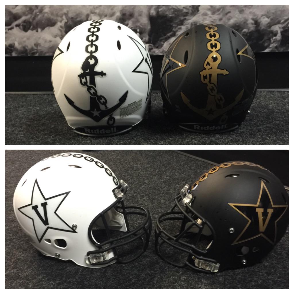
re: Vandy's new helmets... how do you like them?
Posted on 8/5/15 at 6:51 pm to The_Joker

Posted on 8/5/15 at 6:51 pm to The_Joker
quote:
I like them. The chain could be done better but I still like them.
This.
I get not looking like a chain link license plate, but something like the following would be better.

 0
0

Posted on 8/5/15 at 6:53 pm to rt3
Does it bother anyone else that the star stickers were put on so far off from being symmetric. Holy shite that bothers me.
Looks good though.
Looks good though.
This post was edited on 8/5/15 at 6:54 pm
Posted on 8/5/15 at 6:58 pm to rt3
No. Cheesy as hell.
Posted on 8/5/15 at 7:30 pm to rt3
Those are uglier than Lindsey Lohan with no makeup after a 4 day cocaine and BBC bender
Posted on 8/5/15 at 8:04 pm to rt3
LSU needs Hunker Down unis

Posted on 8/5/15 at 8:08 pm to rt3
Not usually a fan of the matte designs but these look pretty good. Most of the uniforms these companies crank out look like total crap but I can roll with these.

Posted on 8/5/15 at 8:23 pm to rt3
Oh those are badass!!!
Well done, Dores
Well done, Dores

Posted on 8/5/15 at 8:34 pm to KaiserSoze99
quote:
Kinda cool. I like the Anchor Down theme.

Posted on 8/5/15 at 8:38 pm to kywildcatfanone
I'm not sure. But I can say this: when I look at them I don't think Vandy. Rather Navy comes to mind instead. Not sure that's a good thing from a branding perspective.

Posted on 8/5/15 at 8:39 pm to kywildcatfanone
I don't love them, but they're at least original.
Posted on 8/5/15 at 9:02 pm to Chillini
Didn't notice it, but now that you mentioned it. It bothers me
Posted on 8/5/15 at 9:07 pm to rt3
The star is throwing me off. Perhaps it's better when worn?
Otherwise, I like the concept a lot. Well done!
Otherwise, I like the concept a lot. Well done!

Posted on 8/5/15 at 9:08 pm to rt3
I like the old ones better. The only thing I like about these is the anchor idea
Posted on 8/5/15 at 9:09 pm to rt3
They would be sweet without the anchor and chain imo

Posted on 8/5/15 at 9:12 pm to rt3
Concept is cool, would look much better if the anchor was much smaller on the back though. Whoever placed the decals was sloppy as hell. Get them things symmetrical
Posted on 8/5/15 at 9:13 pm to chitiger92
Any vandy fans on the forum to chime in?
Posted on 8/5/15 at 9:19 pm to WeeWee
Vanderbilt just down voted themselves.
Posted on 8/5/15 at 9:21 pm to AaronDeTiger
Really like them. Been saying it for a long time but if I was Vandy's AD I would try to go to Nike and say do whatever you want, make us the Oregon of the East as far as branding and uniforms go for all sports. It's not as if there's a ton of tradition tied to one uniform combo like Bama, LSU etc.
I'm a huge fan of the star V and love how that has become "the logo" of VU athletics.
I'm hopeful with Ludwig and his career of success and Mason running the D things improve this season but hard to believe much after the debacle that was last fall.
I'm a huge fan of the star V and love how that has become "the logo" of VU athletics.
I'm hopeful with Ludwig and his career of success and Mason running the D things improve this season but hard to believe much after the debacle that was last fall.

Posted on 8/5/15 at 9:40 pm to rt3
I personally would like for them to change the star logo and incorporate the V into the Anchor.
Posted on 8/5/15 at 10:16 pm to rt3


 Page 2 of 3

Back to top