Started By
Message
SEC logo - Needs to be changed.
Posted on 7/25/21 at 7:55 pm
Posted on 7/25/21 at 7:55 pm
Seriously, it's arse backwards fUgly.
With OKLAHOMA joining as your near future masters, I think we need the logo to be redesigned.
Fire away.
With OKLAHOMA joining as your near future masters, I think we need the logo to be redesigned.
Fire away.
 23
23

Posted on 7/25/21 at 7:56 pm to BigRedNewKingOfSEC
Reeks of alter.
Posted on 7/25/21 at 7:56 pm to BigRedNewKingOfSEC
No.
frick you.

frick you.
Posted on 7/25/21 at 7:56 pm to BigRedNewKingOfSEC
Hey, didn't Switzer get you guys on probation?
Posted on 7/25/21 at 7:56 pm to BigRedNewKingOfSEC
How about 1940s Germany Flag?
Posted on 7/25/21 at 7:57 pm to red sox fan 13
I always liked that bottom SEC logo. For the longest time, I had no idea the current logo was one that was used years earlier.
Posted on 7/25/21 at 7:57 pm to BigRedNewKingOfSEC
Yay, another alter.

Posted on 7/25/21 at 7:58 pm to Che Boludo
No alter, I'm here because OKLAHOMA is joining to take over this conference.
Posted on 7/25/21 at 7:58 pm to BigRedNewKingOfSEC
quote:
With OKLAHOMA joining as your near future masters, I think we need the logo to be redesigned.
You're trying too hard.

Posted on 7/25/21 at 7:59 pm to SCgamecock2988
quote:Yup. With a slice of troll on the side.
Reeks of alter.

Posted on 7/25/21 at 8:00 pm to red sox fan 13
The one and only SEC logo imo

Posted on 7/25/21 at 8:02 pm to SCgamecock2988
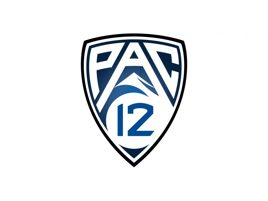
No really, look at the Pac-12's logo - a beauty
I think it's time for a redesign of the SEC logo - that ugly SEC patch will ruin OUr uniforms
I think it's time for a redesign of the SEC logo - that ugly SEC patch will ruin OUr uniforms
This post was edited on 7/25/21 at 8:04 pm
Posted on 7/25/21 at 8:03 pm to BigRedNewKingOfSEC
quote:Still time to head to the kiddie's table and put it on.
Pac-12's logo
Posted on 7/25/21 at 8:03 pm to BigOrangeBri
FIFY

Posted on 7/25/21 at 8:04 pm to red sox fan 13
Much better
Posted on 7/25/21 at 8:04 pm to red sox fan 13
quote:
red sox fan 13
That’s the one I meant to post lol.
Posted on 7/25/21 at 8:05 pm to red sox fan 13


Posted on 7/25/21 at 8:08 pm to Oklahomey
quote:
For the longest time, I had no idea the current logo was one that was used years earlier.
Correct
Posted on 7/25/21 at 8:10 pm to BigOrangeBri
I've always liked that as well.
Need new mascot cartoon (family portrait) image as well.

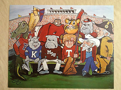

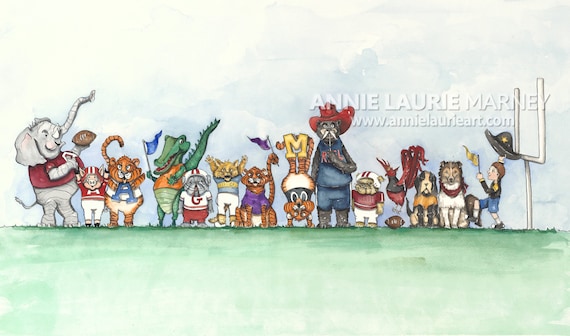
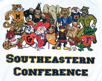
Nothing really stuck as ironically as the 69 version.
Need new mascot cartoon (family portrait) image as well.
Nothing really stuck as ironically as the 69 version.
Posted on 7/25/21 at 8:12 pm to lsufball19
The 1988-2007 logo will always be the one I remember, especially for the championship game.

 Page 1 of 7

Back to top