Started By
Message
Favorite and Least Favorite Uniform
Posted on 4/21/22 at 9:07 am
Posted on 4/21/22 at 9:07 am
What is your favorite and least favorite uniform that your team has ever worn?
My favorite:
LEAST FAVORITE:
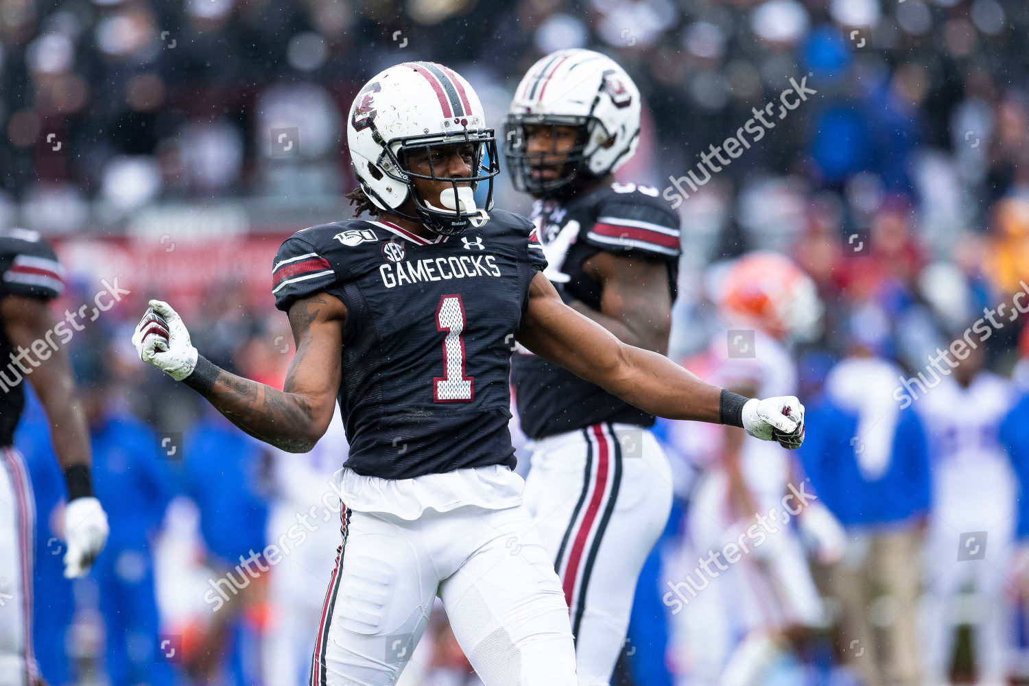
My favorite:
LEAST FAVORITE:
 21
21

Posted on 4/21/22 at 9:11 am to gamecockman12
Not my team but I love Florida state turquoise uniforms 
This post was edited on 4/21/22 at 9:13 am

Posted on 4/21/22 at 9:11 am to gamecockman12
tGOAT:
And then there was this monstrosity:
And then there was this monstrosity:

Posted on 4/21/22 at 9:21 am to BranchDawg
quote:
Honestly if they would have just made the helmet all silver or all red, they would have gone from hideous to passable

Posted on 4/21/22 at 9:22 am to BranchDawg
quote:
And then there was this monstrosity:
frick Nike and frick our admins for going along with it. When asked to wear them we should've told them to pound sand.
Let's not forget the abomination that was the black helmet from 2009 either
This post was edited on 4/21/22 at 9:23 am

Posted on 4/21/22 at 9:24 am to Glorious
Aside from our traditional home whites, these:

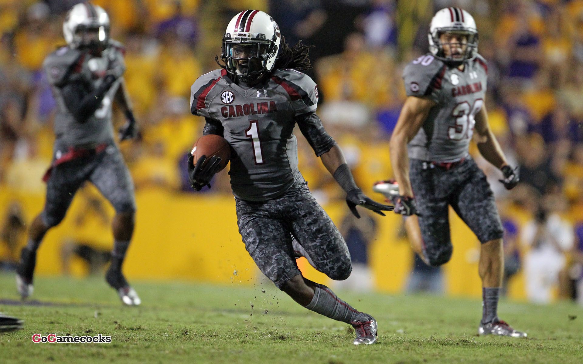
My least favorite, these:
/cdn.vox-cdn.com/uploads/chorus_asset/file/19936862/607369626.jpg.jpg)
My least favorite, these:
Posted on 4/21/22 at 9:24 am to WG_Dawg
The black helmet was obviously not good, but it wasn’t in the same league of bad as the pro combats.
Those Boise game uniforms were just a vomit of bad ideas. Looked like something a middle schooler would design for an instagram page.
Those Boise game uniforms were just a vomit of bad ideas. Looked like something a middle schooler would design for an instagram page.
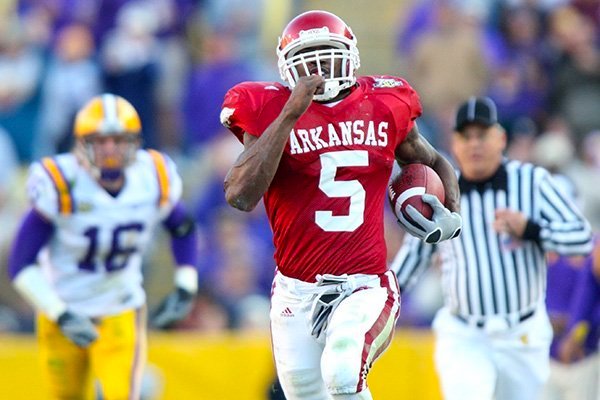
Posted on 4/21/22 at 9:26 am to gamecockman12
BAMA
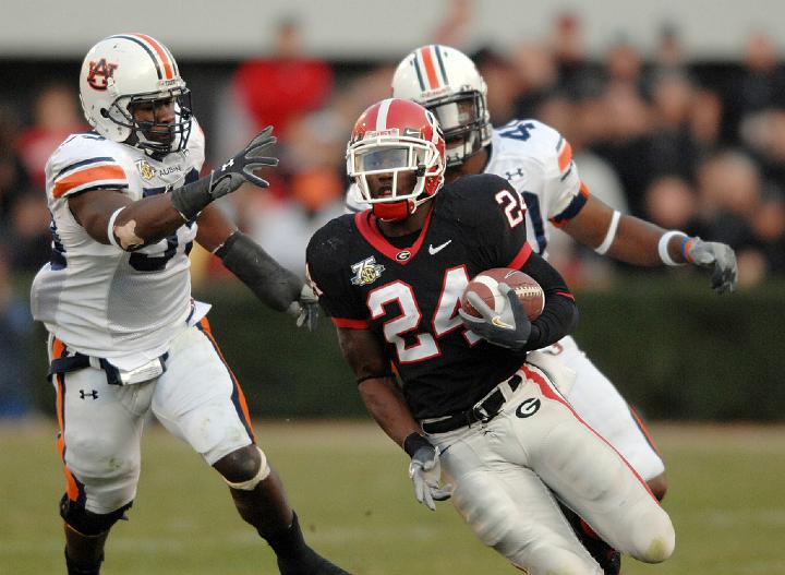
Best
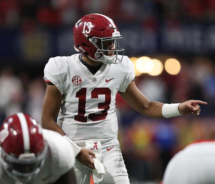
Worst: 2010 Nike Pro Combat. I remember being so excited to leave school, hop on my computer, and see what Nike came up with. Only to realize that they slightly changed the pants stripes, slapped an American flag on there, and put a barely visible houndstooth pattern on the numbers and helmet. I would rather they be outright ugly than this uninspired POS

Best
Worst: 2010 Nike Pro Combat. I remember being so excited to leave school, hop on my computer, and see what Nike came up with. Only to realize that they slightly changed the pants stripes, slapped an American flag on there, and put a barely visible houndstooth pattern on the numbers and helmet. I would rather they be outright ugly than this uninspired POS
This post was edited on 4/21/22 at 9:28 am
Posted on 4/21/22 at 9:27 am to Glorious
quote:
Honestly if they would have just made the helmet all silver or all red, they would have gone from hideous to passable
This.
Posted on 4/21/22 at 9:29 am to BranchDawg
Favorite:

Monstrosity:

Monstrosity:

Posted on 4/21/22 at 9:30 am to gamecockman12
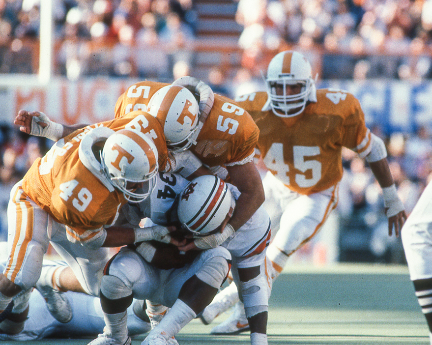
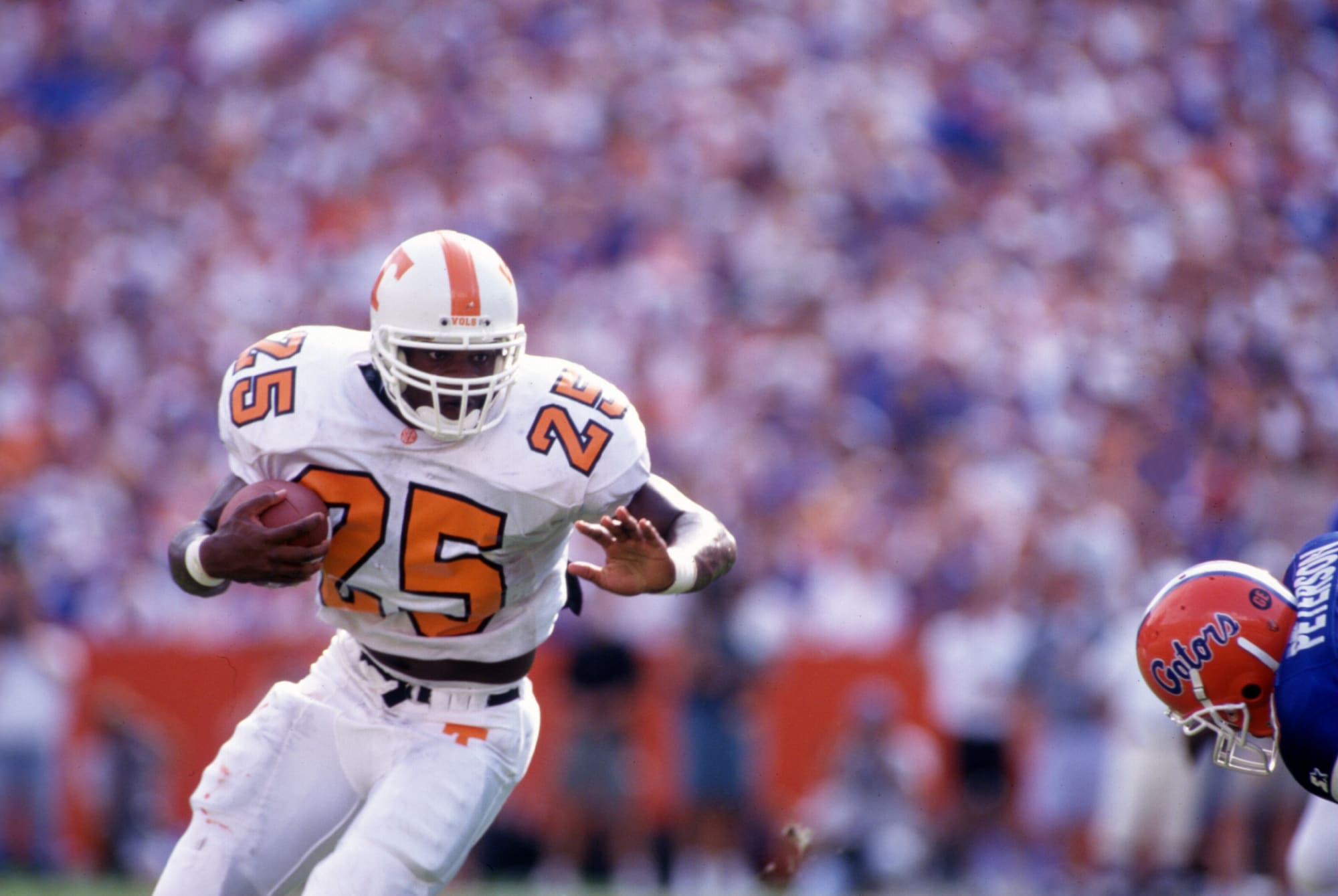
Favorite - Traditional Orange Home with white two stripe pants - Jerseys with block numbers front, back and shoulders and two stripes on sleeves
Least favorite
Not going to delve into the "gimmick uniforms"
Hated when they went to the black number outlines in 1995 and lost the stripes on the pants.
Worst gimmick uniform...lots of people loved them...but I was not a fan of the blackout. There is a lot of "Oregon State" going on there.

Least favorite
Not going to delve into the "gimmick uniforms"
Hated when they went to the black number outlines in 1995 and lost the stripes on the pants.
Worst gimmick uniform...lots of people loved them...but I was not a fan of the blackout. There is a lot of "Oregon State" going on there.
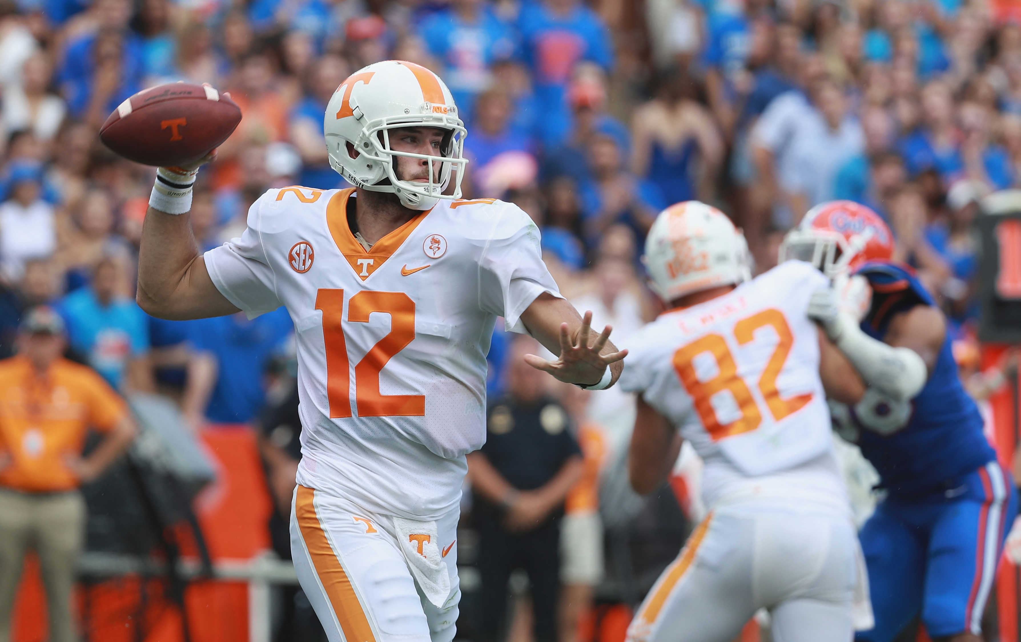
Posted on 4/21/22 at 9:31 am to BranchDawg
Best
:no_upscale()/cdn.vox-cdn.com/uploads/chorus_image/image/16721425/20121124_ajl_bs1_185.0.jpg)
Least favorite

The Smokey Grey needs to be ahead of black in the rotation. The helmet just looks weird in that.
Least favorite
The Smokey Grey needs to be ahead of black in the rotation. The helmet just looks weird in that.
Posted on 4/21/22 at 9:32 am to gamecockman12
/thread
Posted on 4/21/22 at 9:39 am to madmaxvol
quote:
Worst gimmick uniform...lots of people loved them...but I was not a fan of the blackout.
it just makes less than zero sense. Why in the hell is a team whose colors are orange and white wearing black anyway? The greys were equally crappy but at LEAST the excuse there was smoke off the mountains or something liek that. Black was simply to wear black for the hell of it.
Posted on 4/21/22 at 9:43 am to gamecockman12
Here is how Nike takes a perfectly good away uniform and screws it up:
From this
:format(jpeg)/cdn.vox-cdn.com/uploads/chorus_image/image/44266092/usa-today-8238168.0.jpg)
to this
Stupid color around the collar, single stripe pant that fades to checkerboard, idiotic looking number fonts. Screw Nike...
From this
to this
Stupid color around the collar, single stripe pant that fades to checkerboard, idiotic looking number fonts. Screw Nike...
Posted on 4/21/22 at 9:46 am to WG_Dawg
quote:
Worst gimmick uniform...lots of people loved them...but I was not a fan of the blackout.
quote:
it just makes less than zero sense. Why in the hell is a team whose colors are orange and white wearing black anyway? The greys were equally crappy but at LEAST the excuse there was smoke off the mountains or something liek that. Black was simply to wear black for the hell of it.
Tennessee wore black jerseys from the 1890s until 1921. So, I guess that it is an homage to that.
Posted on 4/21/22 at 9:47 am to WG_Dawg

Posted on 4/21/22 at 9:47 am to madmaxvol
quote:
Stupid color around the collar, single stripe pant that fades to checkerboard, idiotic looking number fonts. Screw Nike...
Yeah those changes make absolutely zero sense. No idea who at Nike would have thought damn this looks good.
Posted on 4/21/22 at 9:50 am to Smokeyone
Both the grey and the black are sharp as hell. UT has the only alternate uniforms that I like.
Posted on 4/21/22 at 9:51 am to Smokeyone
quote:
The Smokey Grey needs to be ahead of black in the rotation. The helmet just looks weird in that.
The Smokey Greys need to be burned. I hate those things.

 Page 1 of 4

Popular
Back to top