Started By
Message
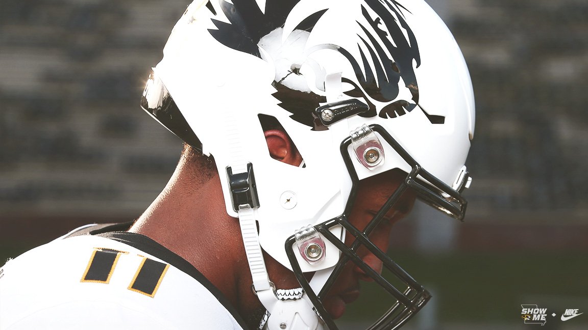
Block M Helmets are back for the UK game
Posted on 10/23/20 at 10:02 am

Posted on 10/23/20 at 10:02 am
All is right, these look sick. We should go back to this Helmet full time
 4
4


Posted on 10/23/20 at 10:10 am to Lou2theZou
That's a really sharp lid. Gold flake!
Posted on 10/23/20 at 10:14 am to Lou2theZou
Need to just make the Block M standard issue again. I hate that stupid oval tiger.
Posted on 10/23/20 at 10:25 am to Athos
I disagree wholeheartedly the matte black tiger helmets are just so clean.
The M logo resembles the Michigan logo too much, especially since our colors are somewhat similar too. Instead of knocking off a bigger and more storied program, I just say stick with the matte black Tiger helmet.
The M logo resembles the Michigan logo too much, especially since our colors are somewhat similar too. Instead of knocking off a bigger and more storied program, I just say stick with the matte black Tiger helmet.
Posted on 10/23/20 at 10:40 am to blueprint_one
Love the M. A few more losses to Ohio State and no one will care about Michigan.
Posted on 10/23/20 at 10:53 am to Drydock
You can't win that battle without a few national championships.
Posted on 10/23/20 at 10:58 am to blueprint_one
No one gives a frick about Michigan anymore.m
Posted on 10/23/20 at 12:36 pm to blueprint_one
This is the point I expected to hear... your not wrong
Let’s meet in the middle and throw the tiger over the “M” like This
Let’s meet in the middle and throw the tiger over the “M” like This
This post was edited on 10/23/20 at 12:37 pm
Posted on 10/23/20 at 1:29 pm to Lou2theZou
Hard pass.
Posted on 10/24/20 at 10:10 am to blueprint_one
I like the new logo ok.
But we had the block M on our helmets over 40 years. We aren’t “knocking off” anything.
But we had the block M on our helmets over 40 years. We aren’t “knocking off” anything.

Posted on 10/24/20 at 1:21 pm to the808bass
Big 10 would see the M as Michigan, SEC ppl would see Mizzou. I think that's ok.
Posted on 10/24/20 at 10:05 pm to Lou2theZou
Didn't notice much during the game, but rewatching the highlights the helmets really do look great. I'm a fan of oval tiger but the block M looks much better on a helmet
Posted on 10/24/20 at 10:35 pm to Lou2theZou
I was at the game. The Block M almost glowed. It was awesome!
Our helmets should ALWAYS be black.
Our helmets should ALWAYS be black.
Posted on 10/24/20 at 11:06 pm to blueprint_one
Absolutely. There are so many other schools that use a boring 'M' helmet. There's nothing appealing about it. I can't stand logos with nothing but bland letter(s). It's so stale and unimaginative. I don't get the endless love affair with those old crappy helmets.
Posted on 10/25/20 at 1:52 am to CRDNLSCHMCPSN11
You stop that blasphemy RIGHT NOW.
Posted on 10/25/20 at 3:46 am to JesusQuintana
I really like the black jerseys with the white pants and helmets.
Posted on 10/25/20 at 7:50 am to CRDNLSCHMCPSN11
quote:
Absolutely. There are so many other schools that use a boring 'M' helmet. There's nothing appealing about it. I can't stand logos with nothing but bland letter(s). It's so stale and unimaginative. I don't get the endless love affair with those old crappy helmets.
That’s some bullshite right there. I’d argue there’s nothing cool and unique about putting a spin on the Jets logo with a mini tiger head. That is boring. It’s a school branding logo that looks weird for a helmet.
Give me the Block M and it’s variants like the Rock M design.
/cdn.vox-cdn.com/uploads/chorus_image/image/61835687/helmets.0.png)
Hell, I’d much prefer this design we’ve rocked to the oval. THAT is unique.

And keep this for our stormtrooper look.
Posted on 10/25/20 at 8:22 am to Athos
You guys are bias Mizzou fans so sometimes we need to remind ourselves that when people see that color scheme and style - the nation sees a more storied program - they see Michigan - not Mizzou. It's always been that way. Even if both teams have used that similar style for the same period of time.
Posted on 10/25/20 at 8:58 am to blueprint_one
Those people are objectively retarded. We shouldn’t be slaved to the idiocy of retards.
And the colors are in no way similar.
And Jesus frick. Michigan doesn’t even rock an M helmet. This is the dumbest of arguments.
And the colors are in no way similar.
And Jesus frick. Michigan doesn’t even rock an M helmet. This is the dumbest of arguments.
Posted on 10/25/20 at 9:13 am to Athos
Michigan has their Wolverine stripe pattern, it never changes. The M on the helmet is ours, dammit.

 Page 1 of 2

Popular
Back to top