Started By
Message
Vanderbilt Pinstripe Baseball Uniforms
Posted on 5/30/15 at 1:59 pm

Posted on 5/30/15 at 1:59 pm
I have traditionally been a big fan of Vanderbilt's color scheme and uniforms in all sports. The logo is simple and looks great:


That being said, and maybe this has been discussed here, but the pinstripe baseball uniforms have got to go. I had seen them before but I forgot how bad they look.
Instantly made me think of zoot suits.
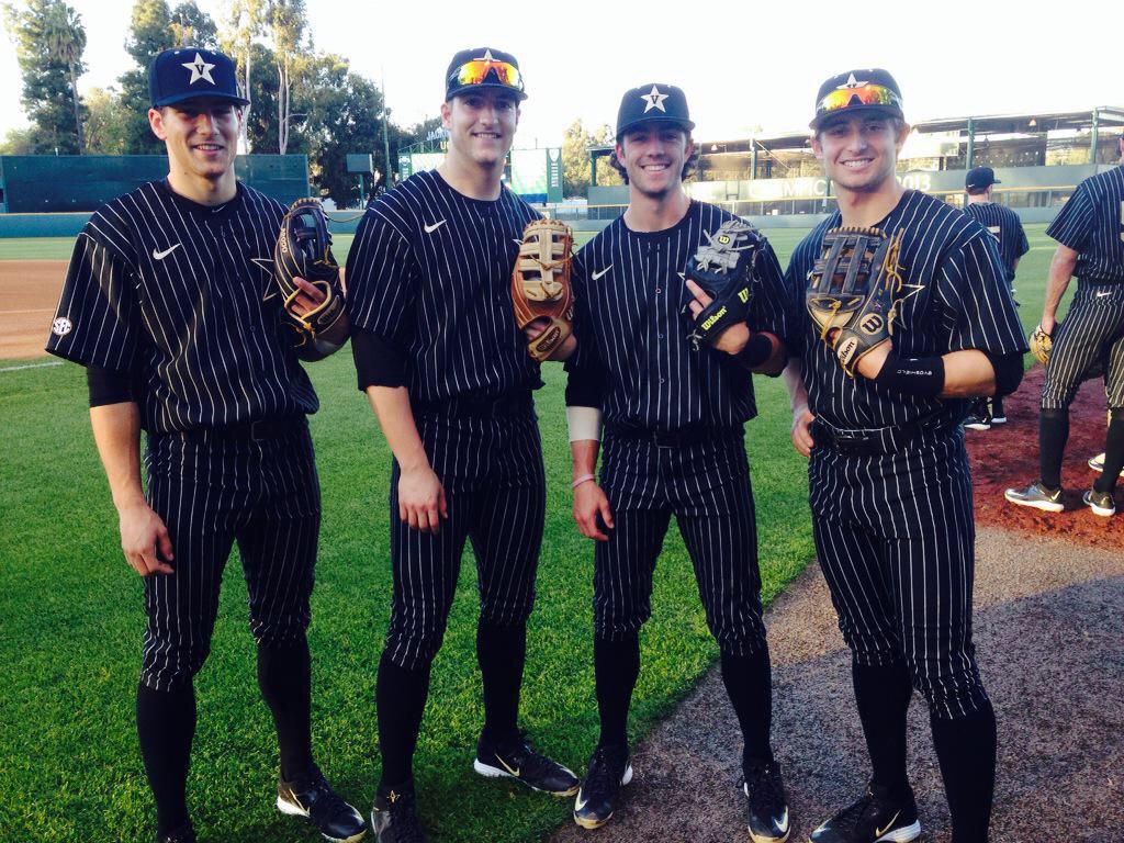

Maybe I am in the minority, do people like these?
That being said, and maybe this has been discussed here, but the pinstripe baseball uniforms have got to go. I had seen them before but I forgot how bad they look.
Instantly made me think of zoot suits.
Maybe I am in the minority, do people like these?
 8
8


Posted on 5/30/15 at 2:02 pm to JumpingTheShark
I vote no

Posted on 5/30/15 at 2:03 pm to JumpingTheShark
quote:
I am in the minority
Post a pic and we will judge the answer to this.
Posted on 5/30/15 at 2:03 pm to Landsharks
A white uniform with black pinstripes would look pretty good, unless they don't want to look like the yankees or something

Posted on 5/30/15 at 2:03 pm to JumpingTheShark
quote:
Posted on 5/30/15 at 2:26 pm to JumpingTheShark
I didn't think it was possible, but they're growing on me. They look much better at night.
Posted on 5/30/15 at 2:31 pm to DoreonthePlains
Chef's pants made for fencing.
Posted on 5/30/15 at 2:31 pm to DoreonthePlains
I like them, but black is my favorite color.

Posted on 5/30/15 at 2:32 pm to JumpingTheShark
Those are ugly.
Posted on 5/30/15 at 2:35 pm to JumpingTheShark
Auburn pinstripes 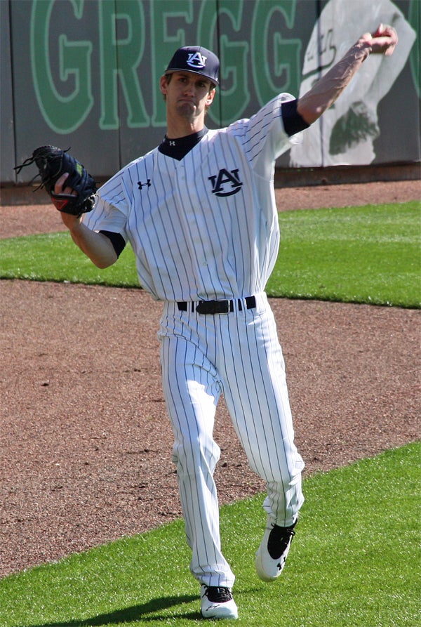

Posted on 5/30/15 at 2:35 pm to JumpingTheShark
Minority I'm sure but I like them.

Posted on 5/30/15 at 2:49 pm to JumpingTheShark
The design is intended to distract the opposing team and make them uncomfortable, thus causing them to lose focus and make mistakes.
I just made that up but it does seem like a practical explanation for those eyesores.
I just made that up but it does seem like a practical explanation for those eyesores.

Posted on 5/30/15 at 2:52 pm to JumpingTheShark
quote:
A white uniform with black pinstripes would look pretty good, unless they don't want to look like the yankees or something
Vandy could use their gold logo V-star logo to keep it from looking too much like the yankees. And if they were that concerned using the baseball version of this light gold as the base color (below) with black pinstripes would look pretty good:

Add this to complete the uni:

Vandy has some of the easiest colors to work with and get a decent design out of. That color palatte is actually hard to frick up but Nike has managed to create an eyesore despite that. Reminds me of the infamous UGA helmet and uniform where Nike managed to frick up another very easy to design for color palette:

How do you screw up a color palettes that are so damned easy to get right??? It's not like these are difficult schemes to work with (some combos are but not these).
Posted on 5/30/15 at 2:53 pm to GeauxToBed
If you wear,them and win in them keep wearing them

 Page 1 of 1


Back to top