Started By
Message
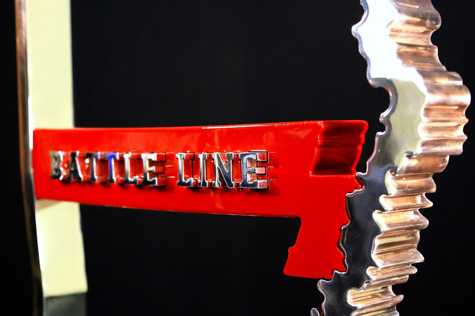
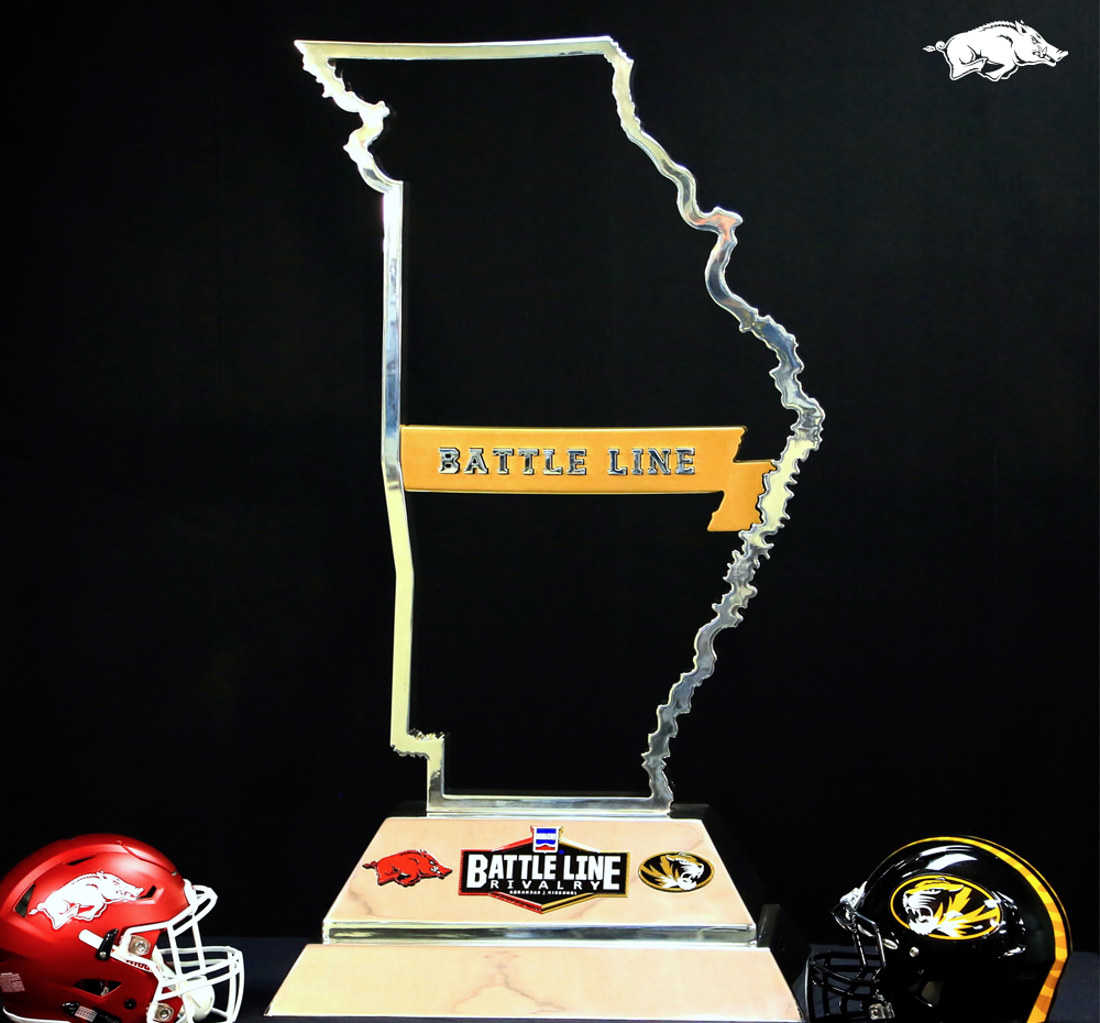
"Battle Line" Trophy...
Posted on 11/23/15 at 10:32 am
Posted on 11/23/15 at 10:32 am
 11
11


Posted on 11/23/15 at 10:35 am to I Ham That I Ham
trophies not too bad
that "rivalry" name though sucks donkey balls
that "rivalry" name though sucks donkey balls
Posted on 11/23/15 at 10:38 am to hawgfaninc
quote:
David Bazzel – Designer & Project Lead
of course
Posted on 11/23/15 at 10:59 am to I Ham That I Ham
quote:
David Bazzel – Designer & Project Lead
glad he was able to come up with an original idea
Posted on 11/23/15 at 11:01 am to hawgfaninc
can't wait to see the boot and the line beside each other in our trophy case
Posted on 11/23/15 at 11:17 am to I Ham That I Ham
Everything about it fricking sucks.
It is a very cheap-looking copy of The Boot.
It is a very cheap-looking copy of The Boot.
Posted on 11/23/15 at 11:19 am to I Ham That I Ham
quote:
Much like cheap jewelry it comes with a red or yellow line to accessorize based on winner!
Hopefully the Shelter Insurance logo can pop out, too. You know, in case we sell the rights to Pepsi or Tyson.
With so many removable pieces, it's like the Mr. Potato Head trophy.
Posted on 11/23/15 at 11:24 am to Numberwang
I would have liked it to be named the Wal-Mart Rivalry , it flows so much better.

Posted on 11/23/15 at 11:45 am to Numberwang
quote:
Everything about it fricking sucks.
true, but it's still better than this

Posted on 11/23/15 at 11:46 am to hawgfaninc
Just like I said on the Rant. ARMOgeddon. I forgot who came up with the name last year
Posted on 11/23/15 at 4:01 pm to I Ham That I Ham
Better, but still sucks.
Posted on 11/23/15 at 4:08 pm to I Ham That I Ham
This may be the first trophy where the winning team rushes the field to take the trophy to the losing side and leave it there. Better then what we had before, but still hideous.

Posted on 11/23/15 at 4:19 pm to I Ham That I Ham
So if we win this one, do we just stack it on top of the boot and call it the leg?
Posted on 11/23/15 at 4:34 pm to BennyAndTheInkJets
Seems like the only option.
Posted on 11/23/15 at 4:42 pm to I Ham That I Ham
I actually really like the trophy. I think it looks good and I like the interchangeable part.
Posted on 11/23/15 at 5:21 pm to I Ham That I Ham
There's just something "off" about the design.
Either the outside or the inside should have been a straight line. The "river texture" on both sides makes it look awkward. I keep wanting to correct it.
Also, there's obviously a "disputed area" crammed into the middle, but the river outline continues, as if that portion is a part of both states. Inaccurate and it just throws it off from a visual perspective.
Poor design, and that logo on the bottom will look very dated in just a few years. It already does, actually. Throw in a corporate logo, and you have one shitty trophy.
I hate it.
Posted on 11/23/15 at 5:28 pm to wmr
I like "Mizery needs company" myself.
Posted on 11/23/15 at 7:28 pm to wmr
Yeah i think they had to make up a section of river that doesnt actually exist
Posted on 11/23/15 at 8:35 pm to wmr
quote:
Poor design, and that logo on the bottom will look very dated in just a few years. It already does, actually. Throw in a corporate logo, and you have one shitty trophy.
This. It's awful.
Posted on 11/23/15 at 8:54 pm to I Ham That I Ham
who's the person who first told Bazzel he was creative? I want to punch that person.
This post was edited on 11/23/15 at 8:55 pm

 Page 1 of 2

Latest Arkansas News
Popular
Back to top