Started By
Message
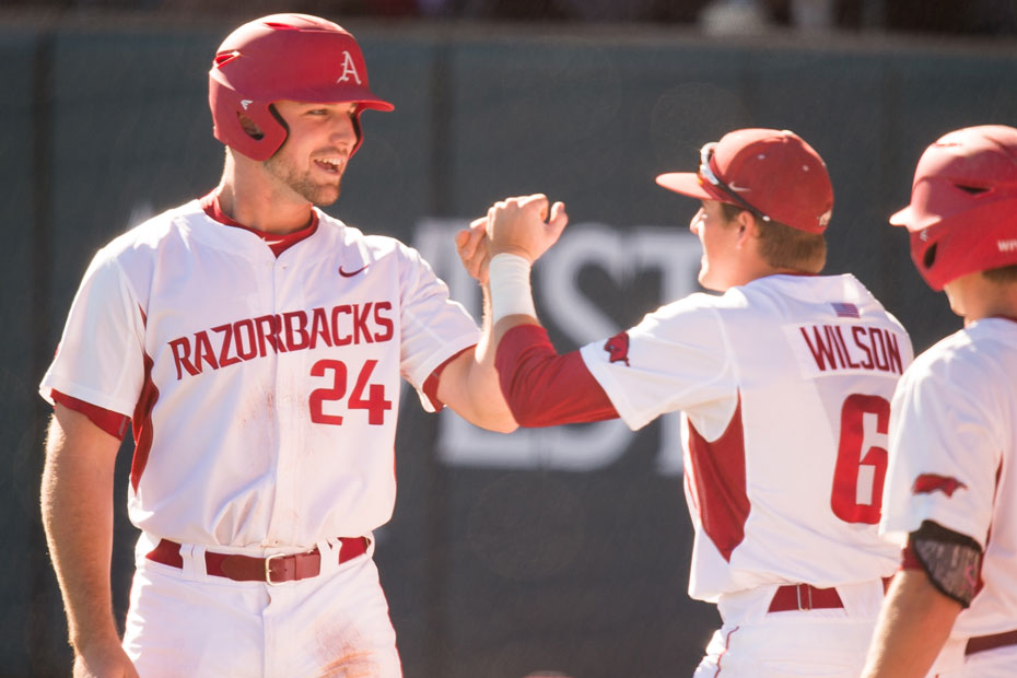
What's up with Auburn's shitty uniforms?
Posted on 4/6/18 at 7:07 pm

Posted on 4/6/18 at 7:07 pm
Part button up, part pull over... No name on the back. They make you look poor.

 14
14


Posted on 4/6/18 at 7:15 pm to cubsfan5150
Throw back, DA.
Posted on 4/6/18 at 7:17 pm to cubsfan5150
That's 100x better than this trash:
Look, I know your mad that Arkansad used to have awesome uniforms in everything and seemingly told Nike "Just frick my shite up!" giving y'all some of the ugliest uniforms in every sport in major college athletics... But don't direct your anger at Auburn just because we're better than you at literally everything.
Look, I know your mad that Arkansad used to have awesome uniforms in everything and seemingly told Nike "Just frick my shite up!" giving y'all some of the ugliest uniforms in every sport in major college athletics... But don't direct your anger at Auburn just because we're better than you at literally everything.
Posted on 4/6/18 at 7:18 pm to MrAUTigers
So you guys had part pullover, part button up jerseys before?
With the odd floating button below the letters?
You didn't learn your lesson before?
Poor and dumb
With the odd floating button below the letters?
You didn't learn your lesson before?
Poor and dumb
Posted on 4/6/18 at 7:26 pm to cubsfan5150
quote:
Poor
LINK
quote:
10. Auburn. SEC. Total Revenue: $140,070,593
quote:
14. Arkansas. SEC. Total Revenue: $124,981,042

Posted on 4/6/18 at 7:28 pm to cubsfan5150
They look full button up? What am I missing here?
Posted on 4/6/18 at 7:47 pm to DBU
quote:
They look full button up?
They are.
quote:
What am I missing here?
A dumbass arky/Cubs fan?
Posted on 4/6/18 at 7:48 pm to DBU
I think those low buttons are fake.
Closer look I'm not sure. Look good though either way?
Closer look I'm not sure. Look good though either way?
This post was edited on 4/6/18 at 7:50 pm

Posted on 4/6/18 at 7:48 pm to cubsfan5150
Those look sharp.
Posted on 4/6/18 at 7:48 pm to roadGator
I like them
Posted on 4/6/18 at 7:49 pm to BowlJackson
Ugly font and colored armpits. Not a good look.
Posted on 4/6/18 at 7:51 pm to Farmer1906
I like the font and the pits aren't a different color. Lol
Eta. You talkin bout Arky
Yes. Don't like the pits
Eta. You talkin bout Arky
Yes. Don't like the pits
This post was edited on 4/6/18 at 7:56 pm
Posted on 4/6/18 at 7:53 pm to Farmer1906
quote:
Ugly font and colored armpits. Not a good look
Not to mention that ugly arse pig logo
Posted on 4/6/18 at 7:56 pm to cubsfan5150
Looks like the uniform from the 80s

Posted on 4/6/18 at 8:07 pm to cubsfan5150
Buttons the whole way tard
Posted on 4/6/18 at 8:13 pm to RockyMtnTigerWDE
quote:
Buttons the whole way
On a pullover jersey... Makes sense
Posted on 4/6/18 at 8:15 pm to Farmer1906
The arky ones are terrible
Posted on 4/6/18 at 8:18 pm to cubsfan5150
Yeah, you really are a window licking hog.

Posted on 4/6/18 at 8:55 pm to JamalSanders
Yeah, those are definitely faux front with two buttons at the top. Design doesn’t even split.
Sharp looking uni if you ask me, though.
Sharp looking uni if you ask me, though.
Posted on 4/6/18 at 9:17 pm to cubsfan5150
GG Auburn 

 Page 1 of 2

Popular
Back to top