Started By
Message
re: Something about your team's unis you'd like to come back
Posted on 5/1/17 at 9:25 am to BranchDawg

Posted on 5/1/17 at 9:25 am to BranchDawg
We want this helmet back 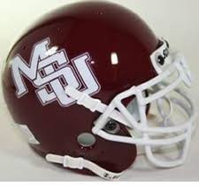
 1
1


Posted on 5/1/17 at 9:26 am to lsufball19
quote:
There's really not that big a difference. I don't know why so many people complain about it
I agree. I actually like it.
UGA did a similar thing a few years ago and I thought it was an improvement.
-2012:

2013-now:

Posted on 5/1/17 at 9:30 am to TheCheshireHog
Arkansas 100% needs to go back to their old unis. Their new ones are awful and the old ones are just classic. I loved the huge "Arkansas" across the chest.
This post was edited on 5/1/17 at 9:31 am
Posted on 5/1/17 at 9:33 am to Farmer1906
quote:
I'm probably in the minority but I liked our gray pants.
So do I. I ran a dynasty with A&M many, many years ago strictly because I liked the maroon/grey pants combo. I only selected my school based on uniform appeal.
Posted on 5/1/17 at 9:41 am to ChewyDante
every single thing about our 2006 home look.

This post was edited on 5/1/17 at 9:49 am

Posted on 5/1/17 at 9:42 am to BranchDawg
the interlocking MSU logo that nike owns F you nike i just did it
Posted on 5/1/17 at 10:41 am to BranchDawg
I always preferred the numbers on the helmets, to the variations on the Toonces theme. This was the standard through the 1971 season. Also, the shade of gold in the helmets and pants was slightly darker, almost a yellow-orange, through the 1971 season. It was AWESOME!

Posted on 5/1/17 at 10:44 am to BranchDawg
SEC and National Championship Game patches... 
Posted on 5/1/17 at 10:48 am to TigerFan4040
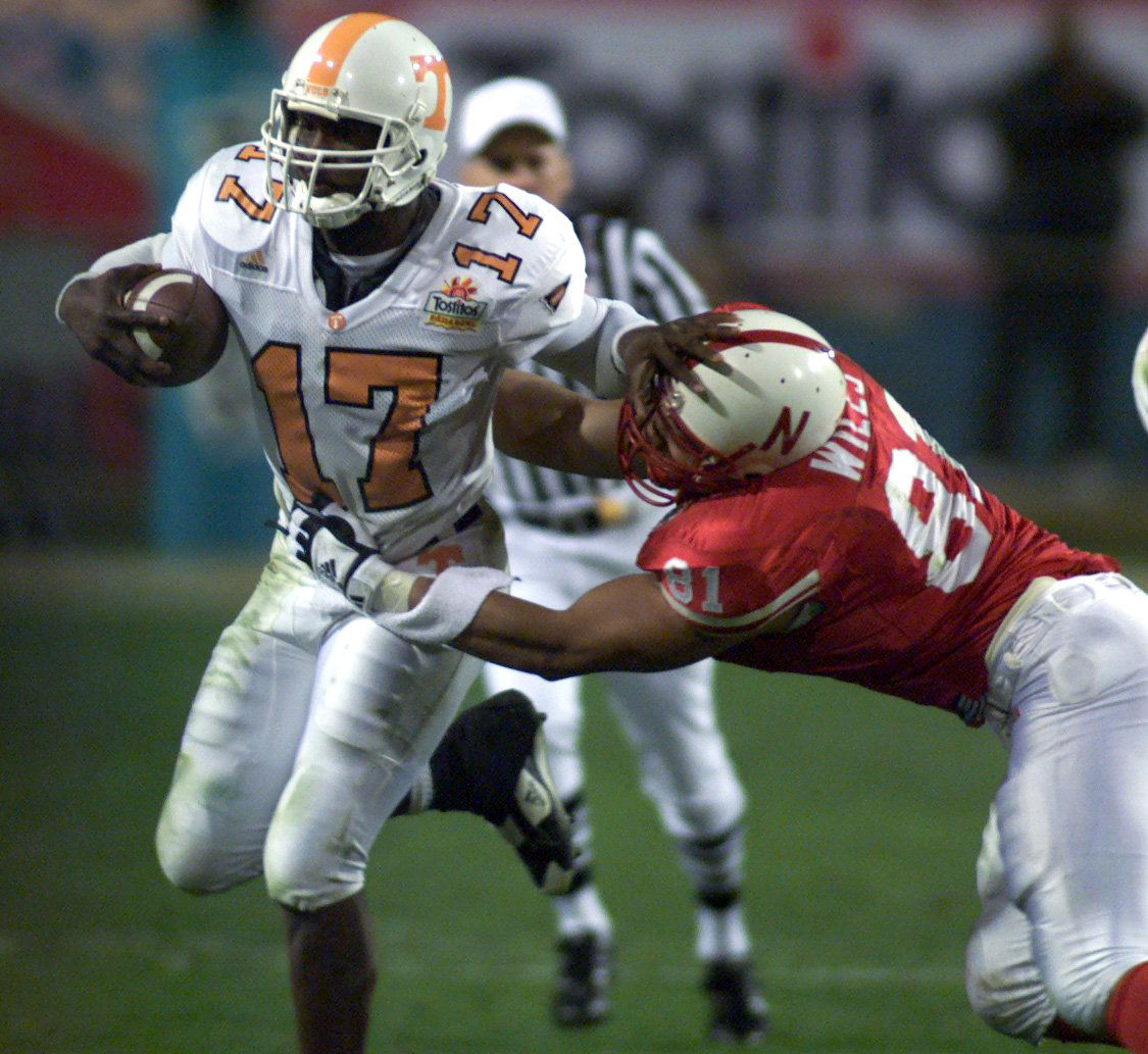
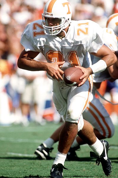
Tennessee should go back to the large font for their numbers

Posted on 5/1/17 at 10:48 am to Vecchio Cane
can't figure out why we ever went away from it... heck we could do a gofund me page to buy the logo from Nike so that the university owns it and can bring it back whenever they want.
Posted on 5/1/17 at 10:51 am to yatesdog38
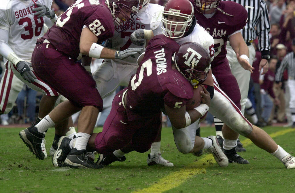
I really liked the all-maroon look A&M wore in the RC Slocum years.


Posted on 5/1/17 at 11:28 am to VolInBavaria
quote:
The black outline on the away jerseys
NO!!!
Either the old Orange outline...or old school no outline at all.

I don't give a damn how hard it is for the announcers to make them out. F them.
Posted on 5/1/17 at 11:33 am to phil4bama
quote:
The white helmets with the Crimson numerals that we used to wear back in the 60s
I completely disagee. Those look horrible.
Posted on 5/1/17 at 11:35 am to 12Pence
quote:
all-maroon look
It looked more purple back when Nike supplied the unis. Yikes. IMO those are some of the worse. No thanks. I hope we never see all maroon again.
Posted on 5/1/17 at 11:44 am to tigerbru17
Yeah, LSU/UF/UGA really fricked up the number styles IMO
Started in 2013 too
Started in 2013 too
This post was edited on 5/1/17 at 11:45 am
Posted on 5/1/17 at 11:54 am to G2160
Mizzou needs to go back to those jerseys as well. Loved the block M.
Posted on 5/1/17 at 11:59 am to ZOU
For LSU ...
Traditional numbers
Wouldn't mind seeing purple pants with a stripe occasionally.
Traditional numbers
Wouldn't mind seeing purple pants with a stripe occasionally.
Posted on 5/1/17 at 12:06 pm to BranchDawg
I miss the black cleats

Posted on 5/1/17 at 12:09 pm to BranchDawg
The McFadden jerseys without a doubt. Those are the best Razorback jerseys we've ever had.
Posted on 5/1/17 at 12:23 pm to pvilleguru
The white helmets over the Crimson jersey looks stupid. The storm trooper look I'd be down with. Wouldn't mind seeing the numbers on the sleeves again.

 Page 3 of 4

Popular
Back to top