Started By
Message
Difference between baseball and football logos...
Posted on 2/21/17 at 11:27 am
Posted on 2/21/17 at 11:27 am
Are you in favor of it, or no?
The block LSU seems to be exclusive to baseball. The football program is all about the 'geaux' font. I couldn't imagine the baseball team wearing a Les Miles'-style cap. It's also odd that the football helmet logo isn't prominently featured on shirts, caps, etc, by the coaches.
Texas A&M's logo seems to be uniform across the board. The Florida 'F' has been on the Gators football helmets before.
Then you have schools like Arkansas, South Carolina, and Mississippi State that seem to have a separate logo for baseball.
Do you like the differences?
 10
10

Posted on 2/21/17 at 11:28 am to TexasTiger08
I like the football/basketball logo better for SC.

Posted on 2/21/17 at 11:28 am to TexasTiger08
States baseball logo is way better than their football logo.
Posted on 2/21/17 at 11:35 am to TexasTiger08
All teams should have the same logo.

Posted on 2/21/17 at 11:35 am to TexasTiger08
A&M is more likely to mix in a Sarge logo or a Texas outline to the normal block ATM.
Posted on 2/21/17 at 11:39 am to Farmer1906
quote:
A&M is more likely to mix in a Sarge logo or a Texas outline to the normal block ATM.
Using the Old Sarge logo seems like a minor league type of stunt. I could see that on a double a cap.

Posted on 2/21/17 at 11:42 am to TexasTiger08
I like that a lot of baseball teams have different logos than other sports. A tiger eye or Mike the Tiger head or Geaux Font would look very wal-marty on a baseball hat. Same can be said for other schools.
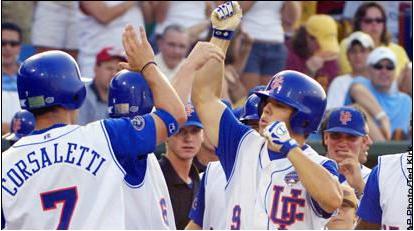
and that's fairly new. Florida used to have UF on their baseball hats
Regardless, it works for some schools, it doesn't for others
quote:
The Florida 'F' has been on the Gators football helmets before.
and that's fairly new. Florida used to have UF on their baseball hats
Regardless, it works for some schools, it doesn't for others
This post was edited on 2/21/17 at 11:45 am

Posted on 2/21/17 at 11:45 am to TexasTiger08
Our baseball logo is the GOAT
This post was edited on 2/21/17 at 11:46 am
Posted on 2/21/17 at 11:46 am to TexasTiger08
Baseball

Football
Football
Posted on 2/21/17 at 11:46 am to lsufball19
Remember when Smoke had the Geaux Font on the uniforms?
I think the Eye of the Tiger could work on a Sunday hat/special game hat.
I think the Eye of the Tiger could work on a Sunday hat/special game hat.
Posted on 2/21/17 at 11:48 am to sms151t
quote:
Remember when Smoke had the Geaux Font on the uniforms?
yes, it was terrible


he also used that weird comic sans font, among many other terrible uniform concepts


This post was edited on 2/21/17 at 11:53 am
Posted on 2/21/17 at 11:51 am to lsufball19
Yikes those aren't good.
Posted on 2/21/17 at 11:55 am to chawk195
Back under Uncle Dave Odom, the basketball team almost exclusively used the interlocking USC as their logo. Three programs, three logos.

Posted on 2/21/17 at 11:56 am to RoyalAir
Oddly enough, that ugly arse logo was developed by Holtz for football.
Posted on 2/21/17 at 12:10 pm to BobLeeDagger
quote:
Our baseball logo is the GOAT

Posted on 2/21/17 at 12:22 pm to Big Balls
State does have a great logo for baseball

Posted on 2/21/17 at 12:25 pm to lsufball19
Comic sans wasn't as bad as geaux font. That super hero crap on the last pic didn't bother me at first, but it looks like shite now.
Agreed, very Wal-Mary/Starter Athletic-y looking.
Agreed, very Wal-Mary/Starter Athletic-y looking.
Posted on 2/21/17 at 12:27 pm to lsufball19
quote:
Florida used to have UF on their baseball hats
Interlocking UF looks better than the current logo in my opinion.
Sticking in the state of Florida, I like the interlocking FS for Florida State and the old English M for Miami. Don't they use the 'U' logo now?
Posted on 2/21/17 at 12:30 pm to TexasTiger08
They brought back the old English M for an alternate uniform but yeah they use the U logo now
Posted on 2/21/17 at 12:44 pm to TexasTiger08
MSU's baseball Logo should be used in all MSU sports IMO.


 Page 1 of 2

Popular
Back to top