Started By
Message
Best/Worst NCAA Baseball Tournament Hat?
Posted on 6/2/21 at 9:44 am
Posted on 6/2/21 at 9:44 am
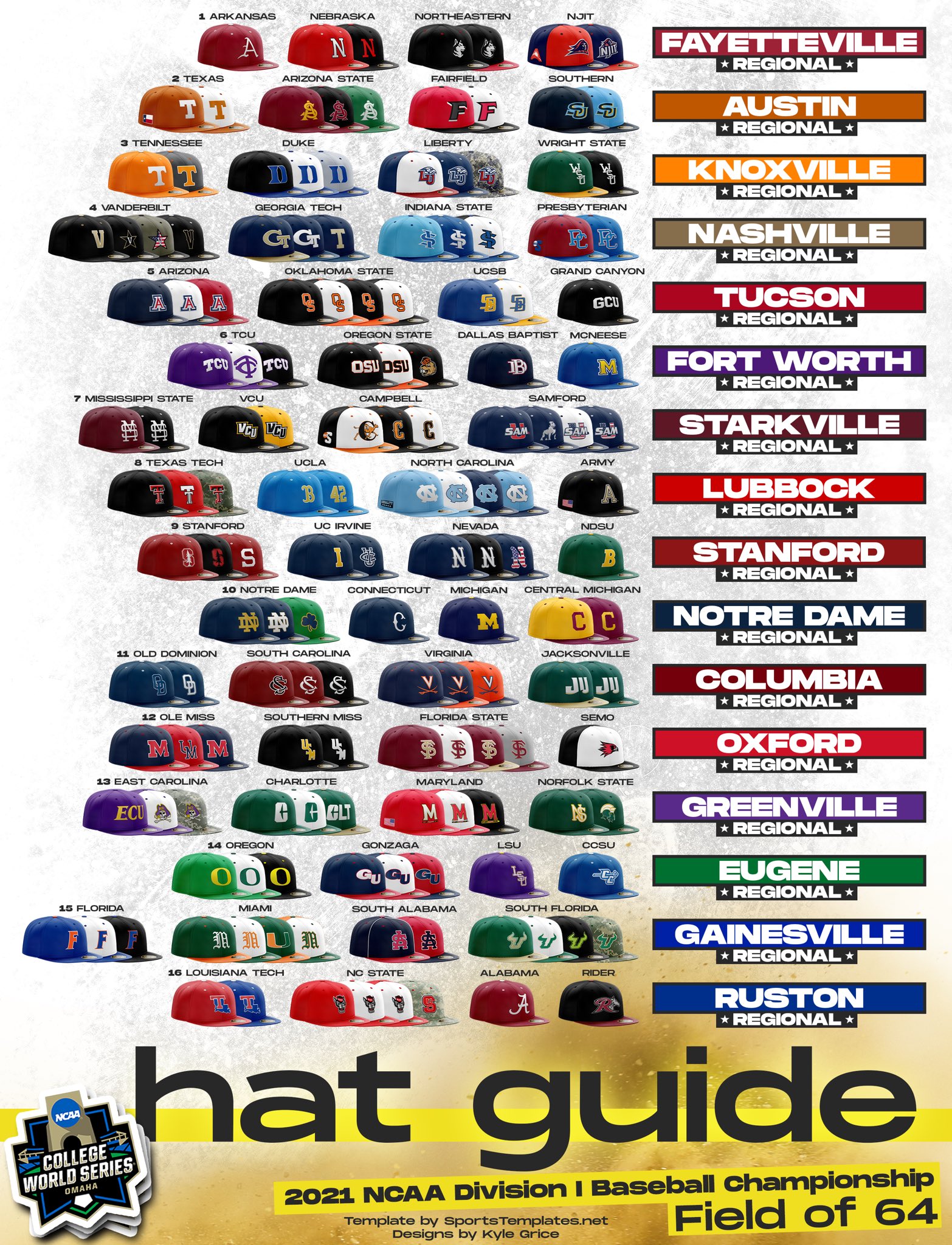
Best
- Wright State
- Classic Stanford S
- UConn
- LSU
- South Alabama
- Ole Miss UM
Worst
- NJIT
- Samford
- Charlotte CLT
- ECU (all of them)
This post was edited on 6/2/21 at 9:52 am
 26
26


Posted on 6/2/21 at 9:51 am to SummerOfGeorge
The Miami Script M is ugly as sin. The whole Samford "SAM" branding needs to go.
I like Maryland, UCLA, South Carolina, and Notre Dame
I like Maryland, UCLA, South Carolina, and Notre Dame
This post was edited on 6/2/21 at 10:05 am
Posted on 6/2/21 at 9:51 am to SummerOfGeorge
Indiana State
Vandy’s original
Vandy’s original
This post was edited on 6/2/21 at 9:53 am

Posted on 6/2/21 at 9:52 am to SummerOfGeorge
I always liked SC's interlocking white font logo. I love our interlocking UM as well and wished we used it across more of our sports honestly
Posted on 6/2/21 at 9:52 am to SummerOfGeorge
Gonzaga and Virginia
Posted on 6/2/21 at 9:56 am to SummerOfGeorge
I also don't quite get the NDSU one. I know the "B" is for Bison, but why would you have the first letter of your mascot name instead of your school or a logo?
UCLA can do that, they're UCLA. They have one of the most unique color schemes in college sports, plus that their hat is about as recognizable a college baseball hat as exists.
UCLA can do that, they're UCLA. They have one of the most unique color schemes in college sports, plus that their hat is about as recognizable a college baseball hat as exists.
This post was edited on 6/2/21 at 9:57 am
Posted on 6/2/21 at 9:59 am to SummerOfGeorge
Also like ODU, South Carolina, Campbell's black hat, Miss State's maroon, the old school "T" Georgia Tech hats.
Don't like GCU, Oregon State, TCU or anyone with the straight across 3 letter look. UCSB and UC Irvine have a ton going on in their logos. Rider's is pretty bad.
Kind of like Central Connecticut State's. Would like Maryland's more if they didn't have the bar part of their logo on there and just the M.
Posted on 6/2/21 at 10:00 am to SummerOfGeorge
Charlotte and Central Michigan are both hideous. The Dallas Baptist cap is pretty sweet. It's pretty unique.

Posted on 6/2/21 at 10:01 am to SummerOfGeorge
I always liked South Alabama's interlocking S & A. Rebs' hat with the red bill is pretty sweet. (TCU's middle hat ripped off the Twins big time).
Posted on 6/2/21 at 10:03 am to TigerLunatik
quote:
Charlotte and Central Michigan are both hideous
I just hate that Charlotte logo. And I am not a very big fan of "airport abbreviation" logos/uniforms (and that includes Atlanta, which probably has the most "famous" airport code in the country - still hate it on jerseys).
Central Michigan's is just boring as hell. They took the Indians post-Wahoo hats and just threw their colors on it.
Posted on 6/2/21 at 10:03 am to SummerOfGeorge
Texas and Tenn look like the same thing.
Posted on 6/2/21 at 10:03 am to tgrmeat
quote:
Worst - Alabama
quote:
tgrmeat
Yea, we get it, you want this to be your schtick. Get in line.

Posted on 6/2/21 at 10:04 am to SummerOfGeorge
That UConn hat is perfect
Posted on 6/2/21 at 10:04 am to SummerOfGeorge
Vandy military, UCLA "numbers", Florida "black". Hands down my 3 faves
Posted on 6/2/21 at 10:04 am to SummerOfGeorge
I’m gonna say worst is Tenneee and Texas.
Posted on 6/2/21 at 10:05 am to MNW
quote:
That UConn hat is perfect
Yea it's pretty great.
It doesn't really fit their uniforms, though. They have more modern uniforms (which are fine) and then the classic old school hat.


Posted on 6/2/21 at 10:05 am to TigerLunatik
quote:
Virginia
Always thought this was a underrated logo design. Not huge or gaudy. Classic with the crossed swords and V.
Posted on 6/2/21 at 10:05 am to reVealed
quote:
UCLA "numbers"
The UCLA Jackie Robinson hat is pretty fantastic

Posted on 6/2/21 at 10:07 am to SummerOfGeorge
Mississippi State's interlocking Maroon MS is the best. Biased or not, I will die on this hill.
This post was edited on 6/2/21 at 10:09 am

 Page 1 of 3

Popular
Back to top