Started By
Message
 0
0

Posted on 2/21/17 at 9:04 pm to phil4bama
Any logo with an animal sucks. Fwiw, I'm older school and logos are absolutely, 100, advertising. To each his own 
I miss my athletic department tire cover for Jeep. Sad
I miss my athletic department tire cover for Jeep. Sad
Posted on 2/21/17 at 9:10 pm to nc14

Best A&M logo ever.
Posted on 2/21/17 at 9:44 pm to DarthRebel
That screams "high school" to me.
Posted on 2/21/17 at 10:37 pm to Triple Daves

My favorite, though not a logo.

Posted on 2/21/17 at 10:43 pm to Triple Daves
Auburn liked our 1950s logo so much that they stole it...
Posted on 2/21/17 at 10:52 pm to WhiskerBiscuitSlayer
Just say no to bevels

Posted on 2/22/17 at 5:08 am to Triple Daves
Either the interlocking AU or this one
Posted on 2/22/17 at 7:29 am to stevo1905
My favorites (not in any particular order)


My least favorites

My least favorites
This post was edited on 2/22/17 at 7:31 am

Posted on 2/22/17 at 7:42 am to Barneyrb
I'm a Clemson fan but have always liked USCe baseball logo. Southern California be damned.
Also, USCe has the best baseball uniforms in the nation (excepting CofCs "the College" black uniforms

Posted on 2/22/17 at 7:52 am to stevo1905
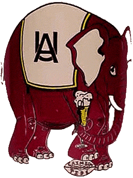
I like our current logo fine, but since I grew up in the 80's, the elephant stepping through the A will always be our "correct" logo to me. Same for Auburn with the eagle flying through the A.
Posted on 2/22/17 at 10:21 am to ATLdawg25
quote:
ATLdawg25
Dude, that was never an official logo for UGA.

Pretty sure that's a variant of the Fresno State dog that some dimwit photoshopped over a disproportionate "G".
Posted on 2/22/17 at 10:42 am to nvasil1
quote:
This Albert looks like he just did some rails off of Alberta's chest.
All of the original 10 SEC teams had a cartoon character logo in the 70's and 80's. They remind me of Hanna-Barbera characters. They look really dated now, but they sold a ton of T-shirts, buttons and key chains back then. TBS even incorporated a version of them in their intro to the weekly SEC game.
LINK
Posted on 2/22/17 at 11:14 am to Triple Daves
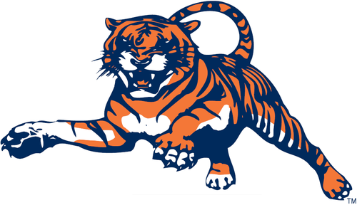
I loved Auburn's leaping tiger and eagle through the A. Those were being phased out right as I was starting school down there.
I am curious about who had the tiger with the hat first - Auburn or LSU.
I am curious about who had the tiger with the hat first - Auburn or LSU.
Posted on 2/22/17 at 11:33 am to PJinAtl
The current version is just too clean looking.
I like these from when I was a wee lad.


I like these from when I was a wee lad.
Posted on 2/22/17 at 11:35 am to Bankshot
quote:
All of the original 10 SEC teams had a cartoon character logo in the 70's and 80's. They remind me of Hanna-Barbera characters. They look really dated now, but they sold a ton of T-shirts, buttons and key chains back then. TBS even incorporated a version of them in their intro to the weekly SEC game.
We were still using Albert up until the mid 90s but I don't remember the eyes being messed up like that.

He got phased out for "mean" Albert which looks stupid.

Posted on 2/22/17 at 11:38 am to PJinAtl
quote:
I am curious about who had the tiger with the hat first - Auburn or LSU.
Missouri had it too as early as 1962. Auburn had it as early as 1950. Not sure about LSU.
Posted on 2/22/17 at 11:46 am to Triple Daves
I hate most of those on the worst ones list.
Posted on 2/22/17 at 11:47 am to Barneyrb
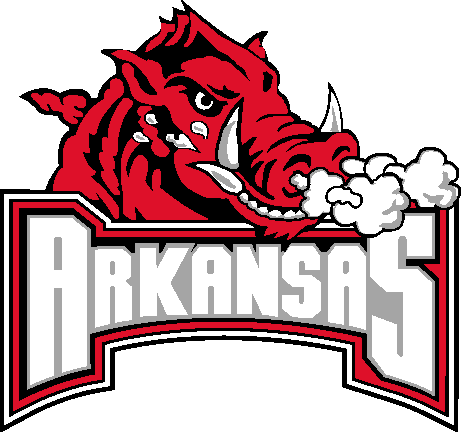
Arkie: putting lipstick on a pig doesn't help.
Posted on 2/22/17 at 11:48 am to Korin
UF: That mean albert thing looks ... bad.

 Page 5 of 6

Popular
Back to top